

Choosing the right bedroom paint color changes how your room feels every day. The best color is not just trendy. It needs to work with your light, your bedding, and the way you actually live.
This guide shares bedroom paint color ideas based on real, lived-in rooms. You will see calm sage-green walls with warm white trim, warm greige for compact city spaces, dusty blue for a teen room, and more.
Each section includes simple styling ideas you can copy with what you already have. You will also get a Pro Design Tip and a Budget Consideration so you can plan your paint project with fewer surprises.
If you came from Pinterest, use this post like a checklist. Pick a color family, match it to your window light, then build the room with easy layers like linen bedding, wood tones, and warm lamps.
1. Calm Sage Green Bedroom Paint for a Restful Primary Suite
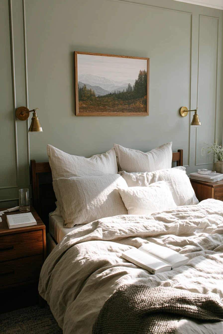
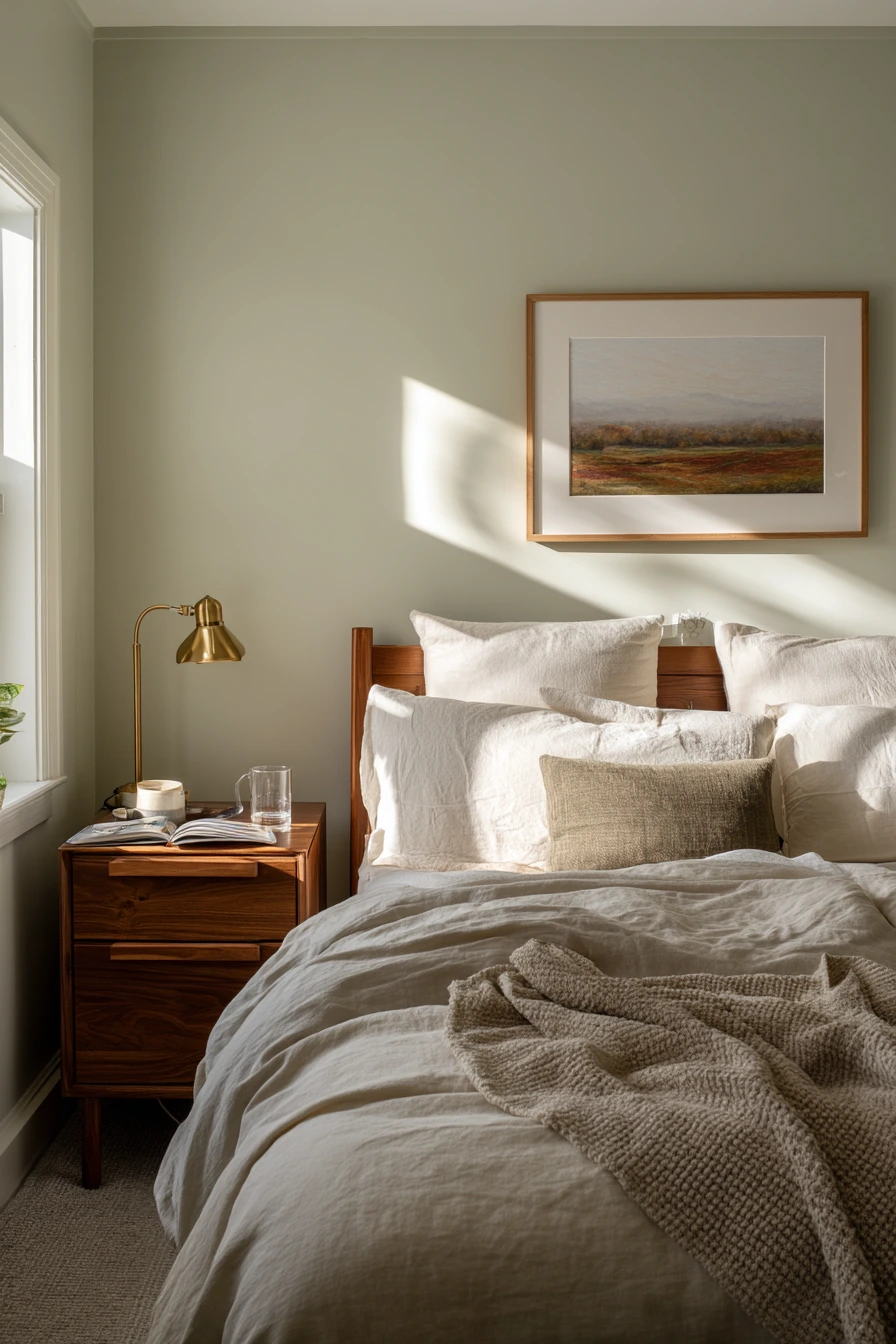
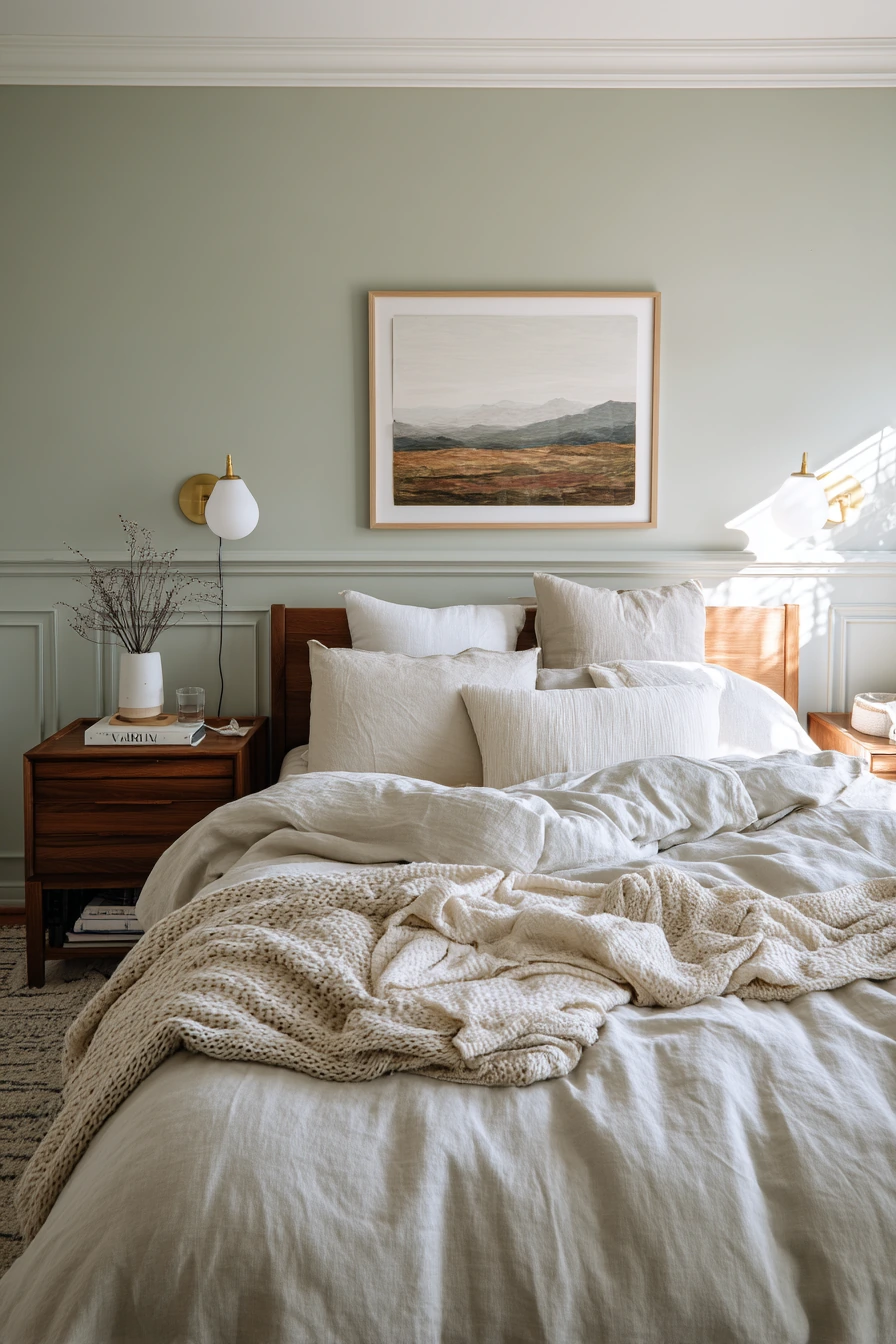
Calm sage-green walls are a strong choice for a primary bedroom because they feel soft but not boring. In a lived-in suburban home, sage reads clean in morning light and cozy at night. It also pairs well with warm white trim, which keeps the room looking crisp instead of dull.
To style this color, lean into natural textures. Linen bedding in oat and ivory looks relaxed against green paint, especially when the duvet is slightly rumpled. Walnut nightstands and brass reading lamps add warmth, so the room feels balanced, not cool. A single framed landscape above the headboard keeps the wall simple and helps the space feel quiet.
Keep the everyday items, but make them look intentional. A paperback novel, a water glass, and a phone charging cable can stay on the nightstand if you group them neatly. Add a soft wool throw folded at the foot of the bed and one plant near the window so gentle plant shadows move across the wall in the sun.
- Choose a sage with a gray base for a calmer look in bright rooms.
- Use warm white trim to sharpen edges and make the green look cleaner.
- Mix metals with care: brass works well with walnut and oat linens.
- Keep wall art simple, like one landscape or one large print.
- Layer bedding in ivory, oat, and light taupe for a natural palette.
Pro Design Tip: Paint a large sample on two walls and watch it from morning to night; sage can shift from green to gray depending on window direction and lamp color.
Budget Considerations: If you cannot replace furniture, keep your existing pieces and update only the lampshades and bedding in warm neutrals to make sage feel custom without a full room redo.

2. Warm Greige Bedroom Paint Ideas for Small City Bedrooms
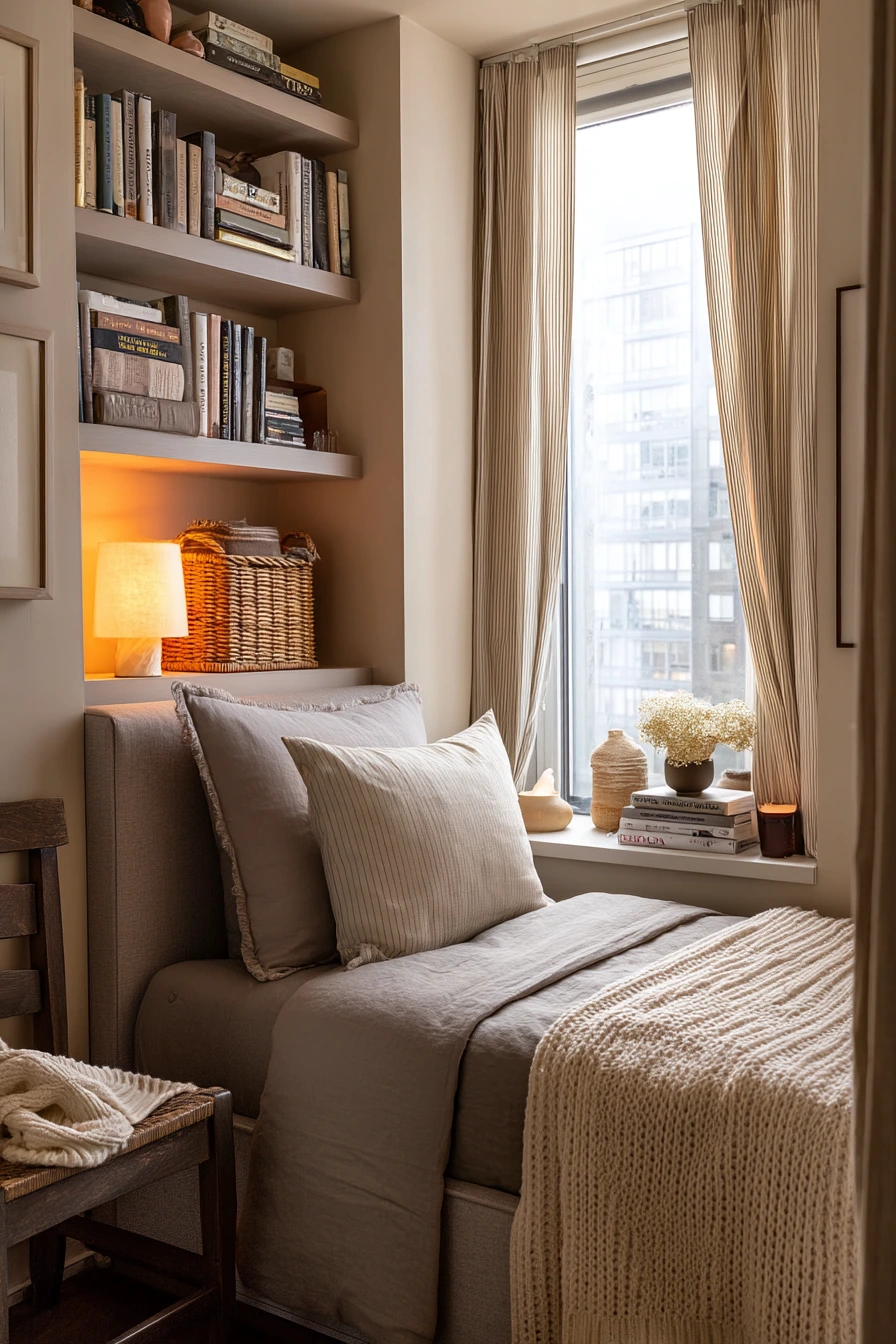
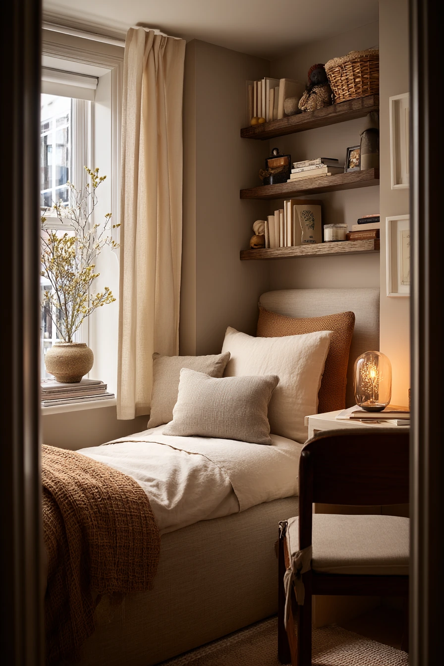
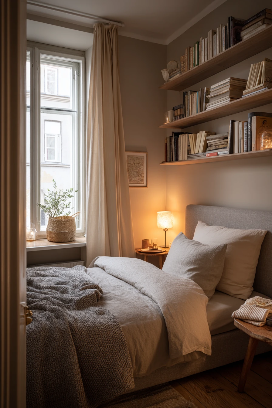
Warm greige is a safe, high-impact paint color for a compact city bedroom. It sits between beige and gray, so it feels modern but still soft. In small rooms, this tone helps walls fade back, which makes the space feel less crowded.
Greige works especially well with space-saving furniture like an upholstered bed and narrow floating shelves. Cream blackout curtains look calm against the wall color, and they help control light for better sleep. Add a woven basket under the window for extra storage that still looks tidy.
Keep the styling simple and useful. Stack a few books on the shelf, place a glasses case where you can reach it, and add a tiny ceramic lamp with a warm bulb for evening. A half-folded sweater on a chair is real life, but you can make it feel nicer by using one chair in a light fabric and keeping the rest of the corner clear.
- Pick a greige with a warm undertone so it does not look purple or cold.
- Use floating shelves instead of a bulky nightstand to save floor space.
- Choose cream curtains to soften the wall color and keep the room bright.
- Add one warm lamp to avoid harsh overhead light at night.
- Use baskets to hide small items while keeping them easy to grab.
Pro Design Tip: Match your bulb temperature to the paint; a 2700K warm bulb keeps greige from turning flat and helps it feel inviting.
Budget Considerations: Floating shelves and plug-in lamps are often cheaper than new furniture and are easy to take with you if you move.

3. Dusty Blue Bedroom Paint Colors for a Teen Room That Grows With Them
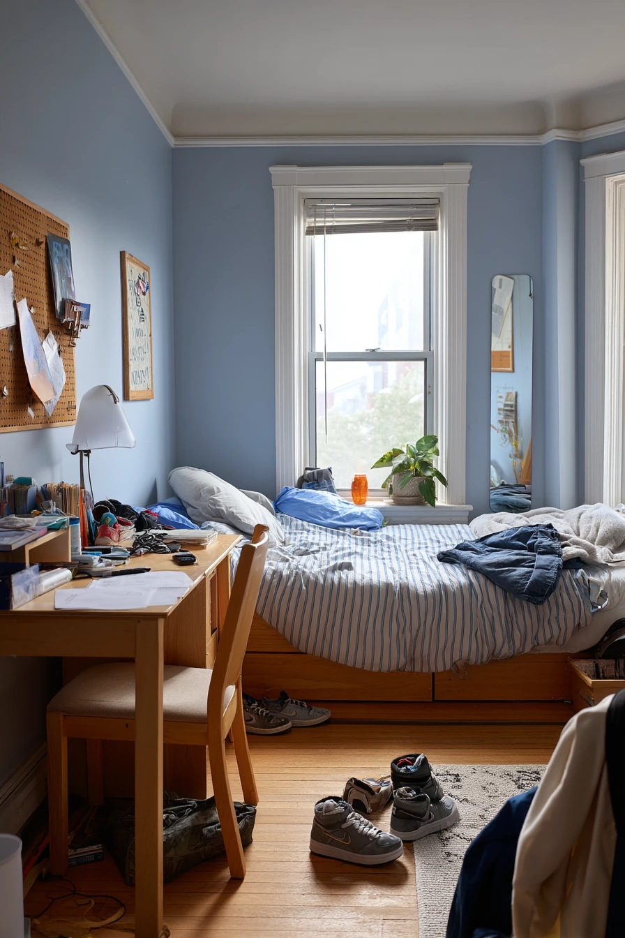
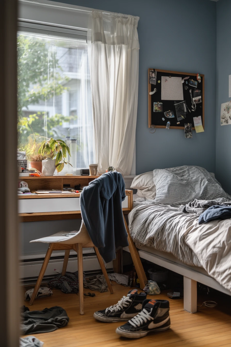
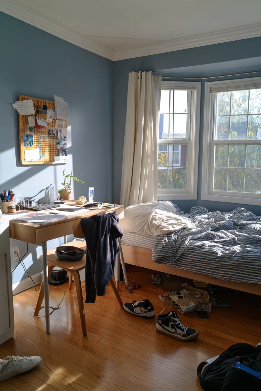
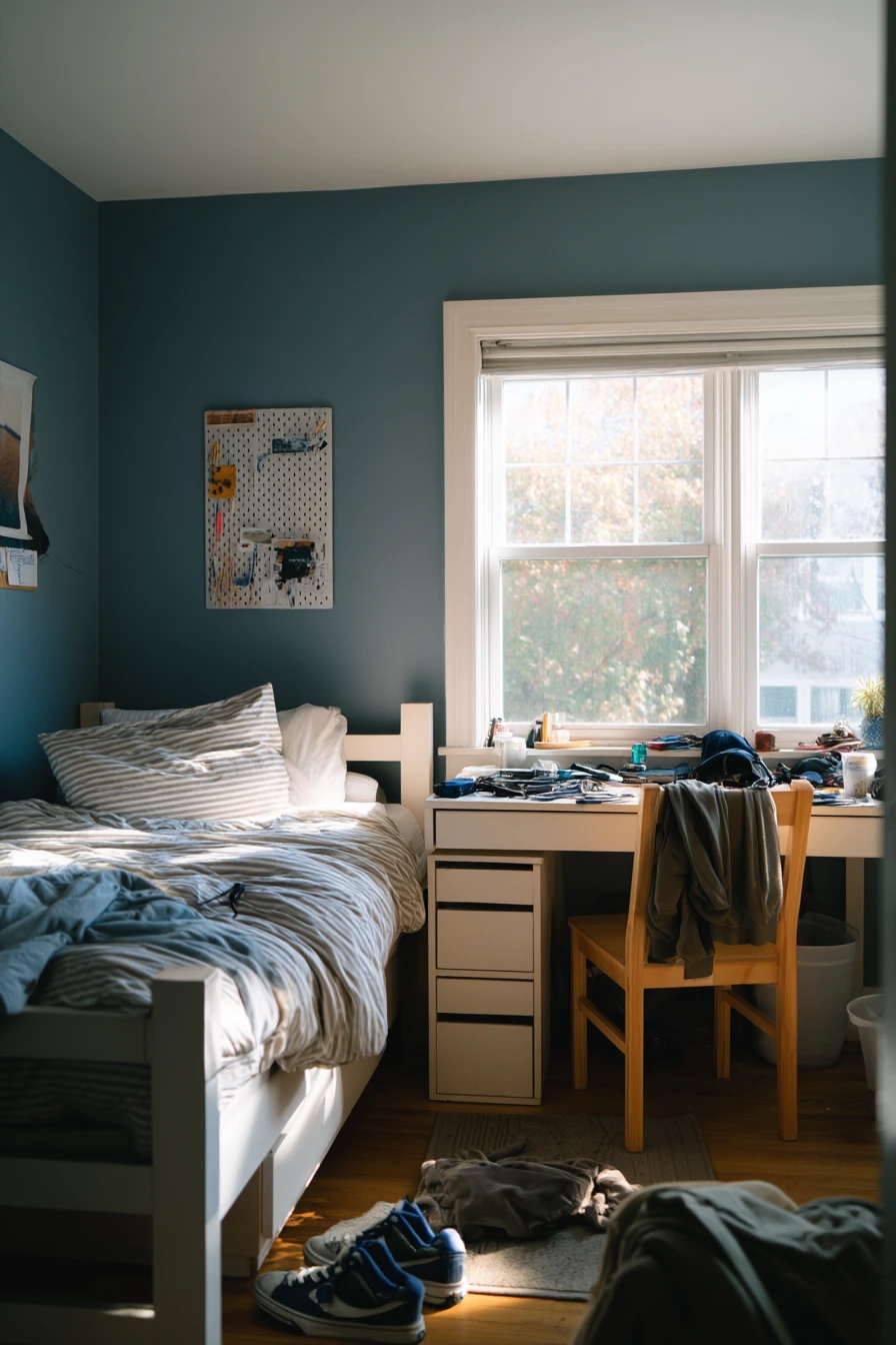
Dusty blue is a smart bedroom paint color for teens because it feels current but not childish. It also hides scuffs better than white, which helps in a busy family home. In late-afternoon window light, dusty blue looks mellow and helps the room feel less chaotic.
To style it, keep the bigger items simple and add personality through small pieces. A simple platform bed and a striped duvet bring structure without looking too grown up. A white oak desk brightens the room and gives a clean work zone for school and hobbies. A pinboard above the desk is an easy way to show photos, notes, and art without putting lots of holes in the wall.
Let the room be a little messy, but create clear “landing spots.” A sneaker pile by the door is normal, so add a low tray or a small mat to keep it contained. A hoodie draped over the chair looks better if the chair is a simple shape in a neutral color. On the desk, group earbuds, a sketchbook, and pens in one organizer. Add a small plant on the sill to soften the blue and bring life to the space.
- Use dusty blue with white trim for a clean, sporty look.
- Choose a striped duvet to add pattern without changing the wall color later.
- Pick light wood furniture to keep the room from feeling too dark.
- Add one pinboard to display items and reduce wall clutter.
- Create a shoe zone near the door with a basket or tray.
Pro Design Tip: Use a washable, scrubbable paint finish (like eggshell) on teen bedroom walls so you can clean marks without stripping color.
Budget Considerations: If a new desk is not possible, paint the existing one a warm white and swap the knobs; it will pop against dusty blue for low cost.
4. Buttercream Yellow Guest Bedroom Paint That Feels Warm and Welcoming
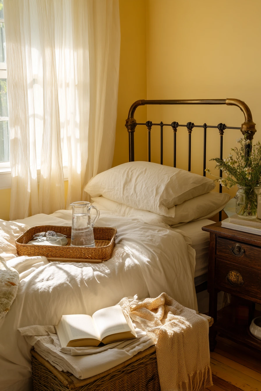
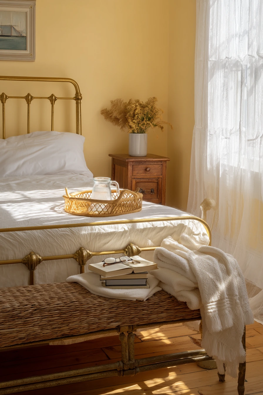
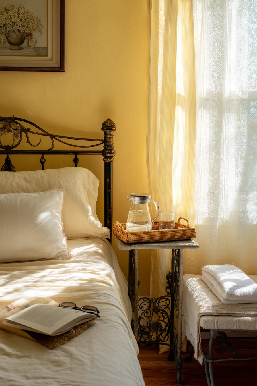
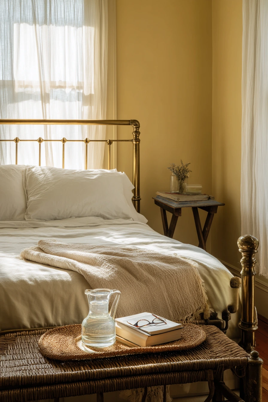
Buttercream yellow is a friendly guest bedroom paint color that makes people feel at ease. It brings warmth without the harsh brightness of a strong yellow. In morning light through sheer curtains, the walls look soft and gentle, which is ideal for visitors.
This color pairs well with classic pieces like an antique brass bed frame and crisp white cotton sheets. Keep the bedding simple and fresh, then add comfort with a folded blanket at the end of the bed. A vintage nightstand gives charm, and it also lets you add practical touches for guests.
Style the room like a small hotel, but keep it homey. Place a woven tray with a carafe and water glass on the nightstand. Add a novel and reading glasses to suggest rest. Put a spare towel on a bench so guests do not have to ask. Keep decor minimal so the room feels open, even if it is modest in size.
- Pick a buttercream shade that leans creamy, not neon or lemon.
- Use white bedding to keep the room looking clean and bright.
- Add brass accents to echo the warmth of the paint.
- Set out water, a towel, and a small book for a thoughtful touch.
- Use sheer curtains to keep the light soft and flattering.
Pro Design Tip: Test yellow next to your trim; a warm white trim prevents buttercream from looking dull and helps it feel fresh.
Budget Considerations: Shop secondhand for a vintage nightstand and bench; small guest room pieces are often easy to find and cost less than buying new sets.
5. Muted Terracotta Bedroom Paint Ideas for Renter-Friendly Warmth
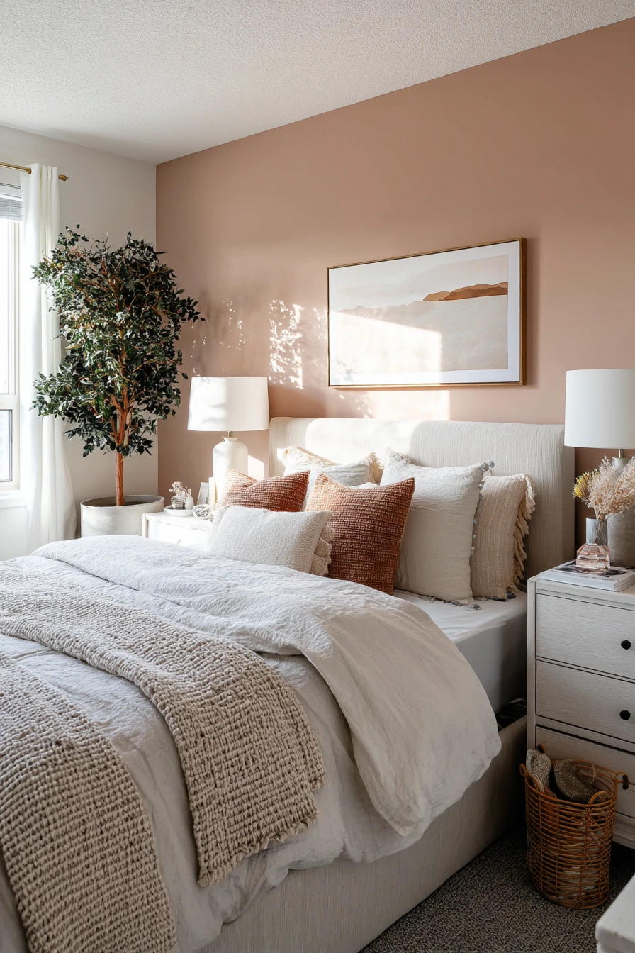
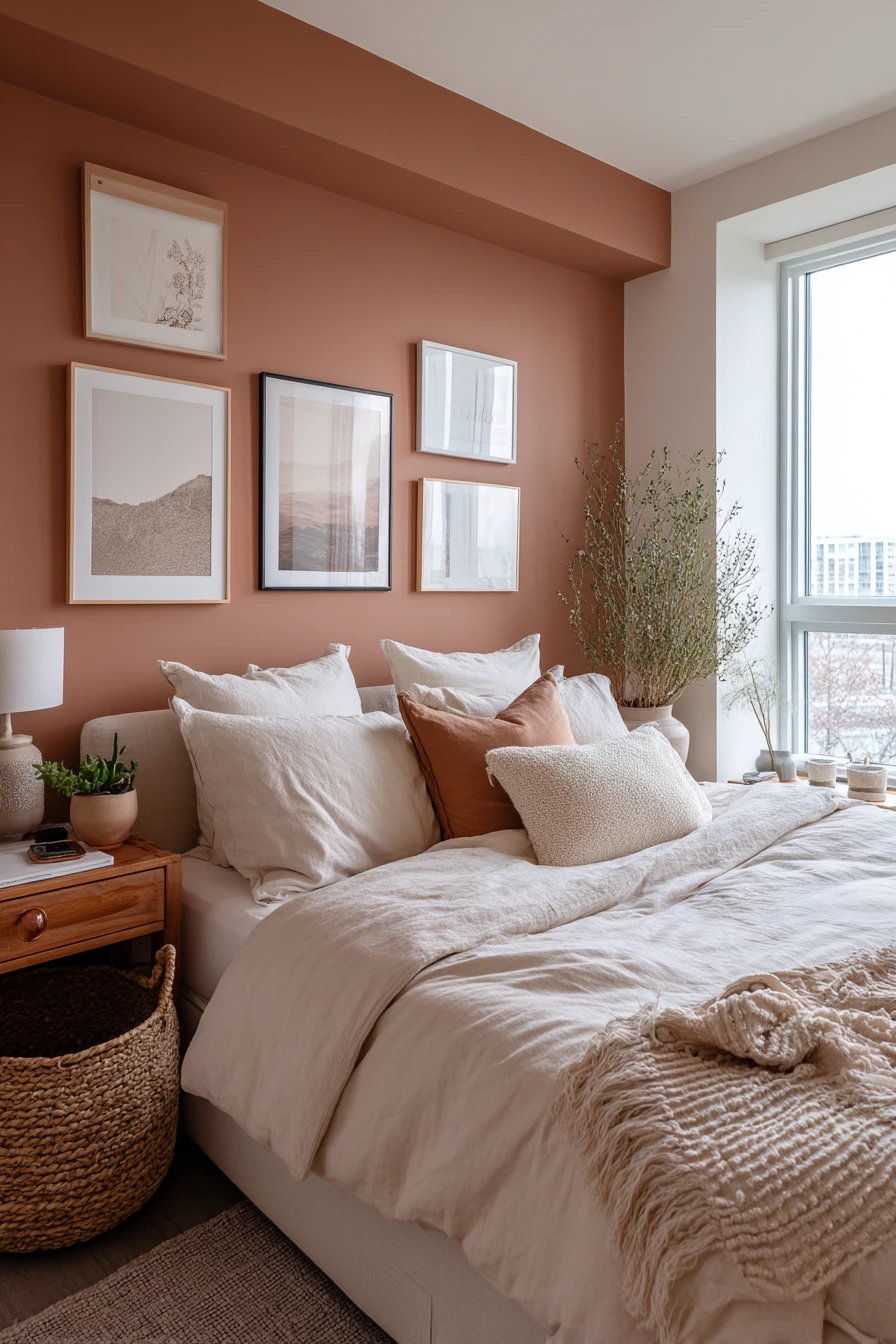
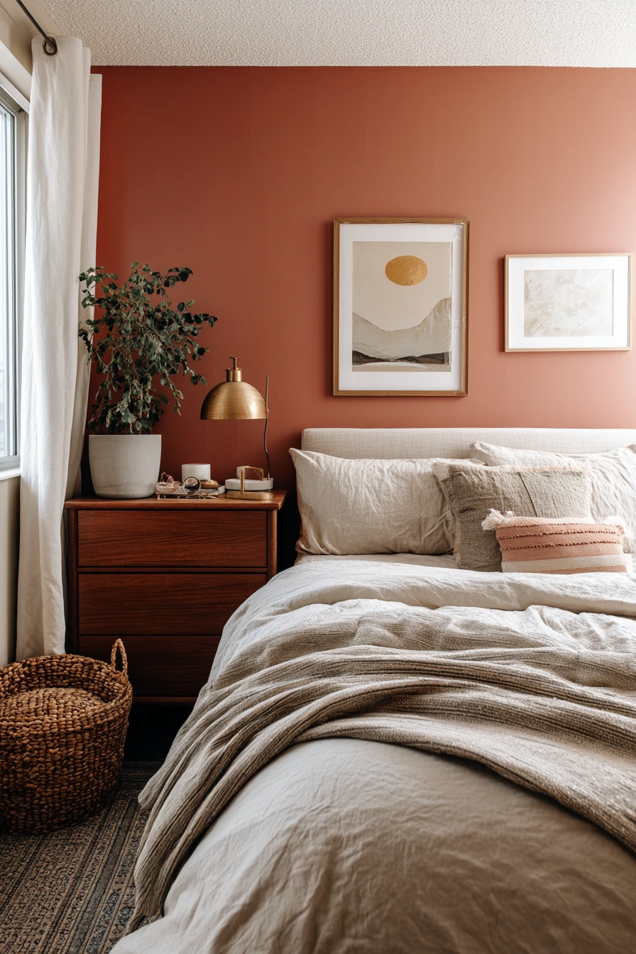
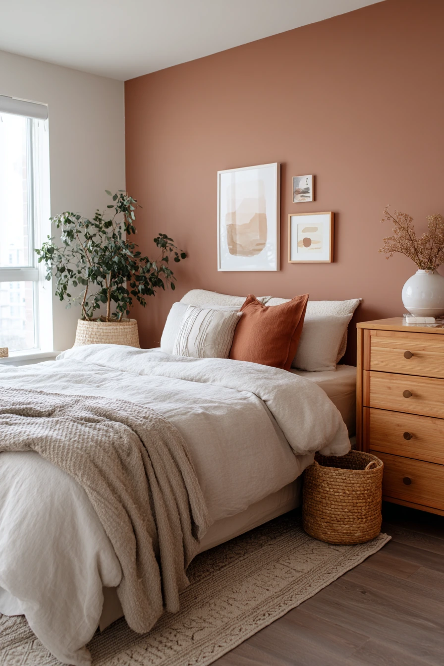
Muted terracotta adds earthy warmth, even in a rental. It brings color without feeling loud, and it pairs well with neutral bedding. If you can only paint one wall, use terracotta as the main wall behind the bed to create a clear focal point.
Keep the setup renter-friendly with removable pieces. Use peel-and-stick framed art for a finished look without many holes. A removable headboard can make the bed feel more grounded, and it helps the room look styled even with basic furniture. Add a tall plant in a clay pot to repeat the warm tone and soften corners.
Real life can stay visible, but keep it tidy. A laundry basket can tuck beside the dresser. A jewelry tray on top of the dresser stops small items from spreading out. If your phone is always on charge, use a short cord and a small catchall to make that corner look cleaner. A slightly wrinkled throw works with terracotta because the whole vibe is tactile and relaxed.
- Use terracotta on one wall if the room is small or gets low light.
- Pair it with cream, sand, and warm gray bedding for balance.
- Add plants and natural fibers to make the color feel grounded.
- Choose removable art and headboards to protect rental walls.
- Keep surfaces neat with trays, baskets, and one or two decor items.
Pro Design Tip: Terracotta looks best with warm lighting; use bulbs in the 2700K range so the paint reads rich instead of brown.
Budget Considerations: Peel-and-stick art, plug-in sconces, and a budget-friendly faux headboard can give a finished look without permanent changes or high costs.
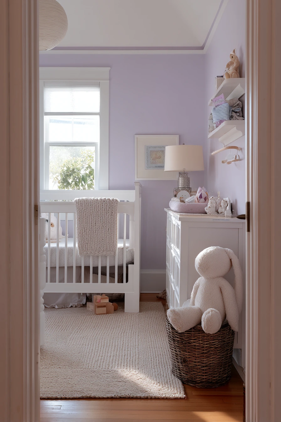
6. Pale Lavender Nursery Paint Color Ideas for a Calm, Peaceful Room
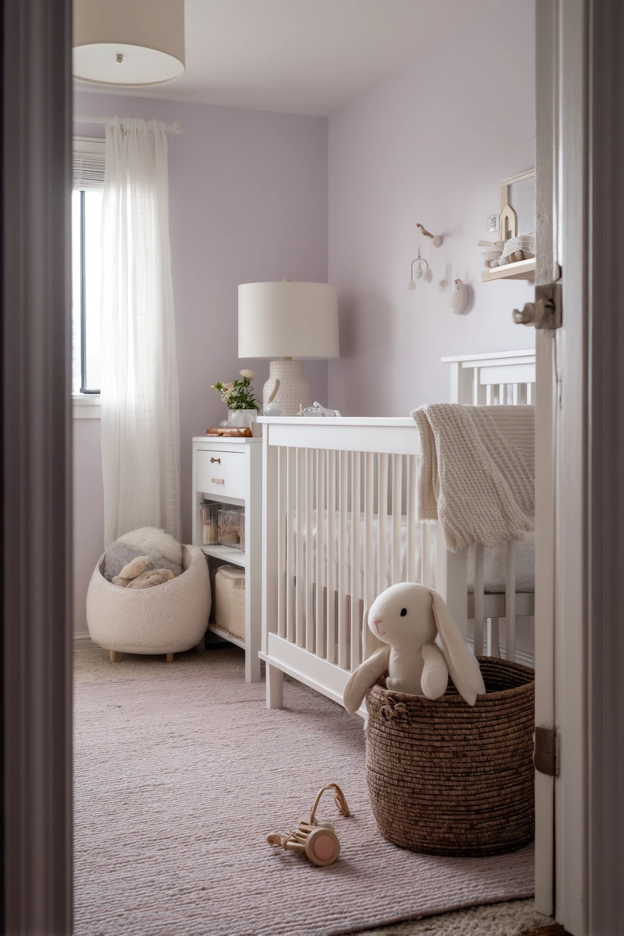
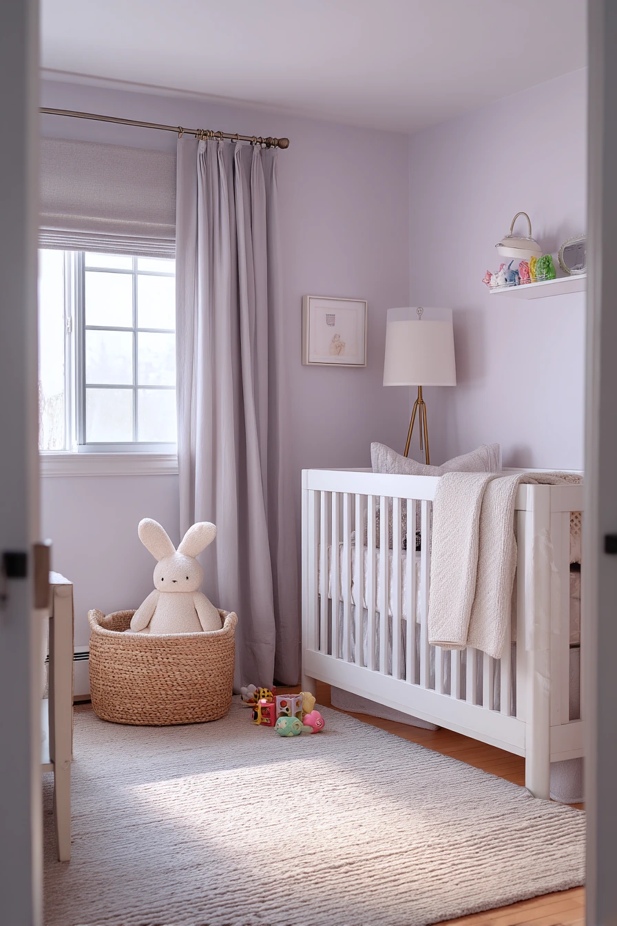
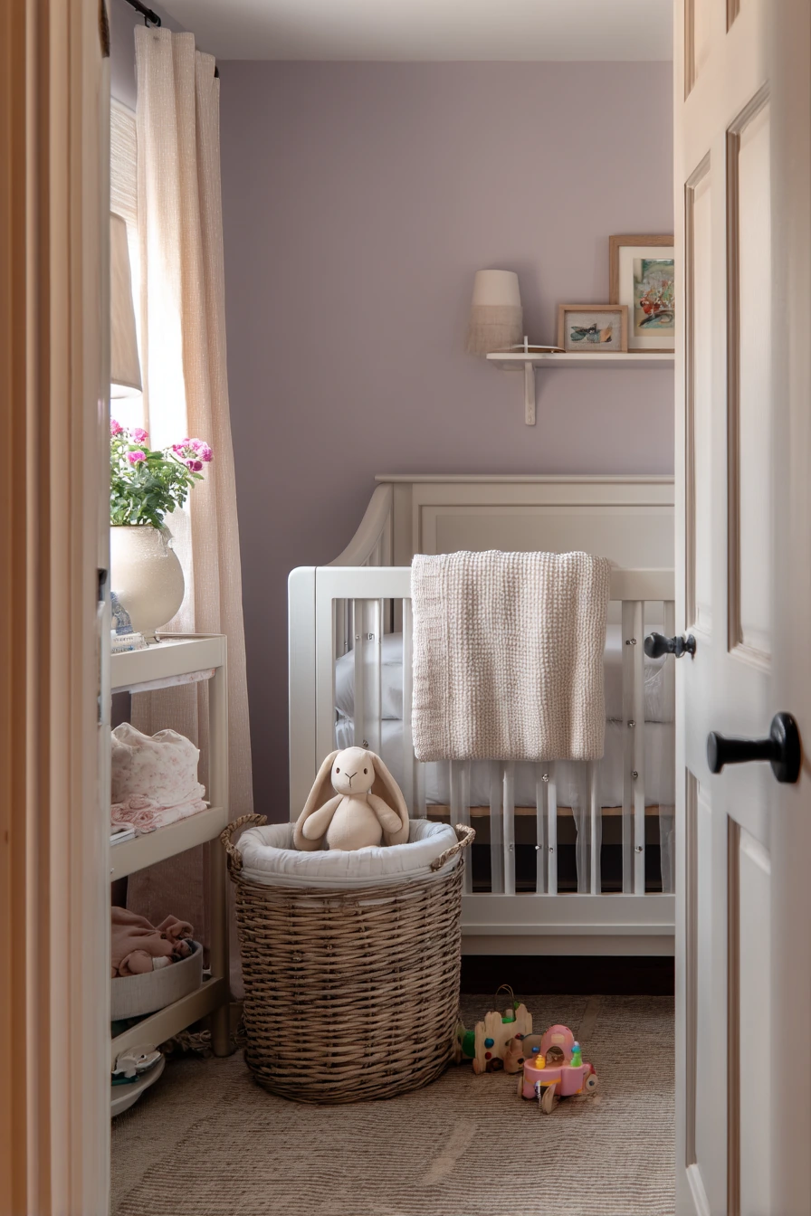
Pale lavender is a soothing nursery paint color that still feels light and clean. It brings gentle color without overstimulating the room. When soft window light blends with a dimmable lamp, lavender looks calm and helps the space feel settled for naps and bedtime.
Keep the main furniture simple so the paint can shine. A white crib and a white changing table look crisp against lavender and make the room feel airy. Add warmth with textiles like a knit blanket and a soft rug where a few toys can sit without making the space look messy.
Style the room around real routines. Use a toy basket for stuffed animals like a bunny, and keep a diaper caddy where you can reach it quickly. Fold burp cloths into a small tray so they look neat. Place the baby monitor in a clear spot with a short cord. A small lamp with a dimmer is worth it, since harsh light can make any paint color look wrong at night.
- Choose a lavender with a gray base so it stays soft, not bright.
- Pair with white furniture for a clean, timeless look.
- Add knit and cotton textures to make the room feel cozy.
- Use baskets and caddies to keep baby items contained.
- Use a dimmable lamp to control mood and light during night feeds.
Pro Design Tip: Paint lavender in a matte or eggshell finish; it reduces glare and helps the walls look smooth in both daylight and lamplight.
Budget Considerations: Skip pricey decor and focus on a great lamp and smart storage; baskets, caddies, and simple shelves often cost less and make daily life easier.
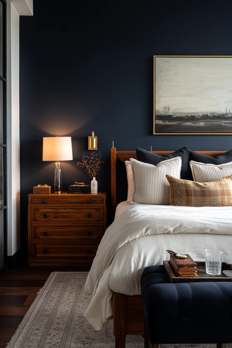
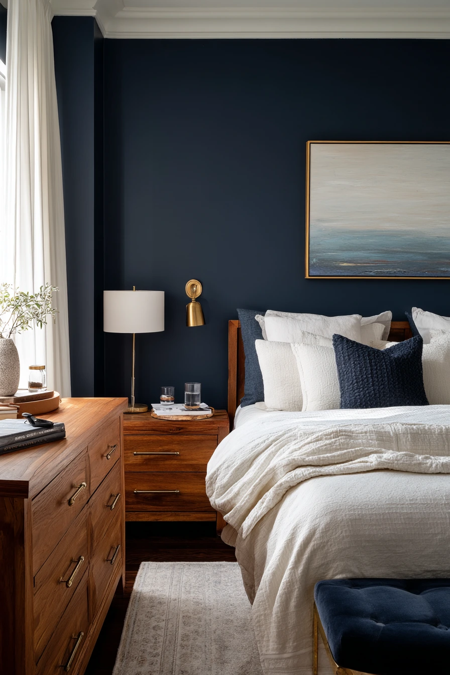
7. Deep Navy Bedroom Paint for a Sophisticated, Cozy Main Bedroom
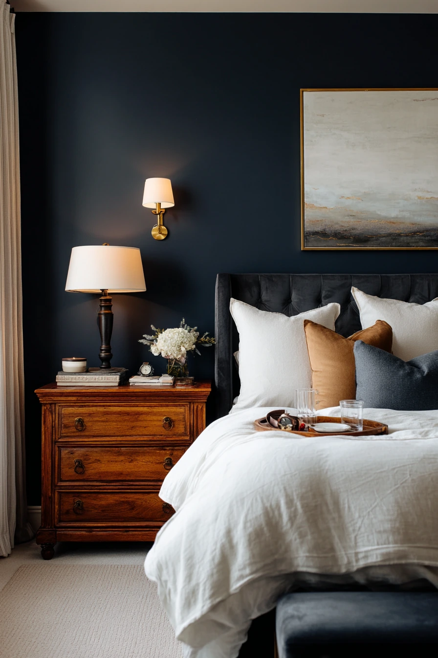
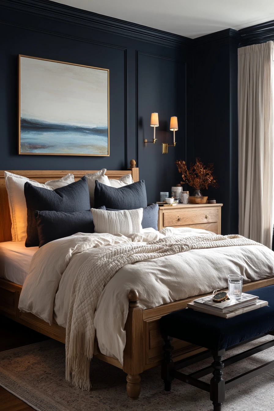
Deep navy is a bold bedroom paint color that can still feel soft when you style it with warm light and light bedding. It creates a cocoon effect, which many people want in a main bedroom. The key is balancing the dark walls with enough contrast so the room does not feel heavy.
Start with ivory bedding to brighten the center of the room. Add an oak dresser and a velvet bench to bring in warm wood and a soft texture. Brass sconces and warm bedside lamps help navy look rich and inviting. Simple abstract art works well because it adds shape without competing with the dark color.
Keep the room looking lived-in, not staged. A small book stack on the nightstand and a water glass are normal, and they fit the calm mood. On the dresser, a watch and keys can look neat if you use a shallow tray. Slightly unmade pillows are fine with navy because the tone already feels relaxed and grounded.
- Use navy in rooms where you can add warm lamps for balance.
- Pick ivory or off-white bedding to create contrast against dark walls.
- Repeat brass in lighting and small decor for a cohesive look.
- Use trays to group daily items like keys and watches.
- Keep wall art simple so the color stays the main feature.
Pro Design Tip: Paint the ceiling a softer white (not stark bright white) so the navy walls feel seamless and the room looks taller.
Budget Considerations: If repainting the whole room feels expensive, start with one navy accent wall and use warm lamps and ivory bedding to get a similar mood for less.
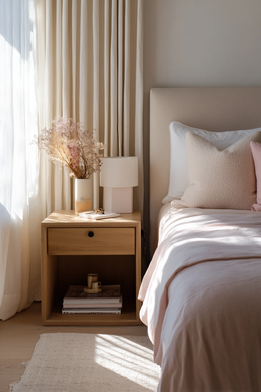
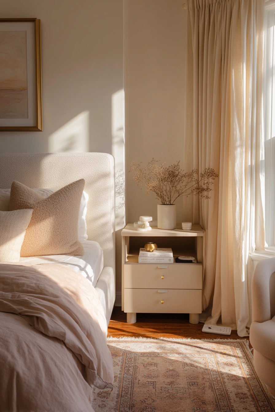
8. Blush Beige Bedroom Paint Colors for Soft, Serene Warmth
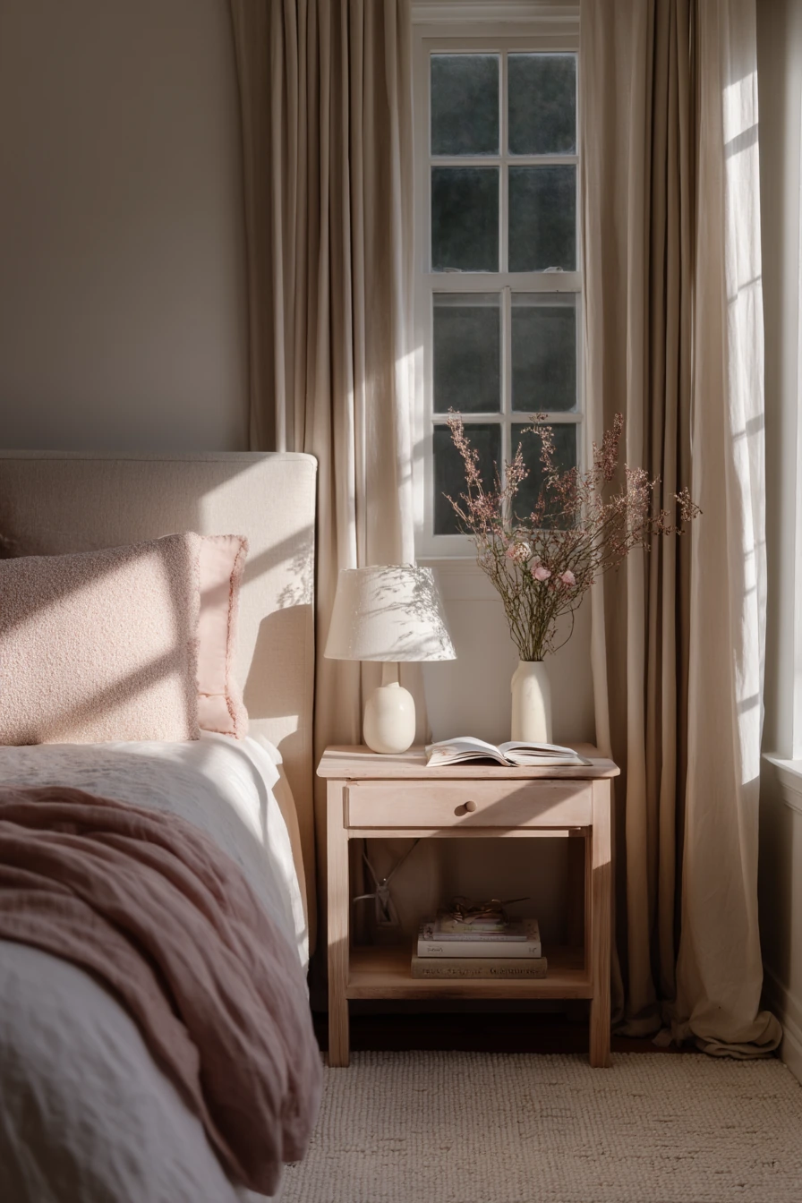
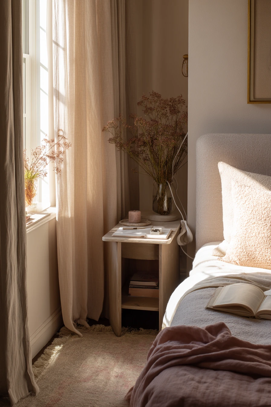
Blush beige is a gentle bedroom paint color that feels warm and calm without looking overly pink. It is a good option if you want a serene, feminine look that still feels grown up. In warm morning light, blush beige makes the room glow and helps the space feel peaceful.
Style it with soft shapes and light woods. A low upholstered bed keeps the room feeling open. Add a boucle pillow for texture, and use a pale oak side table for a clean, simple contrast. Linen curtains work well because they filter light and add an easy, relaxed look.
Keep the decor minimal and real. A small vase of dried stems adds height without needing fresh flowers. An open book on the bed makes the room feel used. Hide clutter by giving small items a spot, like a dish for hair clips and a clip-on cord holder for a charging cable. When sunlight pools across the rug, the tone of the paint will look warmer, so keep your bedding in soft whites and creams to avoid color clashes.
- Pick blush beige with a neutral base so it reads calm, not bubblegum.
- Pair with linen curtains to soften light and add texture.
- Use pale oak or light wood to keep the room airy.
- Add one textured accent like boucle to keep it from feeling flat.
- Create small “homes” for daily items like clips, cords, and books.
Pro Design Tip: Use a slightly deeper blush beige on the trim only if you want a tone-on-tone look; otherwise, keep trim warm white for a cleaner frame.
Budget Considerations: Dried stems, a simple vase, and a new pillow cover can refresh the whole palette without buying new furniture.
9. Charcoal Accent Wall Bedroom Paint Ideas for a Modern Couple’s Room
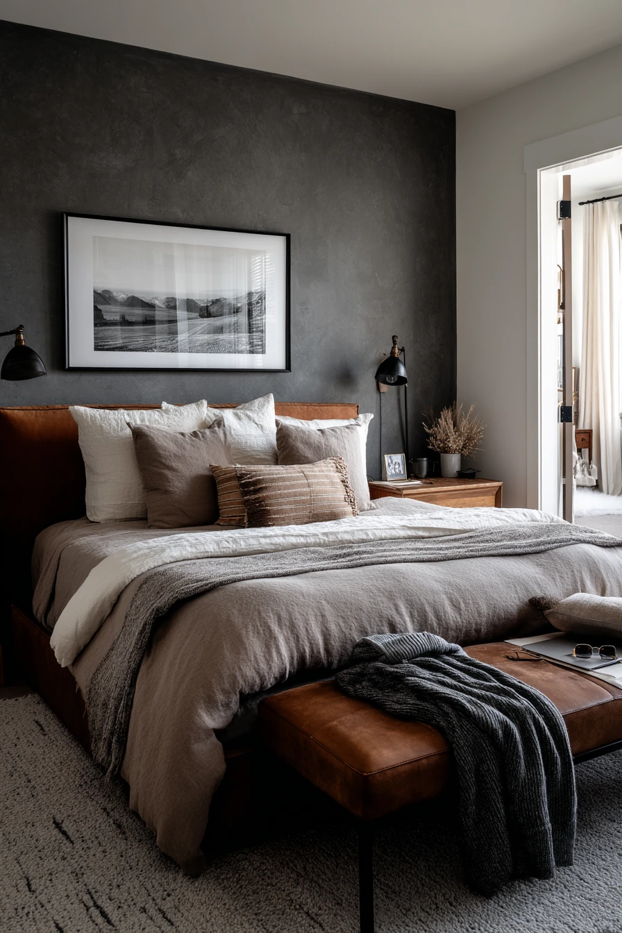
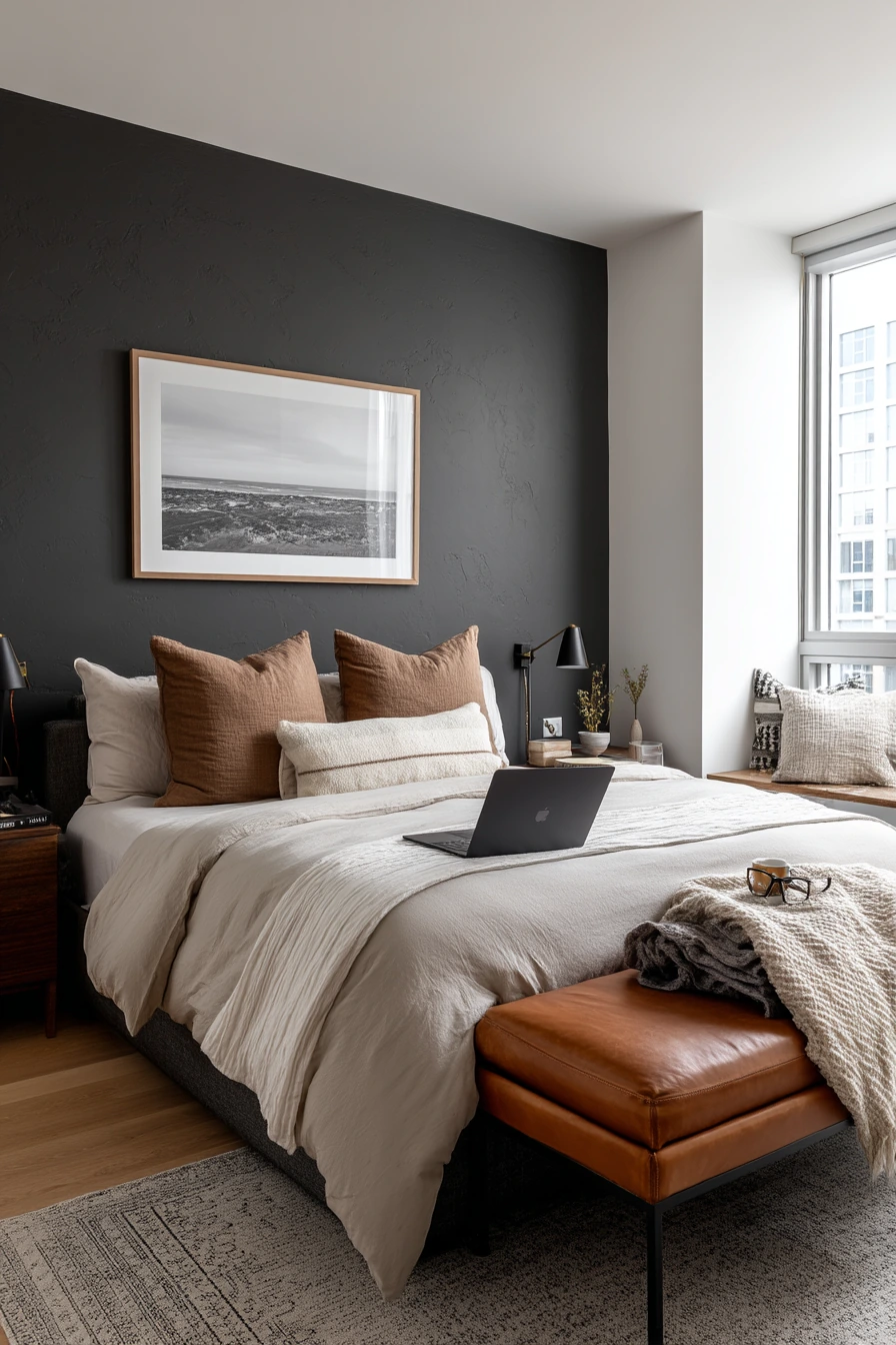
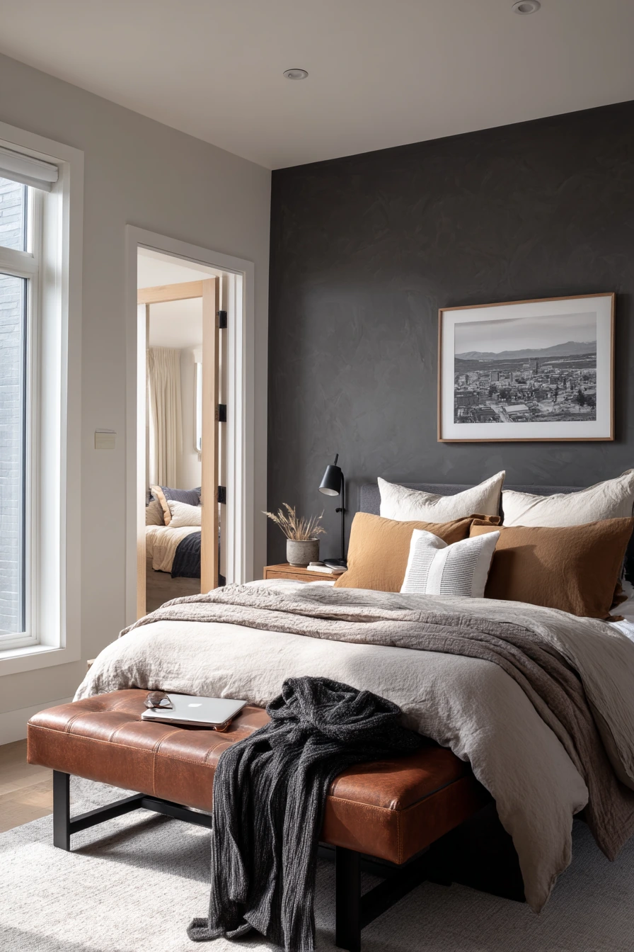
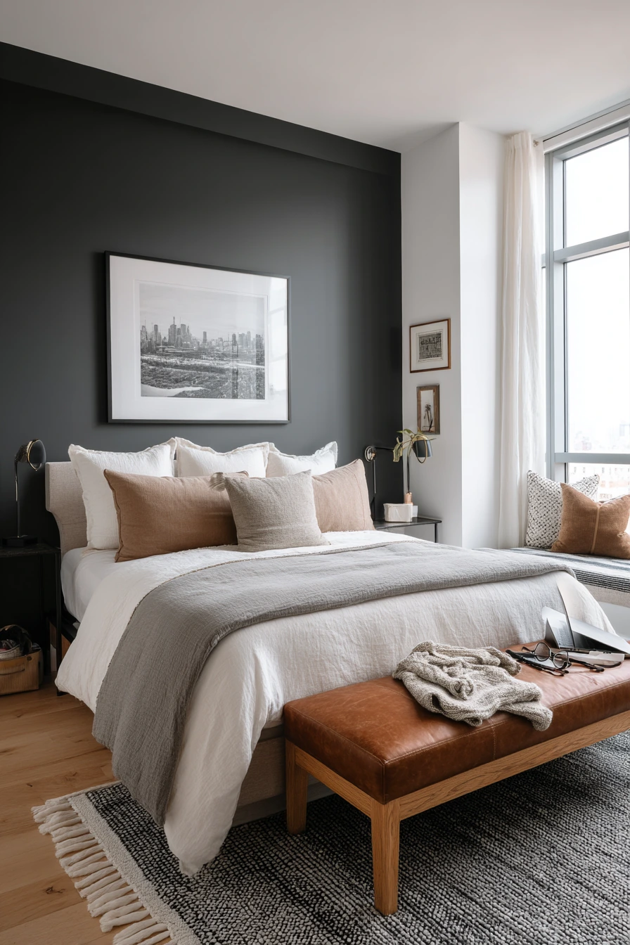
A charcoal accent wall behind the bed adds depth and makes the bed area feel anchored. It is a popular bedroom paint color idea because it looks modern, but it can still feel calm when you keep the other walls warm white. The contrast creates structure without making the whole room dark.
Style charcoal with layered bedding in stone and taupe to keep the mood soft. A leather bench at the foot of the bed adds warmth and a practical place for a folded sweater. A framed black-and-white photo works well because it matches the simple, grounded palette and does not fight the dark wall.
Let the room look like a real home. Two mismatched bedside lamps can still feel intentional if they share something in common, like similar shade color or warm bulbs. If an open laptop or reading glasses are part of the space, group them neatly on one side. Keep cords controlled with a small box or clip so the clean lines of the accent wall do not get lost.
- Use charcoal on one wall to create depth without shrinking the room.
- Keep the other walls warm white for balance and brightness.
- Layer bedding in taupe, stone, and cream to soften the contrast.
- Use a bench for daily items so the bed stays clearer.
- Make mismatched lamps work by matching bulb warmth and shade tones.
Pro Design Tip: Paint the accent wall in a low-sheen finish; it helps charcoal look smooth and reduces patchy reflections from lamps.
Budget Considerations: An accent wall uses less paint and less time; you can invest in one quality gallon and update the look with new pillow covers instead of new furniture.
10. Creamy White Bedroom Paint Ideas That Let Colorful Art Shine
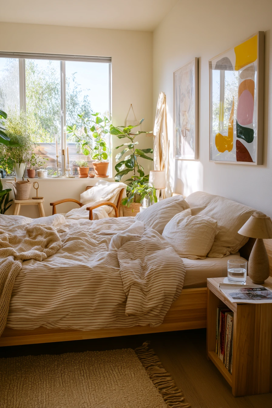
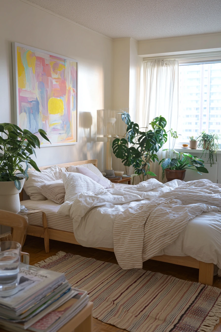
Creamy white is a top bedroom paint color because it works with almost any style and makes rooms feel brighter. Unlike stark white, creamy white has warmth, so it feels comfortable and livable. It is also a great backdrop if you want colorful artwork to stand out.
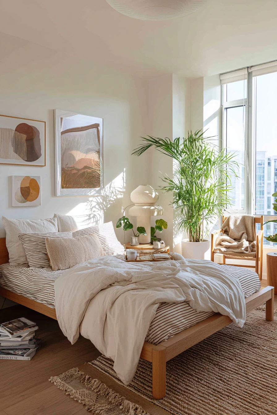
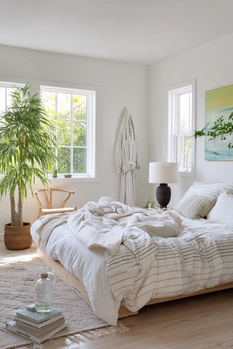
To style a creamy white bedroom, bring in natural materials and a few bold accents. A natural wood bed warms up the space, and a striped duvet adds pattern without making the room busy. A woven rug adds texture and helps soften footsteps. A tall plant and a ceramic lamp bring in shape and a relaxed, everyday feel.
Keep the room fresh by limiting clutter, not by hiding all signs of life. A magazine pile can look neat if it is stacked. A glass of water and a robe on the back of a chair make the room feel used, but you can choose one chair and keep it as the “robe spot.” If sheets are slightly rumpled, balance that with one tidy surface, like a clear nightstand with just a lamp and a book.
- Choose creamy white for a soft look that still feels bright.
- Use colorful artwork as the main accent instead of many small decor items.
- Add natural wood to keep the room from feeling cold.
- Bring in texture with a woven rug and a striped duvet.
- Create one drop zone for everyday items to reduce visual clutter.
Pro Design Tip: When using creamy white, match it to your flooring and trim first; warm whites can look yellow if the trim is too bright or too cool.
Budget Considerations: White paint is often affordable, and you can change the whole look later with art and textiles instead of repainting.
The best bedroom paint color ideas come from real rooms and real routines. Start with the light you have, then choose a shade that supports how you want to feel, like calm sage, warm greige, or deep navy.
After paint, focus on a few easy layers: bedding in soft neutrals, warm lamps, natural wood, and simple storage. Small choices like trays, baskets, and curtain color make the room feel pulled together.
Save this post and pick one color direction to try first. A few paint samples and a plan for styling will help you get a bedroom that feels steady, comfortable, and easy to keep up.