Choosing bathroom color ideas is easier when you start with real rooms, not perfect showpieces. The right paint and tile can make a small bath feel bigger, a busy family space feel calmer, and a guest bath feel welcoming.
This guide walks through 10 color stories inspired by everyday bathrooms, from sage green walls with warm white tile to terracotta plaster and dusty blue with subway tile. Each one includes simple styling ideas you can copy.
You will also get practical notes on lighting, finishes, and hardware like brushed nickel, brass, chrome, and matte black. These small choices change how a color reads in natural window light or under a vanity bulb.
Near the end, you will find a quick FAQ to help you pick paint, match a vanity color, and avoid common mistakes in small bathrooms and powder rooms.
1. Sage Green Bathroom Color Ideas for a Small Family Bath
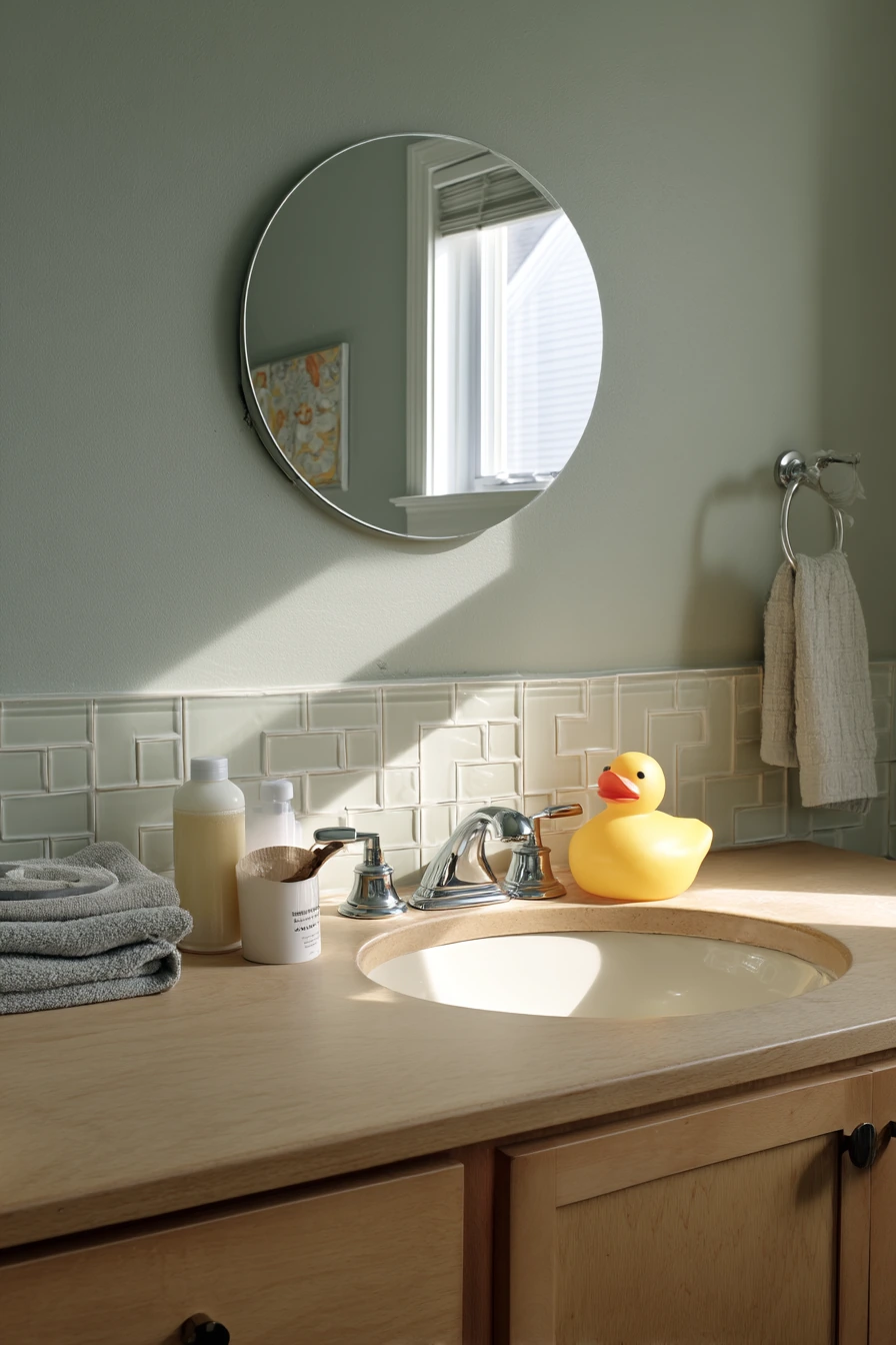

Sage green walls are a steady choice for a real family bathroom because the color hides minor marks better than bright white, but it still feels airy. Pair it with warm white tile to keep the room looking clean without feeling cold. In a small suburban home, this mix works well with soft window light because sage shifts gently through the day, from gray-green in the morning to warmer green in late afternoon.
To keep the look practical, lean into simple, honest details. An oak vanity adds warmth and helps the green feel grounded. Brushed nickel faucets and a round mirror keep the vibe calm and easy to live with. If you want the room to look pulled together even when it is in use, set out just a few daily items like a parent’s lotion bottle, a kid toothbrush cup, and one folded hand towel. A small toy bath duck can stay out without ruining the style because the color palette is soft.
How to style it: choose towels in creamy white, oatmeal, or light gray so the sage stays the main color. Add one texture, like a simple woven basket or a ribbed soap dispenser. Keep countertop items in the same finish family, like white, clear, or matte stone, so the oak and nickel do not fight for attention.
- Use warm white tile with a beige undertone to avoid a minty look.
- Pick a sage paint with a little gray for better stain hiding.
- Choose brushed nickel to soften reflections in bright daylight.
- Add an oak vanity or oak shelf to warm up the green.
- Keep accessories minimal so the room feels bigger.
Pro Design Tip: Paint the ceiling a lighter version of the sage (or a warm white) to keep the room bright while still feeling wrapped in color.
Budget Considerations: If a new oak vanity is too much, swap in oak-toned hardware or add an oak-framed mirror to get the same warmth for less.


2. Terracotta Bathroom Color Ideas for a Warm Powder Room


Terracotta walls are a strong bathroom color idea for a compact powder room because they make the space feel cozy and intentional. A creamy plaster finish keeps the color from looking flat, especially under warm lamp light. In a small room, this kind of texture does a lot of work, adding depth without extra decor.
Balance terracotta with lighter surfaces so the room stays fresh. A pale stone sink and small brass sconces bring in soft shine and a clean contrast. Add one vintage framed print to make the room feel collected, not themed. For a realistic, lived-in look, let a few everyday items show: a hand soap refill, a slightly wrinkled linen towel, and even a wallet on the counter. These details fit the grounded mood and help the space feel like a real home, not a staged photo.
How to style it: use linens in cream, sand, or flax to keep the palette warm. If you want a little pop, add one dark accent like a black tray or dark wood frame. Keep metal finishes consistent, so if you pick brass sconces, match the faucet or mirror edges in a similar tone.
- Choose terracotta with a muted base, not bright orange.
- Use plaster or limewash texture for a softer look.
- Pair with pale stone or creamy sink materials.
- Pick brass lighting to add warmth and glow.
- Limit decor to one print and one candle for a tidy counter.
Pro Design Tip: Use warmer bulbs (around 2700K) so terracotta reads rich and calm instead of harsh or pink.
Budget Considerations: A true plaster finish can cost more; for a similar effect, try a matte paint in terracotta and add texture with linen towels and a stone-look accessory.


3. Dusty Blue Bathroom Color Ideas with White Subway Tile

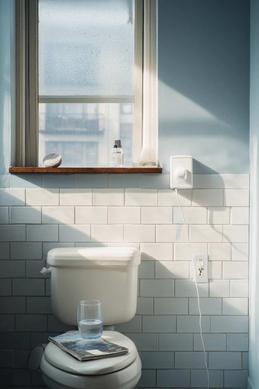
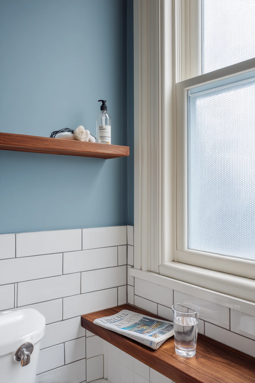
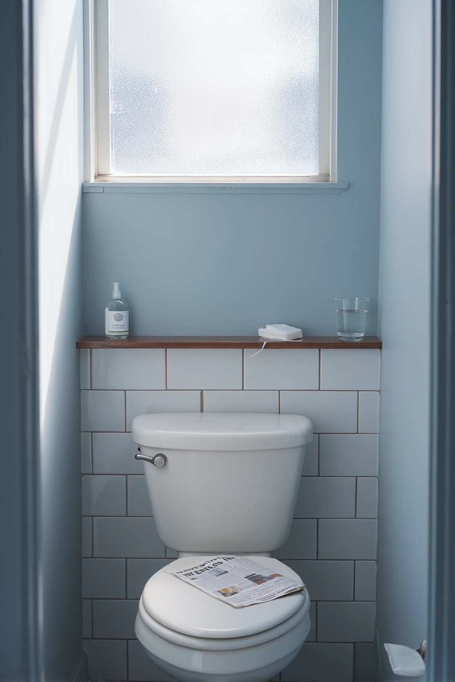
Dusty blue lower walls with white subway tile is a classic combination that still feels current. It works well in a long-used primary bathroom because it looks clean even when life is moving fast. The white tile keeps things crisp, while the blue adds color without taking over. In cool natural light from a frosted window, dusty blue stays calm and a little gray, which helps the room feel neat.
Chrome fixtures fit this palette because they reflect light and match the clean look of subway tile. To add warmth, bring in a walnut shelf above the toilet for storage and tone. This is also a good setup for a bathroom that shows a real morning routine. A toothpaste cap, charging cable, half-read magazine, and a water glass can exist without the space looking messy if you keep surfaces simple and colors limited.
How to style it: use white or light gray towels and one darker blue item, like a small tray. If the room feels too cool, add a small wood stool or a framed print with warm beige tones. Keep grout lines tidy and consistent, since subway tile lines can either look sharp or look busy.
- Paint only the lower wall dusty blue for a balanced look.
- Use bright white subway tile to lift the color.
- Choose chrome for a crisp, clean finish.
- Add walnut or medium wood for warmth and storage.
- Keep countertop items in a small tray to reduce clutter.
Pro Design Tip: Run the subway tile a bit higher than you think, or add a thin trim line, so the blue feels intentional and not like a short band.
Budget Considerations: If retiling is not possible, use peel-and-stick subway tile panels in a backsplash zone to mimic the look and focus the upgrade where it shows most.
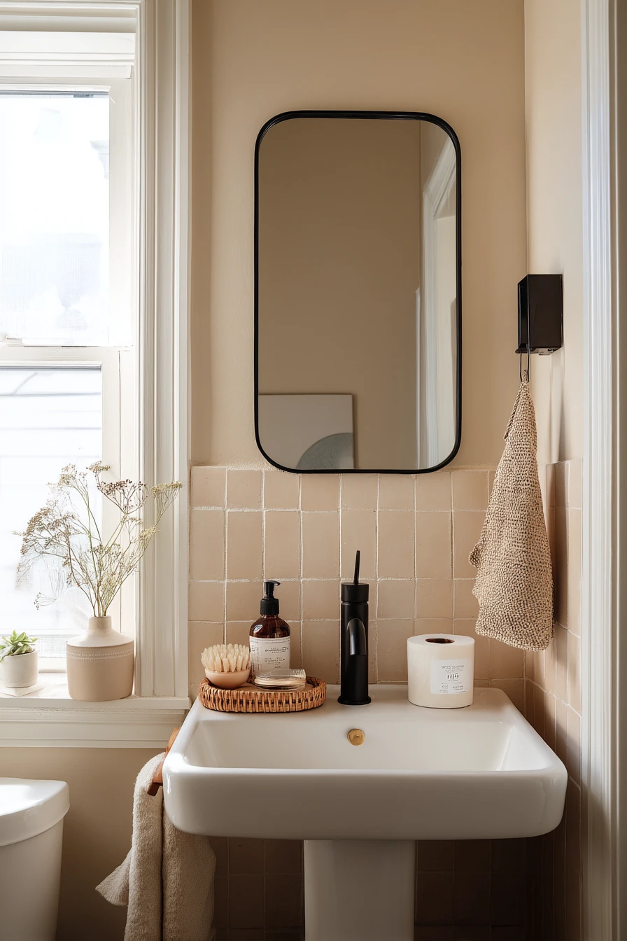
4. Warm Beige Bathroom Color Ideas for a Renter-Friendly Refresh
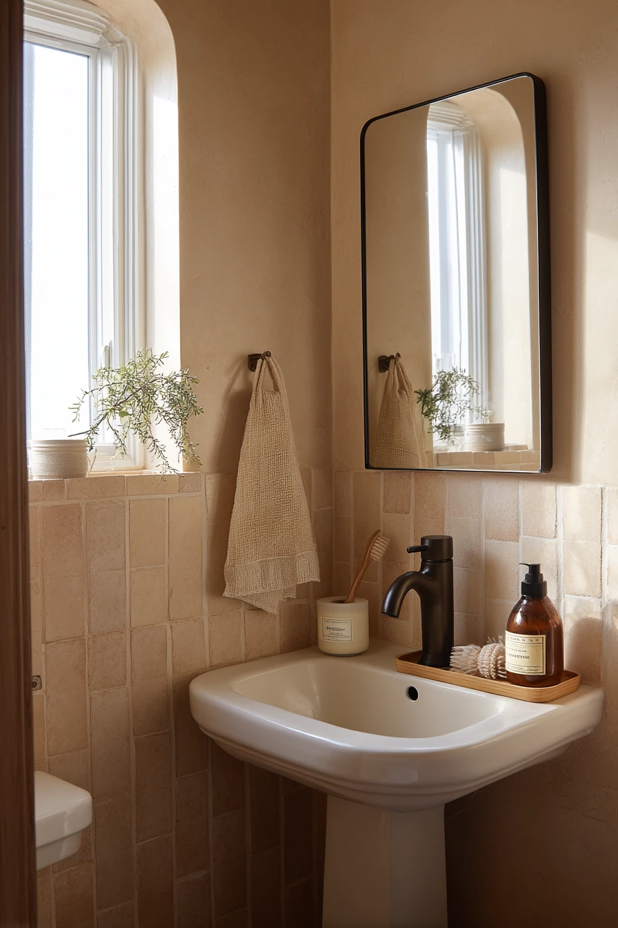
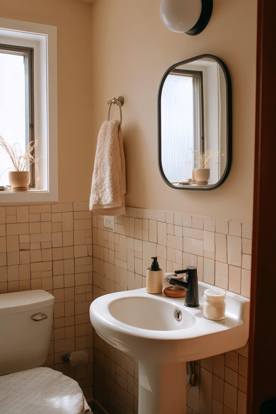
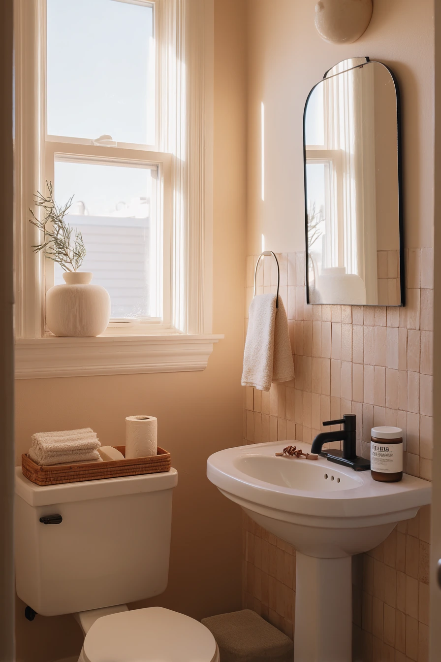
Warm beige paint is one of the easiest bathroom color ideas for renters because it brightens the space but still feels soft. It also plays well with many finishes, so you can update the room without changing major fixtures. Pairing beige walls with peel-and-stick zellige look tile gives you the handmade tile feel with less commitment. In soft morning window light, beige reads clean and gentle, not yellow.
To keep the refresh simple, use a slim black mirror to add contrast and make the room feel more modern. A bamboo tray on a pedestal sink adds a spot for daily items without needing a vanity. This kind of setup looks real when a hair tie or skincare jar is left out, and it still feels tidy. Stack extra toilet paper neatly and add a small plant on the sill for life and color.
How to style it: pick accessories in black, bamboo, and white so the room has a clear direction. Use one pattern only, like a small striped towel, to avoid visual noise. If the beige feels too plain, add texture with a woven basket, a ribbed bath mat, or a linen shower curtain.
- Choose a beige with a warm undertone to avoid a gray cast.
- Use peel-and-stick zellige near the sink for impact.
- Add a black mirror to create a strong focal point.
- Use a bamboo tray to organize on a pedestal sink.
- Bring in one small plant for a fresh, lived-in look.
Pro Design Tip: Keep the black accents to two or three items (mirror, hook, small tray) so the room looks balanced, not harsh.
Budget Considerations: Peel-and-stick tile costs less than real tile, but buy extra sheets for mistakes and future repairs, since lots can sell out.
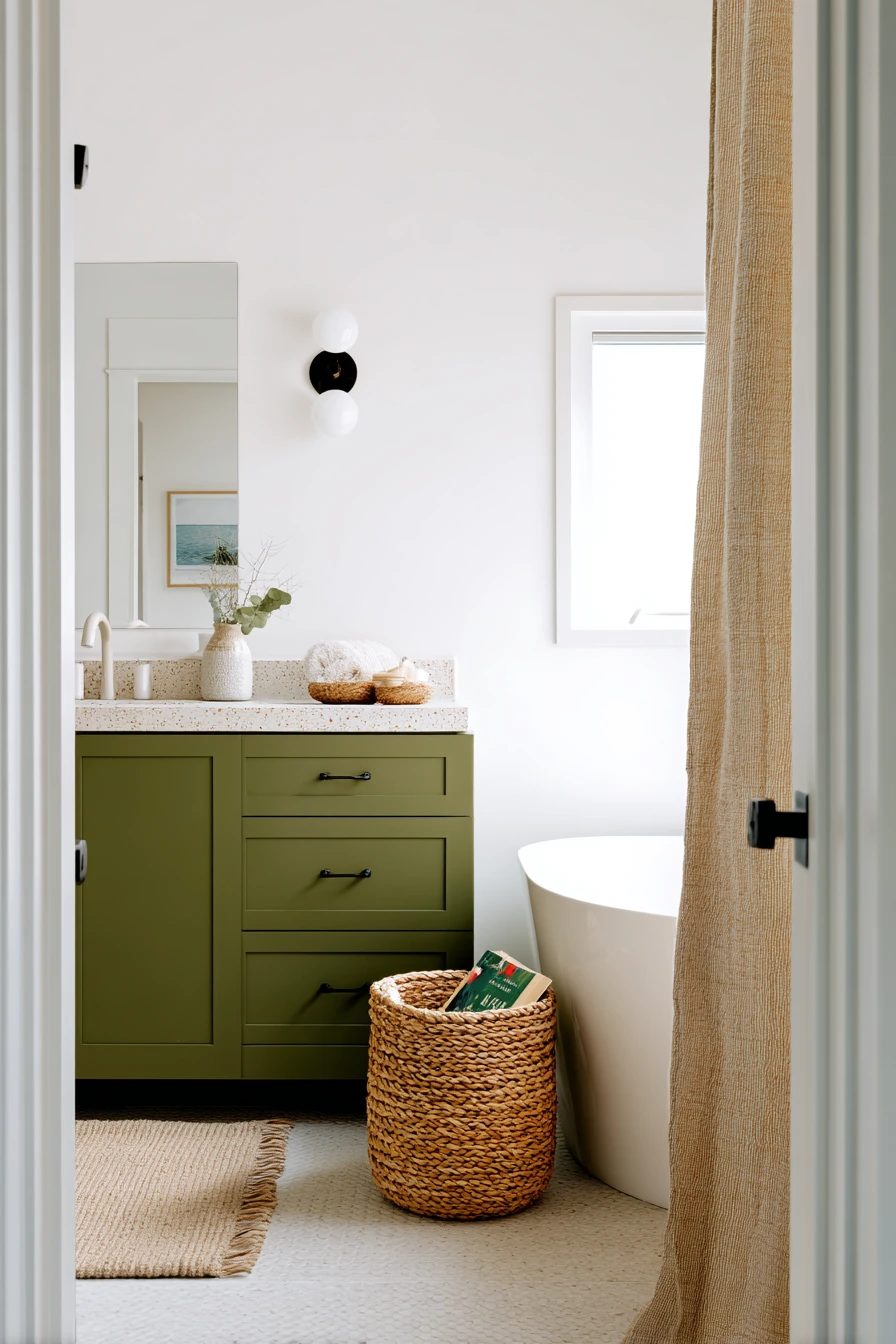
5. Deep Olive Bathroom Color Ideas with Terrazzo and Off-White Walls
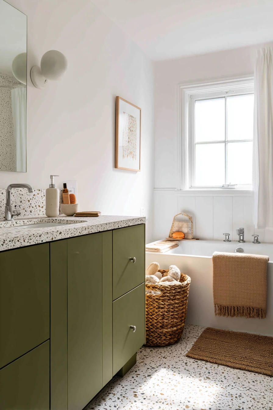
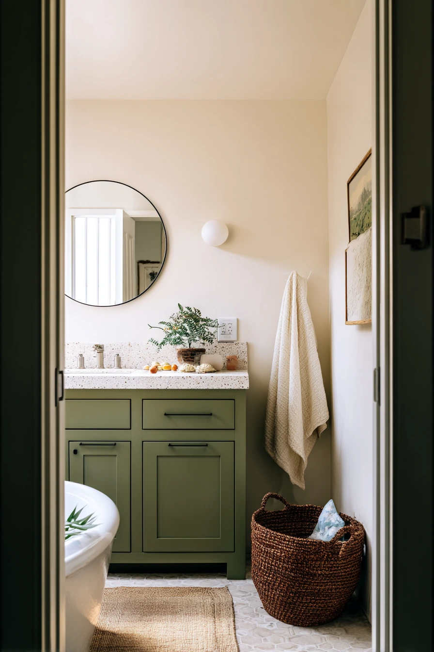
Deep olive is a strong vanity color that makes a family bathroom feel updated without needing bold wall paint. With off-white walls, the room stays bright, and the olive reads rich instead of heavy. Terrazzo counters are a natural match because they mix light and dark bits, tying the palette together. In bright but soft daylight, the contrast looks clean and calm.
Round sconces add a gentle shape and keep the lighting flattering. A woven hamper beside the tub brings in texture and helps the space feel like a real working bathroom. If you want the room to feel lived-in but not messy, show the items that belong there: fresh towels, a damp washcloth, and a children’s bath book. A bath toy basket makes kid stuff feel organized, not scattered.
How to style it: repeat the off-white in towels and shower curtain, then add one warm natural tone, like tan or honey, through baskets or wood accents. If the olive vanity feels too dark, use a light-toned rug and keep wall art minimal. Small touches like amber bottles or a simple soap dish can make the counter feel styled even on busy days.
- Use off-white walls to keep olive from feeling too heavy.
- Choose terrazzo with warm flecks for a softer look.
- Add round sconces to echo the vanity shape and soften lines.
- Use woven storage to hide kid bath toys quickly.
- Stick to two main metals, like brass and nickel, at most.
Pro Design Tip: Match the vanity color to one small detail in the terrazzo so the counter and cabinet feel designed together.
Budget Considerations: Real terrazzo can be pricey; look for terrazzo-look laminate or porcelain, and spend more on good lighting where it makes the biggest difference.

6. Dusty Pink Bathroom Color Ideas for a Cozy Guest Bath
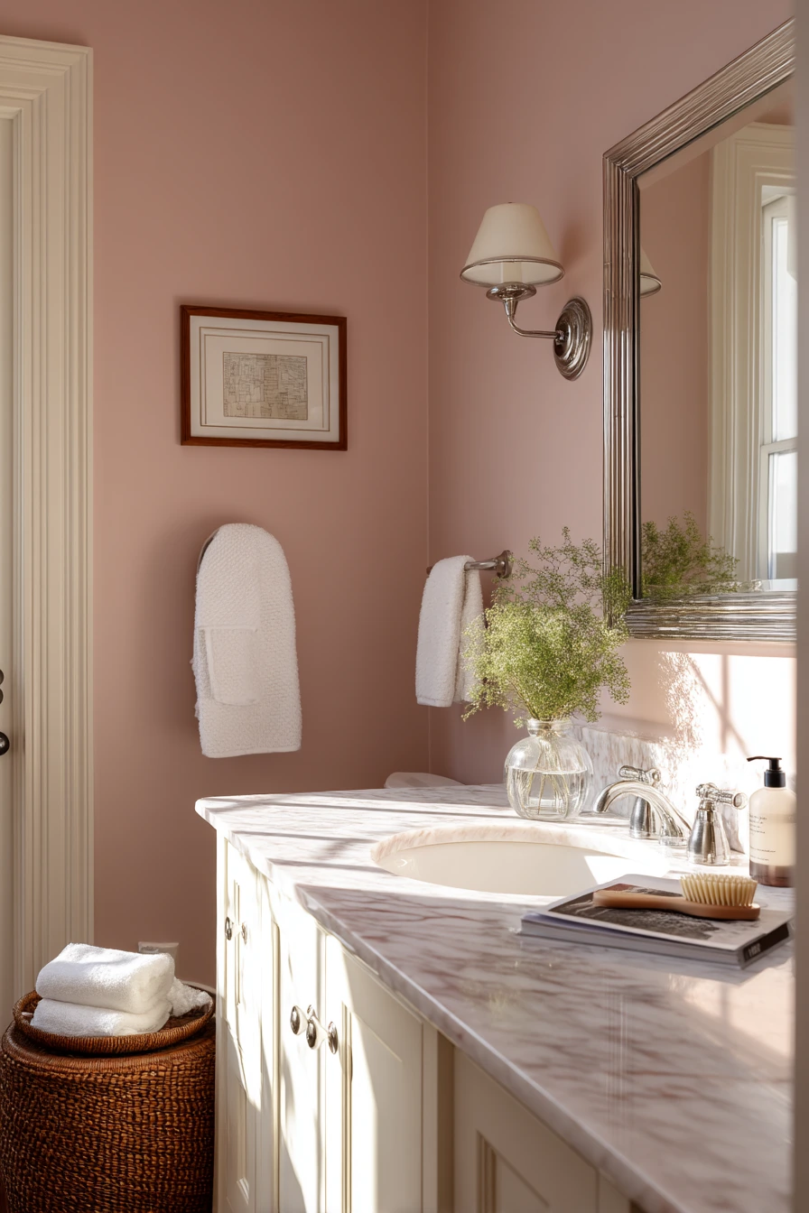

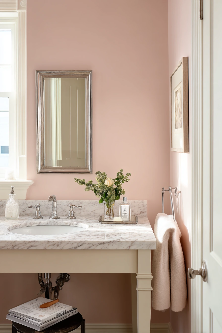
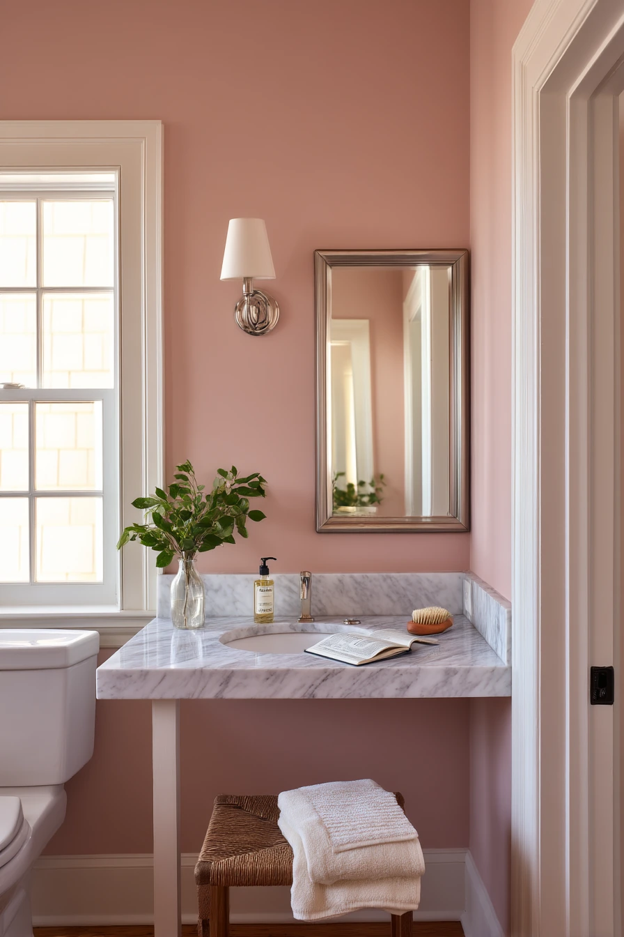
Dusty pink walls can make an older house guest bathroom feel warm and kind without being too sweet. The key is choosing a muted pink with gray or beige in it, then pairing it with ivory trim to keep edges crisp. Polished nickel for the mirror and hardware adds a clean shine that helps the room feel fresh, even with vintage details.
A marble-look counter works well here because it gives a light, classic surface that balances the pink. Add a small vase of greenery for a natural break in the color story. For an overnight-stay feeling, leave out a few useful items: a spare hairbrush, a folded hand towel, and a room spray. An open paperback on a nearby stool makes the space feel lived-in and welcoming, like someone can settle in and relax.
How to style it: use white or ivory towels, and add one deeper tone like cocoa or charcoal in a bath mat or small basket. Keep art simple, like black-and-white prints or soft landscapes. If the room gets late afternoon window light, the dusty pink will look warmer, so avoid bright orange decor that can push it too far.
- Pick a dusty pink with a muted, gray base.
- Use ivory trim to frame the color neatly.
- Choose polished nickel for a clean, classic look.
- Add greenery to keep the palette from feeling flat.
- Keep guest items grouped on a tray for a tidy counter.
Pro Design Tip: Test pink paint in both morning and late afternoon light, since it can shift quickly and look more peach or more mauve.
Budget Considerations: If you cannot replace counters, use a marble-look contact paper or a stone-look tray to bring in the same feel at a low cost.
7. Charcoal Bathroom Color Ideas for a Relaxing, Spa-Like Mood
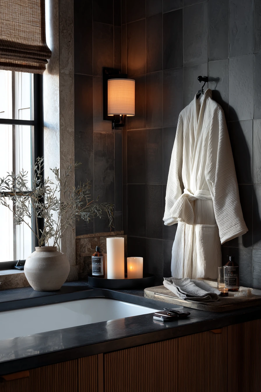
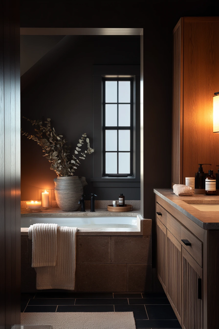
Charcoal walls are a bold bathroom color idea that can still feel calm when the rest of the room is light and warm. A cream stone tub surround keeps the space from looking too dark, and it reflects light back into the room. This palette fits a shared primary bathroom meant for winding down after work, especially when the lighting is soft and warm.
A fluted wood vanity brings texture and helps charcoal feel cozy instead of flat. Matte black fixtures match the wall depth and look modern without being shiny. The lived-in details matter in a darker room because they tell the story: a bath tray, eucalyptus stems, a dropped robe sleeve, and a phone charging on the counter. Keep these items limited so the space still feels restful, not cluttered.
How to style it: use towels in cream, sand, or light gray. Add a small amber candle or a wood bowl on the counter for warmth. If you want art, choose simple pieces with lots of negative space. In a charcoal bathroom, shiny clutter stands out, so store bright packaging in drawers and use matching pump bottles for soap and lotion.
- Pair charcoal walls with a cream or off-white surround or tile.
- Choose warm lighting to soften the dark paint.
- Add fluted or slatted wood to bring texture.
- Use matte black fixtures for a clean, modern match.
- Keep countertop items in a bath tray to look intentional.
Pro Design Tip: Add layered lighting, like a warm vanity light plus a small lamp or sconce, so charcoal looks rich and not shadowy.
Budget Considerations: If redoing tile is not possible, paint the walls charcoal and swap in warmer bulbs and a wood-toned accessory to get a similar spa feel.


8. Soft Yellow Bathroom Color Ideas for a Kid-Friendly Space
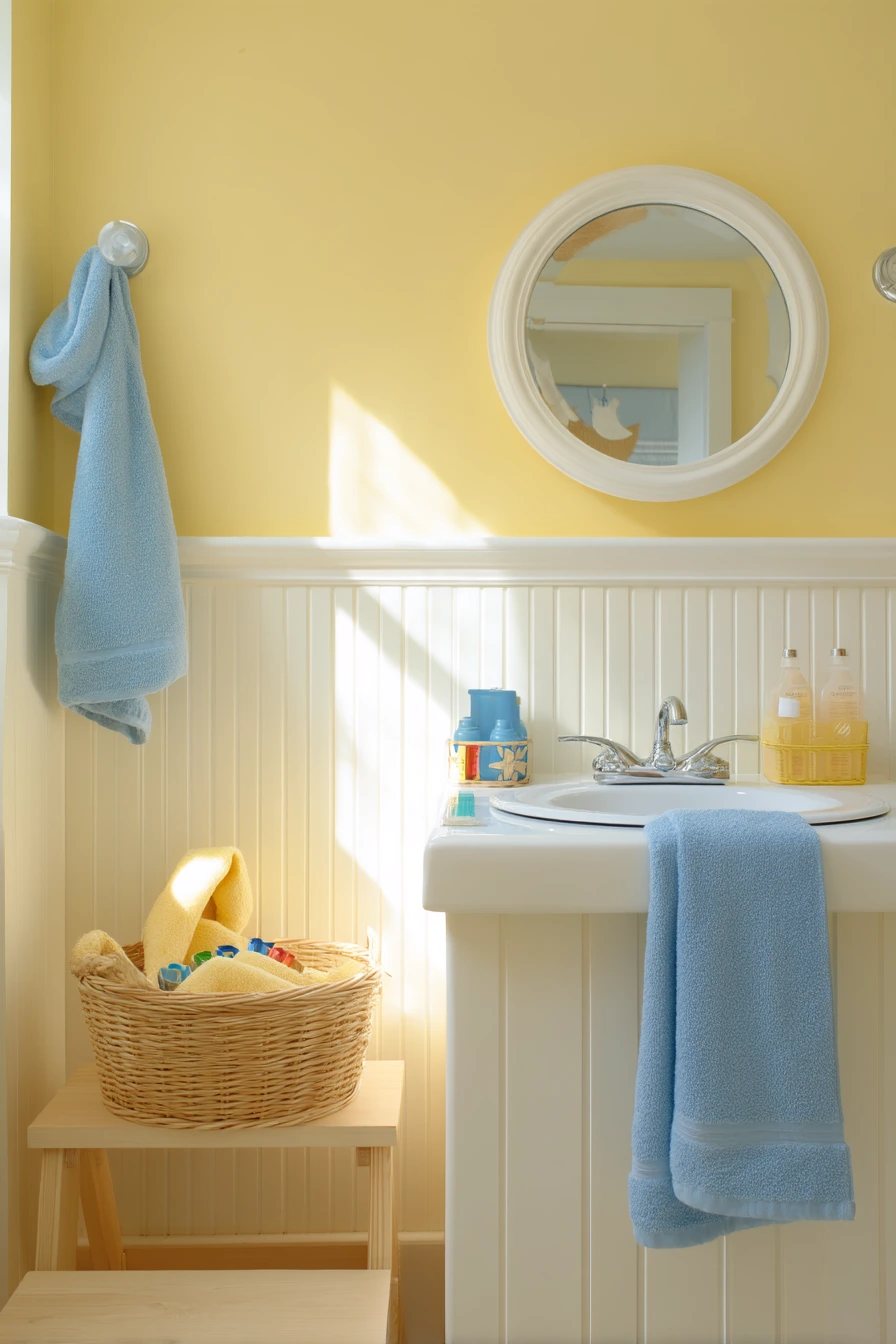
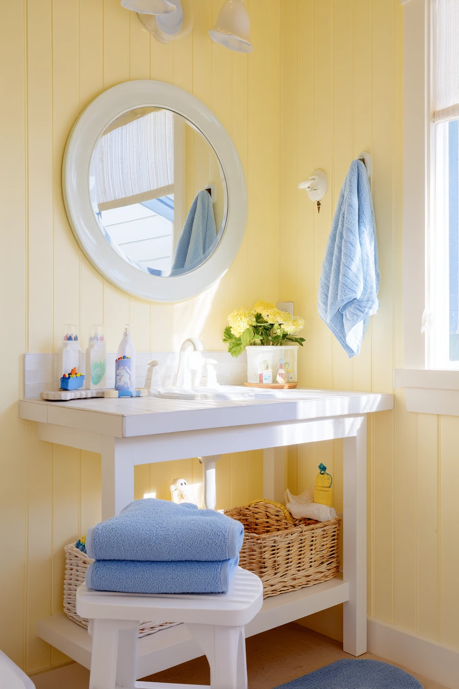
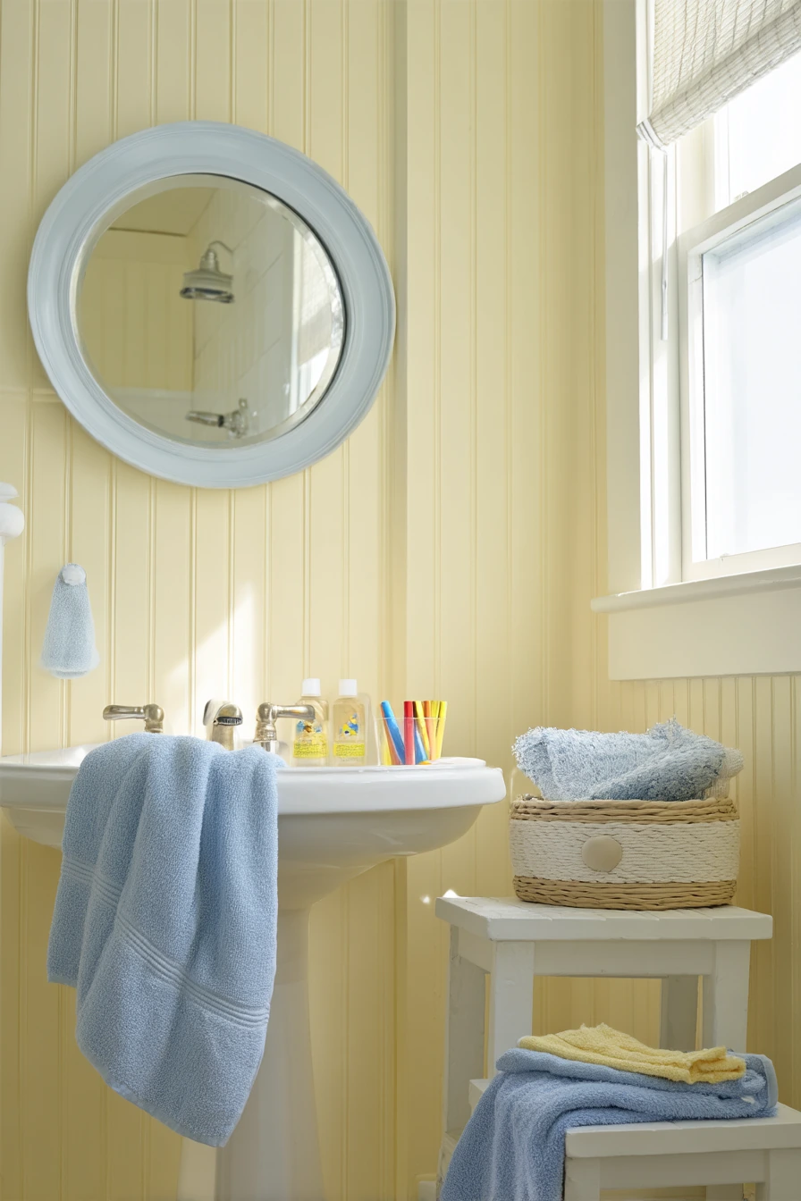
Soft yellow walls are a cheerful choice for a kid-friendly bathroom because the color lifts the room without feeling loud. It works especially well with white beadboard, which adds structure and protects lower walls from splashes. In natural morning light, soft yellow reads sunny but not harsh, making the room feel clean and upbeat.
To keep the space practical, choose simple blue towels for a clear color pair. Blue is a calm counter to yellow and helps the room look balanced. A round mirror with rounded edges is a smart pick for kids, since it feels softer and safer than sharp corners. Real-life items like a step stool, bath crayons, a wet hooded towel, and a small basket of shampoo bottles can stay out if you give each thing a home.
How to style it: use baskets or bins that can be grabbed fast. Add hooks at kid height for towels and swimsuits. If you want a little pattern, try a small striped rug in blue and white. Keep soap and shampoo in simple bottles so the counter does not look busy, even after bath time.
- Pick a butter-soft yellow, not neon or lemon.
- Use white beadboard to add durability and texture.
- Add blue towels for an easy, calm contrast.
- Choose a rounded mirror to match the kid-safe feel.
- Use a basket to group small bottles and toys.
Pro Design Tip: Use semi-gloss or scrub-friendly paint on kid bathroom walls so you can wipe marks without damaging the finish.
Budget Considerations: Beadboard panels can add up; on a budget, paint the lower wall a washable white and add a simple chair rail for the same look.

9. Stone Gray Bathroom Color Ideas for a Modern, Calm Main Bath

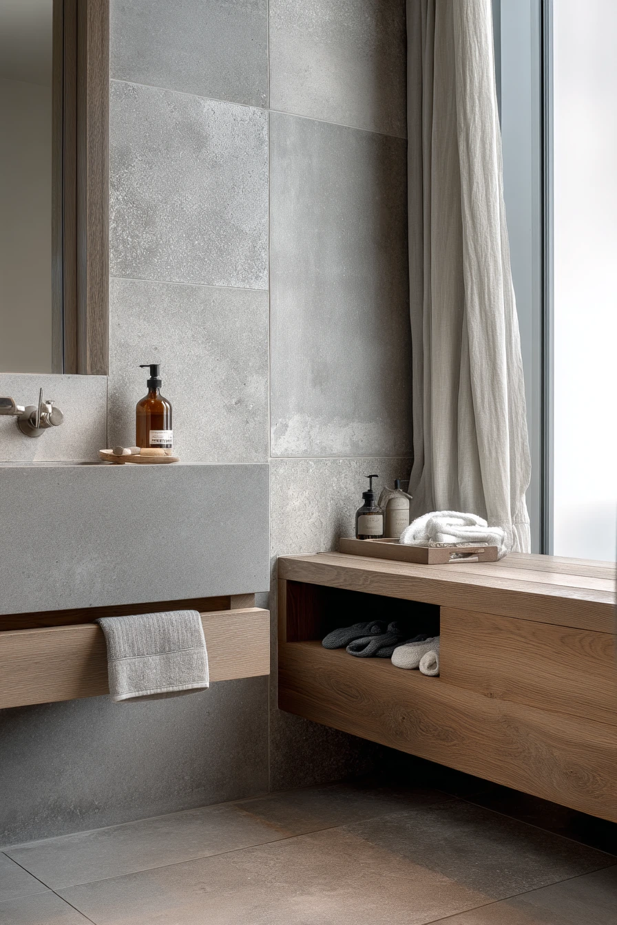
Stone gray walls are a safe, modern pick when you want a bathroom that feels refined and easy to maintain. Gray also pairs well with large-format tile, since fewer grout lines keep the room looking clean. In soft overcast window light, stone gray reads smooth and quiet, which is helpful in a main bathroom that gets steady daily use.
An oak vanity brings warmth so the gray does not feel chilly. A pale linen curtain adds softness and keeps the space from looking too hard or industrial. A slim ledge for daily essentials is a smart move, but the key is to keep it edited. Even small signs of real use, like a toothbrush charger, a skincare bottle, folded socks, and an open drawer edge, can look fine when the palette is calm and storage is planned.
How to style it: pick accessories in white, light wood, and muted black. Use one stone tray or shallow bowl to catch small items. If you want more character, add one piece of art with warm tones, like tan or rust, to keep the gray feeling friendly. Also pay attention to undertones, since stone gray can lean blue or green depending on your tile and lighting.
- Choose a stone gray with a warm undertone for comfort.
- Use large-format tile to reduce visual clutter.
- Pair gray with oak for a balanced, natural feel.
- Add a linen curtain to soften hard surfaces.
- Limit ledge items to the true daily basics.
Pro Design Tip: Match gray paint to the darkest tone in your tile so the room looks coordinated and the walls do not clash.
Budget Considerations: Large-format tile can cost more to install; if you are saving money, use it only in the shower and choose a simple, affordable floor tile elsewhere.


10. Cream and Navy Bathroom Color Ideas for a Shared Couple’s Bath
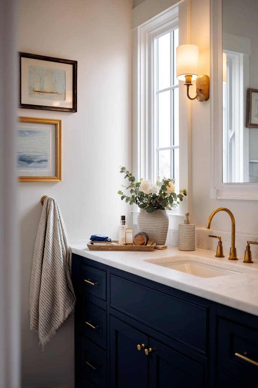

Cream walls with a navy vanity is a strong, flexible bathroom color idea for a shared bathroom. Cream keeps the room bright and forgiving, while navy adds depth and makes the vanity feel like furniture. This combination works well with a white porcelain sink because it looks crisp and clean against the dark base. Brushed brass pulls add warmth and keep the palette from feeling too cool.
To make it feel like a real busy space, small everyday items can stay out as long as they are contained. A shaving kit, a contact lens case, a damp hand towel, and a hair clip are normal in a morning-after-use moment. Keep framed art leaning casually on the counter only if you have enough space, and make sure it is easy to wipe behind. Gentle window light plus a warm vanity bulb is a good lighting mix for cream and navy, since it keeps skin tones natural.
How to style it: use towels in white, cream, or light gray, then add one small brass accent like a tray or soap pump. If you want more color, choose art with soft blues and warm neutrals. Organize the counter with two containers, one for each person, so items do not spread out across the sink area.
- Choose cream paint with a soft warm base, not stark white.
- Use a navy vanity to anchor the room and hide wear.
- Add brushed brass pulls for warmth and contrast.
- Keep counter clutter in small bins or trays.
- Mix window light with warm bulbs for a balanced glow.
Pro Design Tip: Repeat the navy in one small item, like a hand towel stripe or soap label, so the vanity color feels connected to the rest of the room.
Budget Considerations: Painting an existing vanity navy is far cheaper than replacing it; spend extra on good primer and durable enamel for a finish that holds up to moisture.


Good bathroom color ideas come from matching paint, tile, and lighting to how the room is really used. Start with one main color, then build around it with a steady neutral and one warm texture like oak, walnut, bamboo, or linen.
If you want the fastest update, change wall color, swap hardware, and tighten up your countertop styling with trays and matching bottles. Small moves can make a bathroom feel calmer and easier to keep clean.
FAQ
1) What bathroom paint color is most relaxing? Soft greens like sage, muted blues like dusty blue, and warm grays like stone gray tend to feel calm, especially in natural light.
2) Are dark bathroom colors like charcoal a bad idea in small spaces? Not always. Charcoal can feel cozy if you pair it with light tile, warm bulbs, and a mirror that bounces light.
3) How do I choose the right white tile with colored walls? Match the tile undertone to the wall color. Warm white tile fits sage, terracotta, beige, and dusty pink better than bright blue-white tile.
4) What hardware finish is easiest to live with? Brushed nickel hides water spots well. Matte black can show dust, and polished chrome shows fingerprints, but both can work with regular wiping.
5) What colors work best for a guest powder room? Warm, moody colors like terracotta or dusty pink often feel welcoming, especially with soft lighting and simple art.
6) How can I make a kid bathroom look neat? Use baskets, hooks at kid height, and one spot for bath toys. Keep bottles grouped so the counter stays clear.
7) Can I mix metals in a bathroom? Yes, but keep it controlled. Pick one main finish (like brass) and one supporting finish (like nickel), then repeat each at least twice.