Picking the right kitchen wall color can make a small space feel open, a busy family kitchen feel calmer, and a rental feel more personal. In this post, you will find kitchen wall color ideas based on real, lived-in rooms, not staged show kitchens.
Each section matches a different look, from sage-green walls with white cabinets to warm greige for a small apartment, to dusty blue in a renter-friendly setup. You will also see deeper shades like olive, terracotta, and charcoal accent walls that add contrast without making the room feel heavy.
For every color, you will get simple styling steps you can copy, plus a pro design tip and a budget note. Use these ideas to plan paint, choose hardware, and tie in shelves, tile, and lighting so the room looks put together.
If you came from Pinterest, save the colors you like and read the tips under each photo theme. It will help you avoid common paint mistakes and pick a shade that works with your cabinets, counters, and light.
Intro: Sage-Green Kitchen Walls With White Cabinets


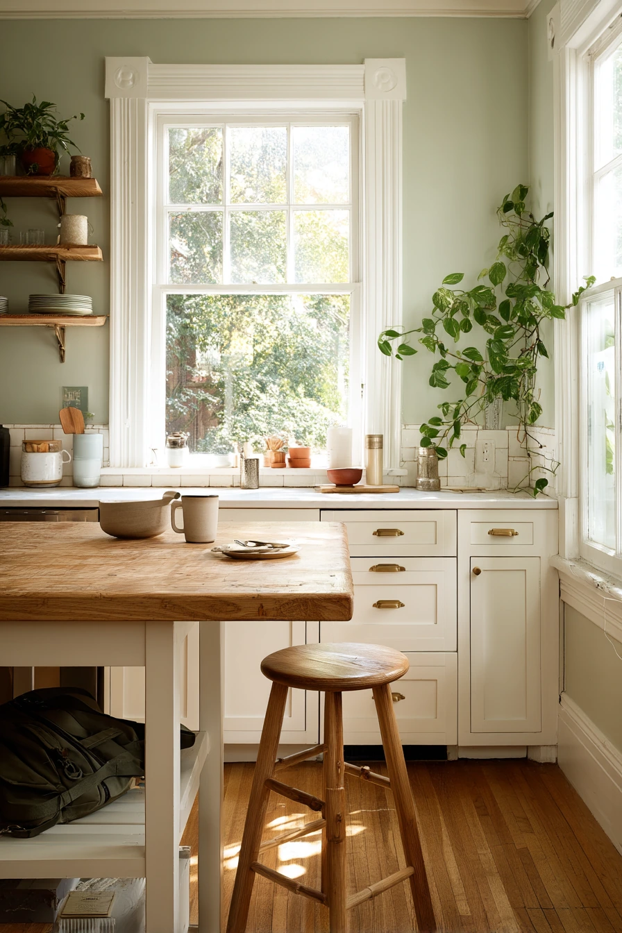
Sage-green walls are a steady choice for a real family kitchen. The color feels calm, but it still adds interest next to painted white cabinets. It works especially well with pale oak open shelves, brass pulls, and a worn butcher-block island, because those warm wood tones keep the green from feeling cold.
This shade also hides daily life in a good way. Morning toast, cereal bowls, and a stack of library books can sit out and still look fine. Add a pothos trailing from the sill to echo the green on the walls. Soft window light makes sage look gentle, so it fits kitchens that get morning sun.
To style it, keep your countertop items simple and useful. Choose one or two ceramics in creamy white, then add a small natural texture like a woven basket or a wood cutting board. If you have brass hardware, repeat that metal once more, like a brass utensil crock or a small framed print, so it looks planned.
- Use warm whites for cabinets so the green does not turn gray.
- Pick open shelves in pale oak to keep the room light.
- Add brass pulls for a soft shine that feels homey.
- Keep counter items in a small group, like a mug, books, and a bowl.
- Bring in a simple plant to connect the wall color to real life.
Pro Design Tip: Test sage paint at different times of day; in low light it can look more gray, so choose a version with a hint of warmth if your kitchen faces north.
Budget Considerations: If new open shelving is pricey, repaint existing shelves and add matching shelf brackets; brass-look pulls in zinc are often much cheaper than solid brass.

1. Warm Greige Walls for a Small Apartment Kitchen


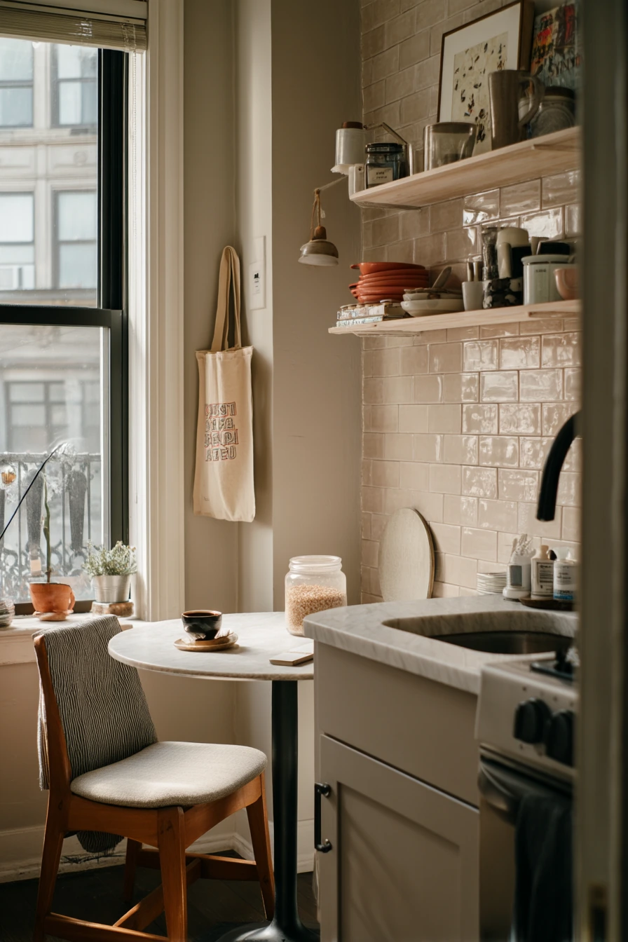
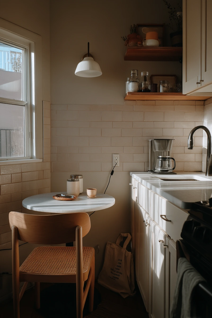
Warm greige walls are a safe, modern kitchen wall color idea for a small apartment. Greige sits between gray and beige, so it blends with many finishes. With a matte cream tile backsplash, slim floating shelves, and a black faucet, the room can feel clean without looking stark.
In a compact layout, every item shows. A round pedestal table squeezed beside the counter can still look nice if you keep the palette tight. Let the greige walls be the quiet background, then use black accents in small doses, like the faucet, a paper towel holder, or frames. Late afternoon window light can turn greige warmer, which helps the kitchen feel more inviting.
For styling, aim for “used but not messy.” Put an open salt jar on a small tray. Hide charging cables in a cord box or clip them under the counter edge. Choose one mug style and keep it near the espresso setup. A tote bag on a chair is normal life, but it looks better if the chair matches the table or repeats the black detail.
- Choose a warm greige that leans beige if your kitchen gets little sun.
- Use matte cream tile to soften the look and reduce glare.
- Add floating shelves to free up counter space.
- Repeat black in 2 to 3 places so it feels balanced.
- Use a small tray to corral daily items like salt, spoon, and mug.
Pro Design Tip: In small kitchens, keep the wall color and backsplash close in value (both light) to avoid choppy lines that make the room feel tighter.
Budget Considerations: Peel-and-stick tile in a cream matte finish can mimic real tile; pair it with an affordable black faucet from a mid-range brand to get the same contrast.
2. Dusty Blue Walls for a Renter-Friendly Kitchen
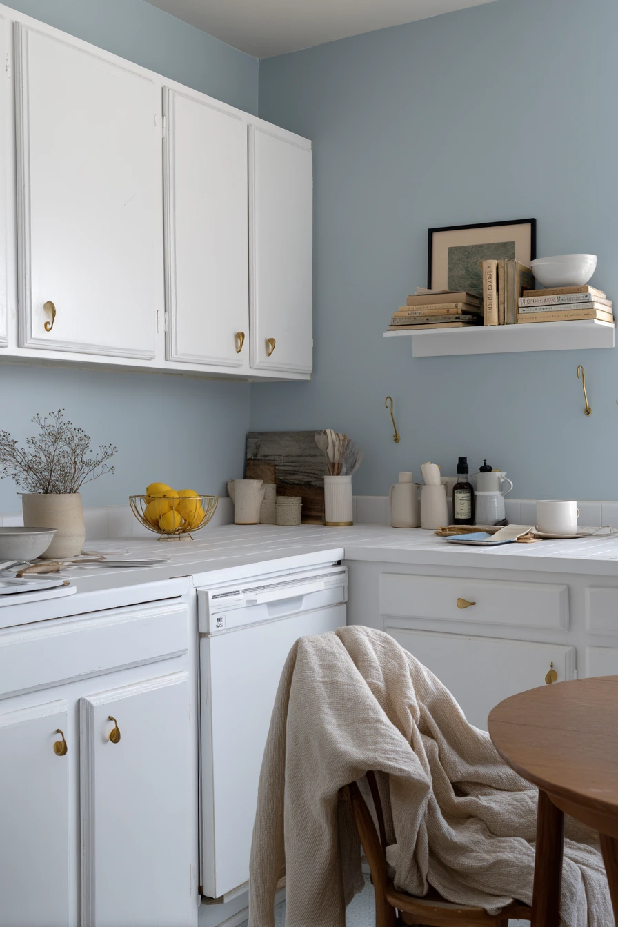
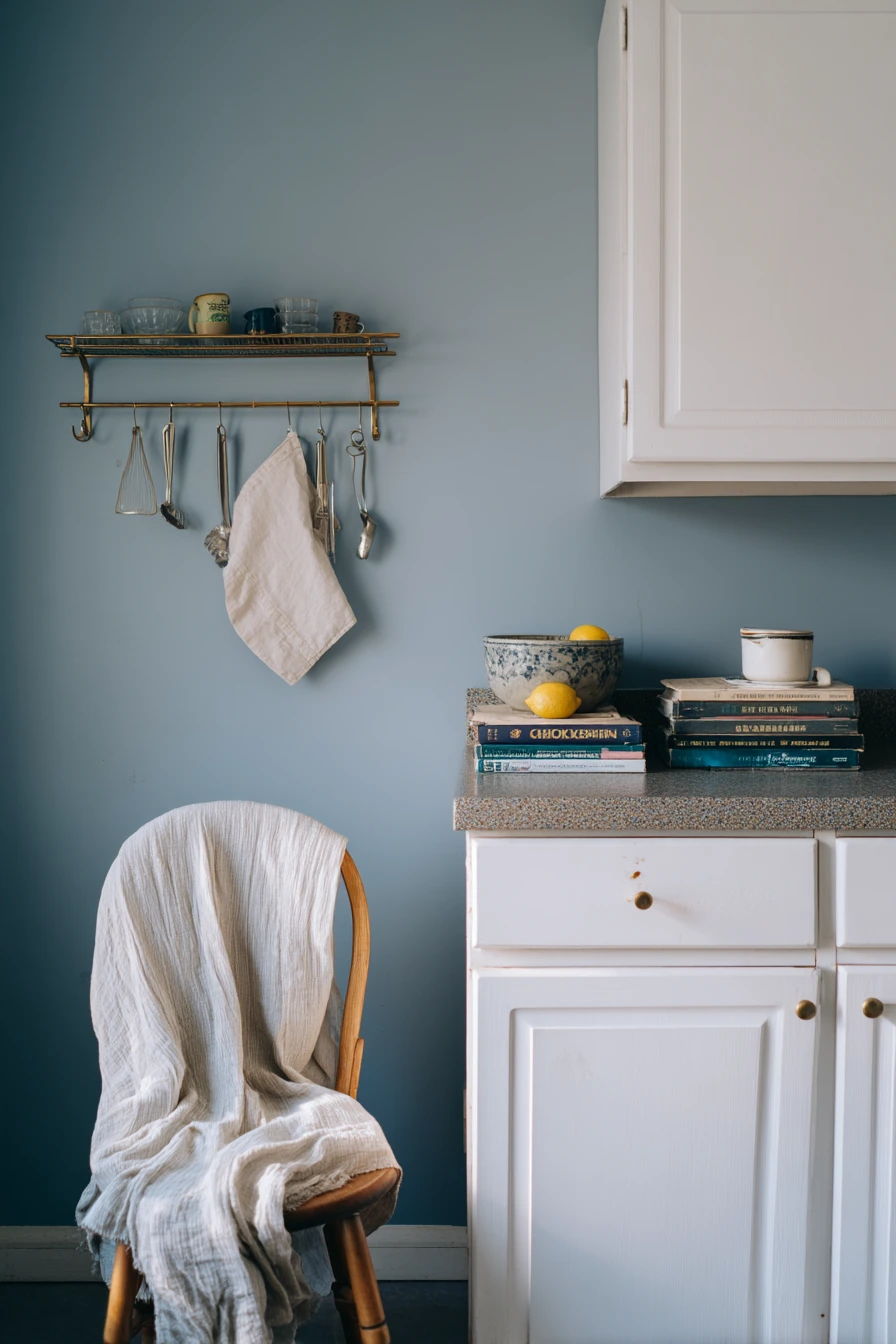
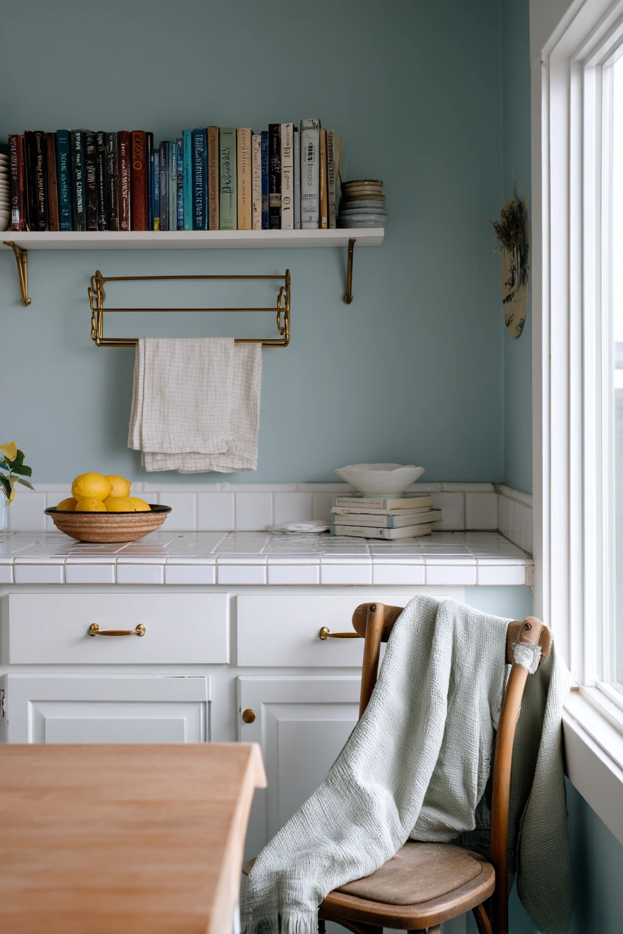
Dusty blue walls can make a rental kitchen feel softer and more personal. This color pairs well with simple white cabinets because it adds mood without looking dark. It also looks good with thrifted items, like a dish rack, a linen tea towel, and a stack of cookbooks on the counter.
Since rentals often limit changes, focus on small upgrades that do not damage the space. Renter-friendly peel-and-stick brass hooks can add function and style. Hang an apron, a towel, or a small basket for keys. A small lemon bowl adds a fresh color pop that looks good against blue, and it helps the room feel lived-in in a simple way.
To style dusty blue, mix textures instead of adding more colors. Use linen, wood, and simple ceramics. If you have one chair in the kitchen, a wrinkled throw draped over it can look relaxed, but keep it in a neutral tone like oatmeal or cream. Overcast daylight makes dusty blue look even calmer, so it is a good fit for kitchens with softer light.
- Pick a dusty blue with gray undertones for a mellow look.
- Use white cabinets to keep the room bright.
- Add peel-and-stick brass hooks for quick storage.
- Style the counter with one small fruit bowl and one cookbook stack.
- Use linen towels to add softness without adding clutter.
Pro Design Tip: Dusty blue looks best when you repeat warm metals (like brass) and warm woods so the blue does not feel cold.
Budget Considerations: If you cannot paint, try removable wallpaper in a dusty blue solid or small pattern; thrift stores are also great for dish racks and bowls that add charm for less.

3. Buttercream-Yellow Walls for a Sunny Breakfast Nook
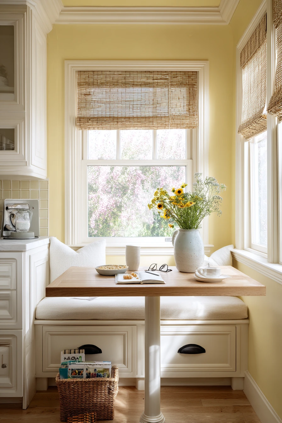

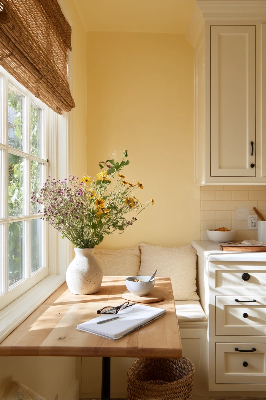
Buttercream-yellow kitchen walls are a cheerful choice for a tiny breakfast nook. This soft yellow is not neon and not too bright, so it feels warm in the morning and cozy later in the day. Next to off-white cabinets, the color reads sunny but still calm.
This look works well with natural textures. A woven roman shade and a pale wood table keep the nook light. Add a ceramic vase with wildflowers for a simple centerpiece that does not block conversation. Real life details, like a notebook and glasses left beside a plate, can stay out because the color palette feels friendly and relaxed.
To style buttercream yellow, keep the rest of the room simple and a bit muted. Use creamy whites, light woods, and a few darker touches for balance, like a small bowl or a frame. If you have kids, a toy basket tucked under the bench keeps clutter controlled. Cereal crumbs happen, so choose wipeable fabrics and a table finish that can handle daily use.
- Choose a soft yellow with a creamy base, not a sharp lemon shade.
- Pair it with off-white cabinets for a gentle contrast.
- Add woven shades to bring in texture and warmth.
- Use pale wood furniture to keep the nook feeling open.
- Hide kid items in one basket so the space still looks neat.
Pro Design Tip: Use the same warm white on trim and cabinets so the yellow looks intentional and not like a patchwork of different whites.
Budget Considerations: If replacing shades is costly, add a woven-look shade liner or use a budget bamboo blind; thrifted vases also work well with wildflowers.

4. Deep Olive Kitchen Walls for a Grounded, Moody Look


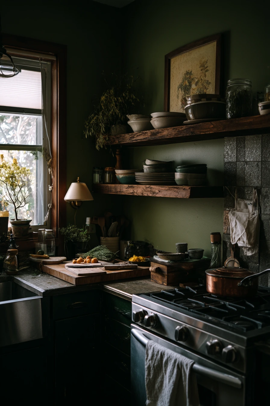
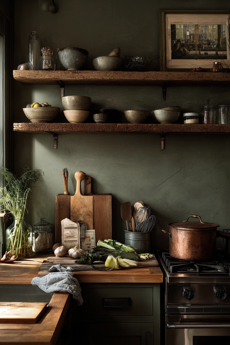
Deep olive kitchen walls create a grounded feel, especially in a home cook’s space where the kitchen is always in use. Olive is rich and earthy, and it makes open oak shelves stand out. Mismatched bowls and matte stoneware look collected, not messy, because the darker wall color pulls everything together.
This color is great if you like a little mood in the evening. Warm lamp light mixing with fading window light can make olive look cozy. Add copper, like a copper pan on the stove, to bring in a warm glow. Everyday items like a cutting board leaned upright, a grocery receipt, and produce bags can still look fine if you keep the counter zones clear.
To style deep olive, focus on contrast and texture. Use light counters if possible, or add a light runner or board to break up dark surfaces. Keep shelves from looking crowded by leaving some open space between stacks. Add a jar with herb stems for an easy green-on-green detail that feels natural and ties into cooking.
- Pair olive walls with oak shelves to add warmth.
- Use matte stoneware to avoid too much shine.
- Repeat copper or brass for a warmer, richer look.
- Create a clear prep zone so the dark walls do not feel heavy.
- Add one simple lamp to boost evening warmth.
Pro Design Tip: Deep olive looks best when you add layered lighting (under-cabinet plus a lamp or sconce) so the walls stay rich instead of flat.
Budget Considerations: If new shelves are expensive, refinish existing shelves in a light oak stain; copper can be added in small ways, like a thrifted pan or a utensil holder.
5. Clay-Pink Kitchen Walls for a Soft, Lived-In Style


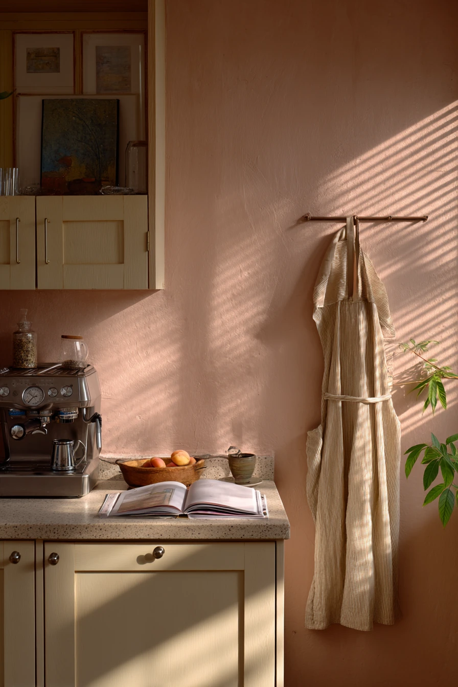
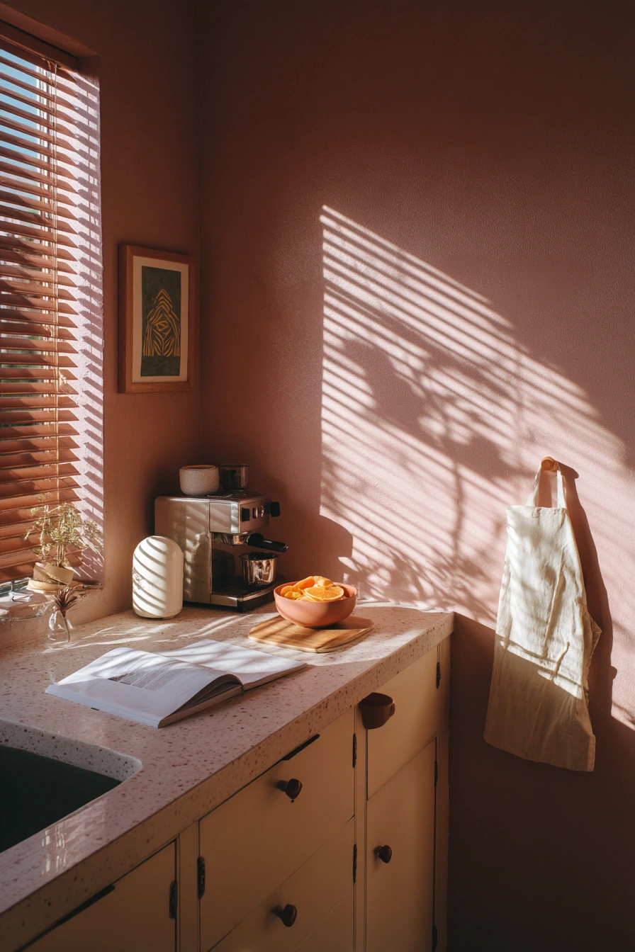
Clay-pink kitchen walls give a soft look that still feels grown-up. This shade has an earthy base, so it does not read as bubblegum. With creamy cabinets and a terrazzo prep counter, clay pink feels warm and relaxed, especially when sunlight makes plant shadows stretch across the wall.
This color works well with small daily moments. A small espresso machine, a cookbook open to a sauce page, and a bowl holding peach peels fit the mood. The walls make these details look intentional. Add a linen apron on a hook to keep the space practical while adding texture.
To style clay-pink walls, keep your other colors simple. Cream, warm white, light stone, and natural wood all work. If you want more contrast, use black in tiny touches, like a spoon rest or a picture frame. Try to avoid bright cool whites, because they can make the pink look too sweet. Warm lighting also helps the color stay mellow in the evening.
- Choose a clay pink with beige or terracotta undertones.
- Pair it with creamy cabinets, not stark white.
- Use terrazzo or speckled counters to add gentle pattern.
- Add linen textiles for a soft, real-life feel.
- Bring in plants to cast shadows and add depth.
Pro Design Tip: Use a warm bulb (around 2700K) so clay pink stays earthy at night and does not shift toward purple.
Budget Considerations: If terrazzo is out of reach, try a terrazzo-look laminate or a large terrazzo-style tray on the counter for the same vibe at a lower cost.
6. Charcoal Accent Wall for a Modern, Cozy Kitchen
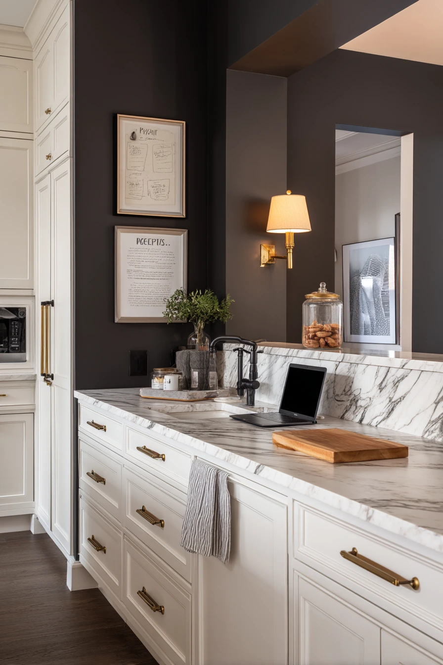

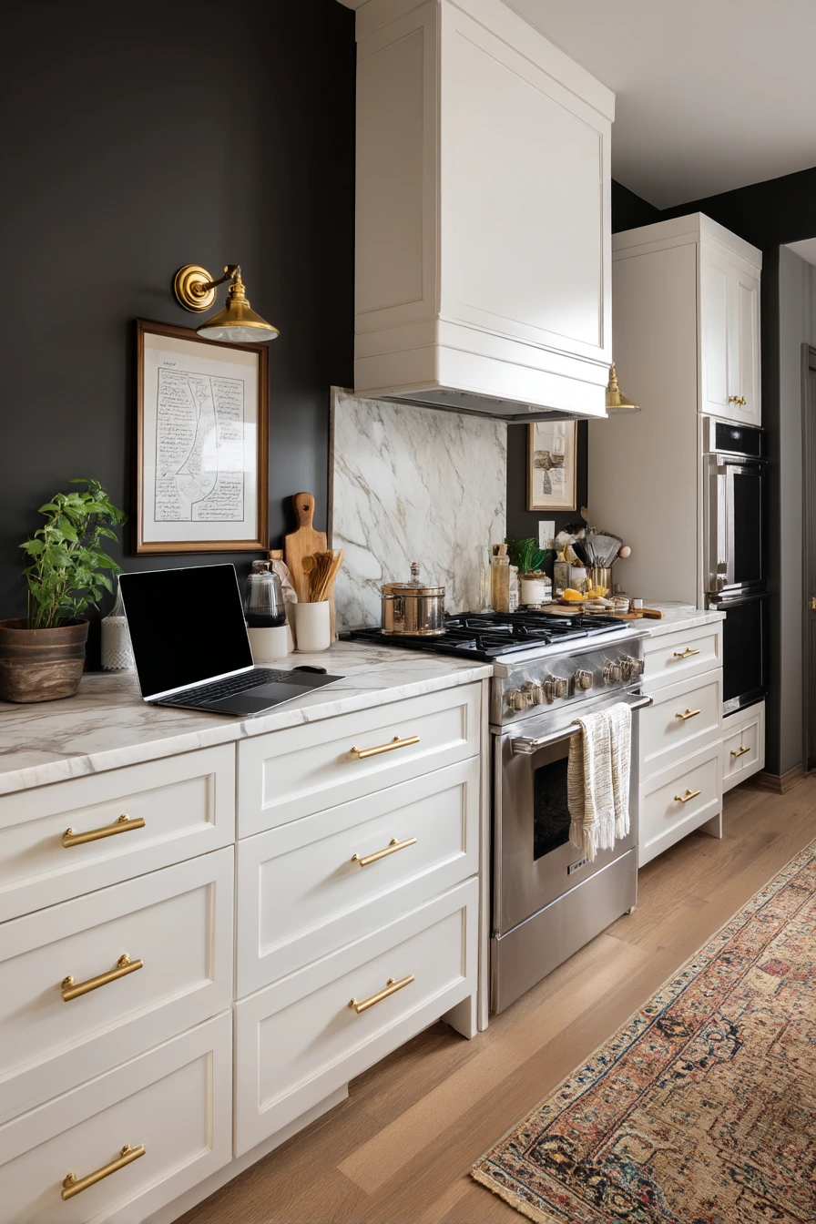
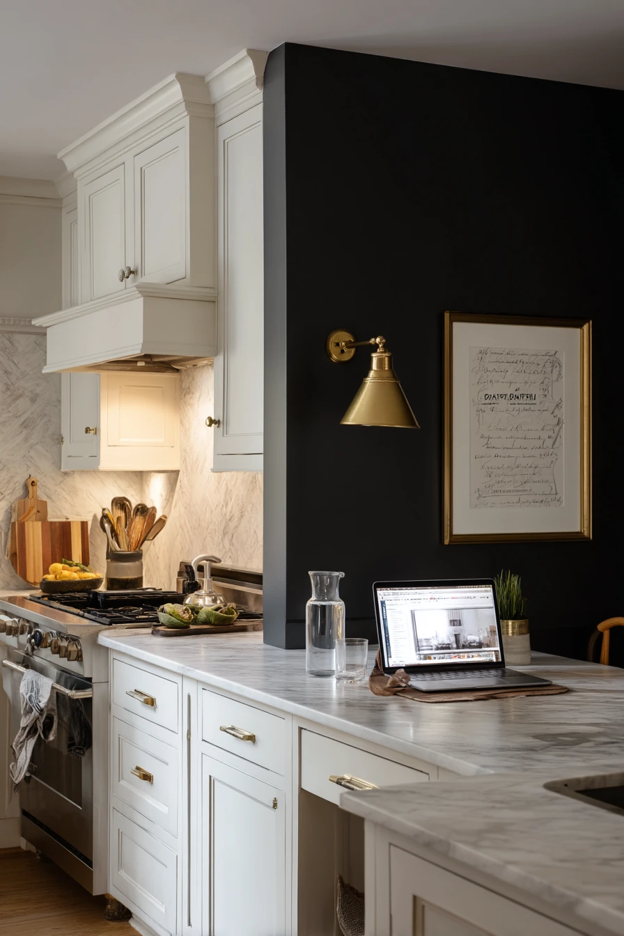
A charcoal accent wall is a strong kitchen wall color idea when you want contrast without painting the whole room dark. Charcoal pairs well with warm white cabinetry and marble-look counters. It can make the kitchen feel crisp and modern, while still cozy in the evening with practical lamp glow.
This look also works in busy homes where the kitchen doubles as a work zone. A framed recipe sketch on the wall adds personality. A dish towel slung over the oven handle and a glass of water on the counter look normal, not messy, because the dark wall hides small marks and adds a clean backdrop.
To style a charcoal accent wall, keep the rest of the finishes warm. Antique brass sconces are a great match, because brass softens the dark paint. If you use a laptop on the island, add a tray or a cutting board nearby so the counter still looks like a kitchen, not an office. Keep decor simple and flat, like one frame and one small shelf, so the wall reads as calm.
- Paint only one wall charcoal to keep the room from feeling smaller.
- Use warm white cabinets for a clean contrast.
- Add antique brass lighting to warm up the dark paint.
- Keep wall decor minimal, like one frame or one small shelf.
- Repeat charcoal in small items, like a utensil crock or rug pattern.
Pro Design Tip: Choose a charcoal with a warm undertone if you have brass and warm whites; cool charcoals can look blue and clash with warm metals.
Budget Considerations: Instead of new sconces, swap to brass spray-painted shades or plug-in wall lights; you can also create an accent wall with removable wallpaper in a charcoal solid.
7. Pale Taupe Walls for a Minimal, Quiet Kitchen
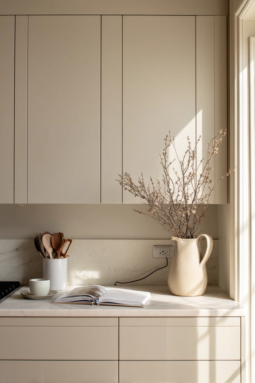

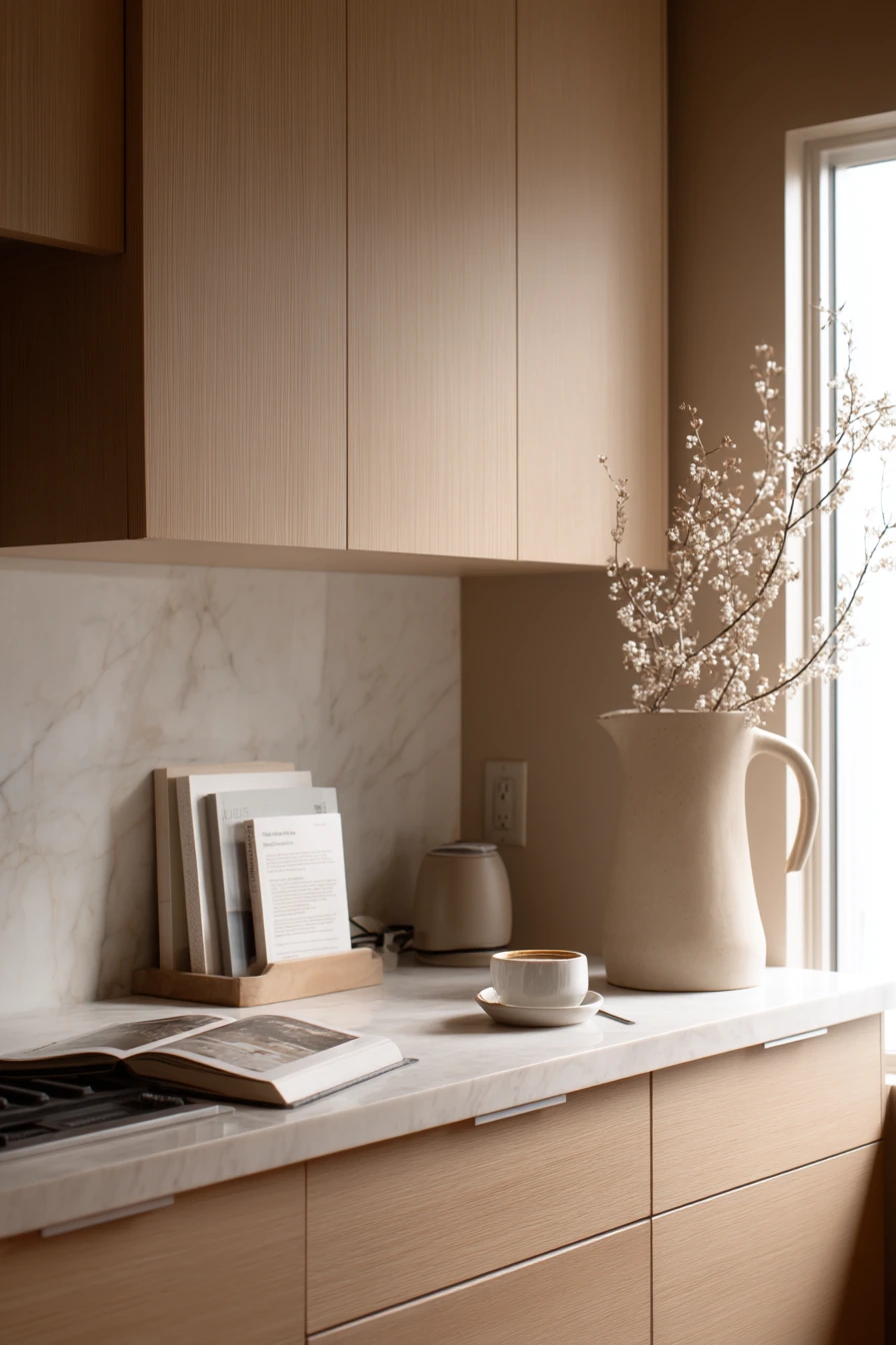
Pale taupe kitchen walls are ideal if you like a serene, muted look. Taupe sits between beige and gray, and it feels soft with flat-front oak cabinets. With hidden appliances and a stone backsplash, the whole kitchen can look simple and calm, even when real life shows up on the counter.
This wall color supports a “less but better” style. A simple branch in a ceramic pitcher becomes the main decor. One cookbook propped open and a coffee spoon beside a half-empty cup can stay out without the space looking busy. Soft noon window light helps taupe look clean and smooth, not muddy.
To style pale taupe, keep your materials natural and your colors close together. Use oak, stone, cream ceramics, and a few black details if you need definition. Hide cords when you can, since taupe walls make clutter stand out more than darker paint. If your cabinets are oak, match your shelf wood tone so the room feels planned and not mixed by accident.
- Pick a pale taupe that leans warm for a cozy feel.
- Pair it with oak cabinets to add natural warmth.
- Use a stone backsplash for texture without bold pattern.
- Keep decor simple, like one branch in a pitcher.
- Tidy cords and small items so the calm look holds up.
Pro Design Tip: When working with taupe, match undertones across finishes (warm taupe with warm stone) so the room does not look slightly “off” in daylight.
Budget Considerations: If you cannot replace a backsplash, use a stone-look vinyl backsplash panel; for decor, clipped branches from your yard can replace expensive arrangements.

8. Muted Terracotta Walls for an Eclectic Kitchen-Dining Room
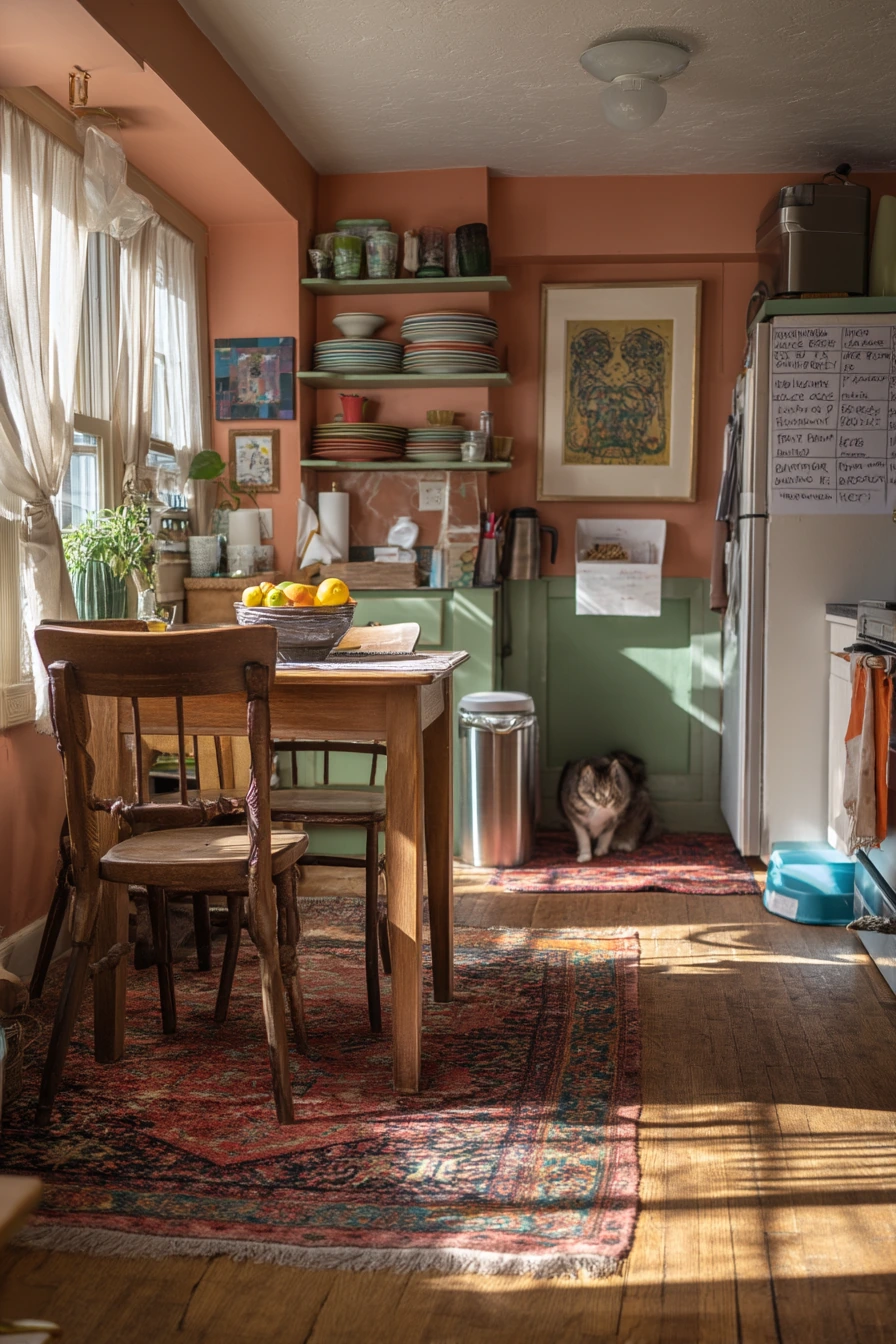

Muted terracotta walls add warmth and personality without being too bright. This color works well in an eclectic kitchen-dining room with a vintage rug, mixed wood chairs, and pale green shelves. Terracotta makes the space feel welcoming, especially when sun and shadow create a textured pattern across the walls.
This shade is great if your home is active. A fruit bowl on the table, stacked plates on shelves, a handwritten grocery list on the fridge, and even a dog water dish near the baseboard can fit the look. Terracotta is forgiving, and it makes everyday items feel like part of the room instead of clutter.
To style muted terracotta, use a mix of old and new, but keep a few repeating colors. Terracotta, pale green, and warm wood can be your main trio. Add small black accents to ground the room, like a frame or light fixture. If your chairs are mixed woods, tie them together with a rug that includes warm tones and a bit of contrast.
- Choose a muted terracotta that leans earthy, not orange.
- Mix woods, but repeat one tone at least twice for balance.
- Add pale green shelves for a soft, fresh contrast.
- Use a vintage-style rug to connect dining and kitchen zones.
- Keep a fruit bowl out for an easy, useful centerpiece.
Pro Design Tip: Terracotta pairs best with warm whites and creamy trims; bright cool white can make the walls look more orange than you planned.
Budget Considerations: If painting feels like a big job, start with one terracotta wall; you can also add terracotta through a washable runner or secondhand art to test the color mood.


9. Powder Gray-Blue Walls for a Clean Renovated Kitchen
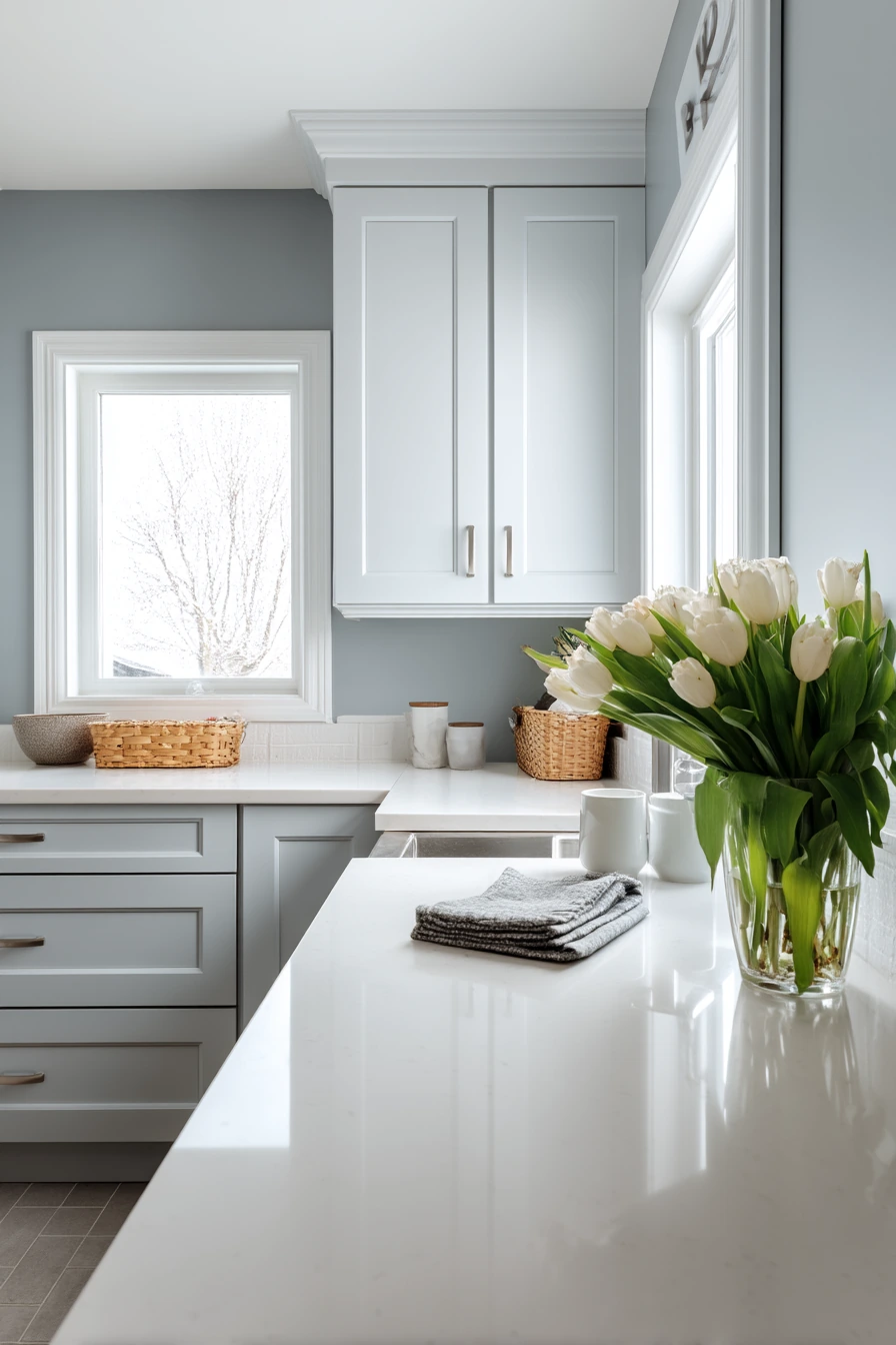

Powder gray-blue walls are a popular kitchen wall color idea for a freshly renovated look. The color feels airy and crisp, and it pairs easily with clean shaker cabinets. With light quartz counters and brushed nickel hardware, gray-blue reads modern without being harsh.
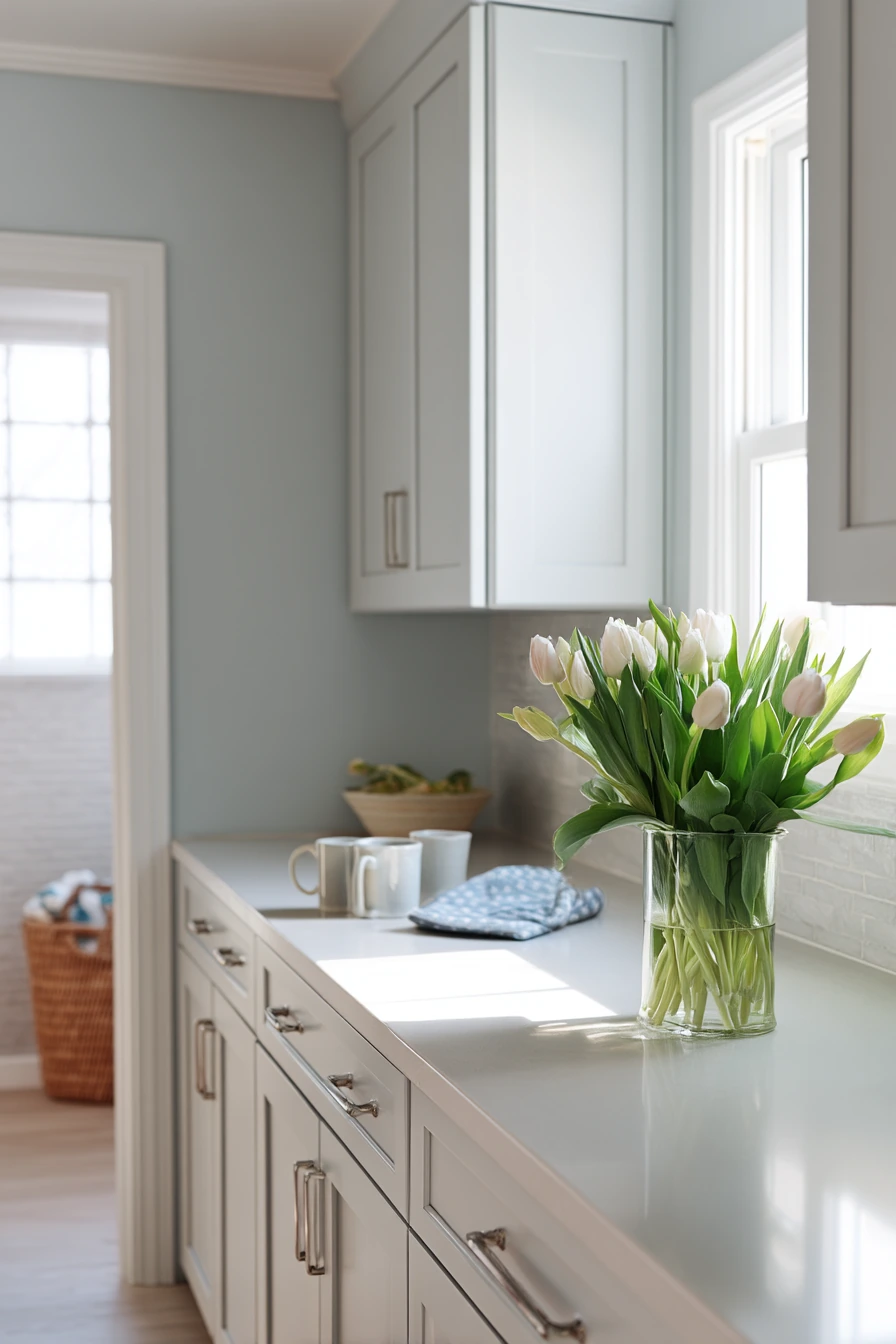
This shade also supports a tidy, everyday style. Two mugs by the sink, folded dish towels, and a vase of tulips can be enough to make the kitchen feel finished. If you can see into a laundry area through the doorway, gray-blue helps connect the spaces because it is soft and neutral, not loud.
To style powder gray-blue, keep your accents simple and bright. White ceramics, clear glass, and light wood add warmth without fighting the wall color. Add small touches of green from flowers or a plant to keep the space from feeling too cool. Overcast daylight often makes gray-blue look more gray, so test paint samples on multiple walls before you commit.
- Pick a gray-blue with a soft, dusty finish, not a bright blue.
- Pair with shaker cabinets for a classic, clean look.
- Use brushed nickel for a quiet, modern shine.
- Style the sink area with two matching mugs and neat towels.
- Add fresh flowers to bring in color without clutter.
Pro Design Tip: Balance cool gray-blue walls with one warm element, like light oak stools or warm-toned lighting, so the kitchen does not feel chilly.
Budget Considerations: If new quartz is expensive, look for quartz remnants for a smaller section like an island; brushed nickel pulls are widely available at budget stores and still look high-end.

FAQ: Kitchen Wall Color Ideas (Quick Answers)
Choosing kitchen wall color ideas can feel hard because paint shifts with light and nearby finishes. Use these quick answers to narrow down your options before you buy gallons of paint.
Think about your cabinets, counters, and backsplash first. Then choose a wall color that supports those fixed items, especially in a small apartment kitchen or a rental where big changes are limited.
If you are unsure, start with a sample board and look at it in morning and evening light. That one step prevents most regrets.
- What is the best kitchen wall color with white cabinets?
- Are sage-green walls too dark for a small kitchen?
- How do I choose between warm greige and pale taupe?
- What wall color works with brass pulls and warm woods?
- How can renters change kitchen wall color without painting?
Pro Design Tip: Pick paint after you choose bulbs; warm vs cool lighting changes how greige, taupe, blue, and green read on the wall.
Budget Considerations: Paint samples, poster boards, and a small tester pot cost far less than repainting a whole kitchen, so test first even if you are on a tight budget.
The best kitchen wall color ideas are the ones that match your light, your cabinets, and how you really live. Sage green, warm greige, dusty blue, buttercream yellow, deep olive, clay pink, charcoal, pale taupe, muted terracotta, and powder gray-blue can all work when the styling is simple and the undertones match.
Save the colors you like, then test them on your walls for a few days. Small choices like hardware, shelves, and lighting will help the paint look finished without a full remodel.