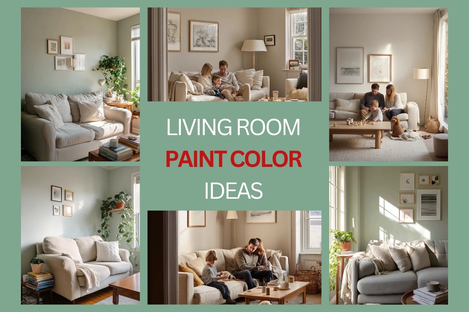

Choosing the right living room paint color can change how your whole home feels. The best shade helps your room look calm, welcoming, and easy to live in, not just pretty in photos.
This guide shares living room paint color ideas based on real, lived-in spaces. You will see warm greige, soft sage, clay blush, cool dove gray, muted olive, buttercream, dusty blue, deep taupe, pale sand, and soft terracotta.
For each color, you will get simple styling ideas you can copy, plus a pro design tip and a budget note. These are renter friendly where possible, and they work with everyday items like linen sofas, thrifted tables, books, plants, and washable rugs.
If you came from Pinterest, use this as a quick plan. Pick a shade that fits your light, your routine, and your furniture, then use the tips to pull the room together.
1. Warm Greige Living Room Paint for a Grounded Family Space


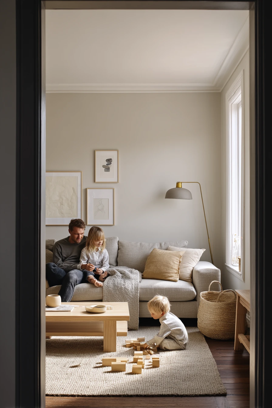
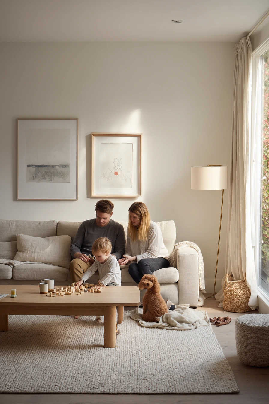
Warm greige is a safe, flexible paint color for a real family living room. It sits between beige and gray, so it feels soft and warm without turning yellow. In a busy room with a linen sofa, pale oak coffee table, and a brass floor lamp, warm greige keeps the backdrop calm while still feeling cozy.
This shade works well with soft window light because it shows gentle shadows and natural depth. It also hides small scuffs better than bright white, which matters in a space with blocks on the rug, a tea mug on the table, and dog toys nearby. If you like framed art leaning casually instead of perfectly centered, greige supports that relaxed look.
To style it, stay in a simple palette. Use off-white, oatmeal, and light oak, then add one darker tone like charcoal or deep brown for contrast. Texture does most of the work here, like a woven basket, linen curtains, and a thick rug.
- Pair warm greige walls with a linen sofa and soft cream pillows.
- Choose pale oak or light walnut for the coffee table to keep the room bright.
- Add brass or aged gold lighting for warm shine without clutter.
- Use a woven basket for toys and blankets to keep the floor clear.
- Lean one framed print on a shelf or console for an easy, lived-in feel.
Pro Design Tip: Test warm greige on two walls, one in window light and one in shadow, because the same paint can look more gray in low light and more beige in sun.
Budget Considerations: If a new oak table is pricey, look for a secondhand wood table and refinish it with a light matte seal to match the greige tone.
2. Soft Sage Living Room Paint for a Calm Renter-Friendly Look


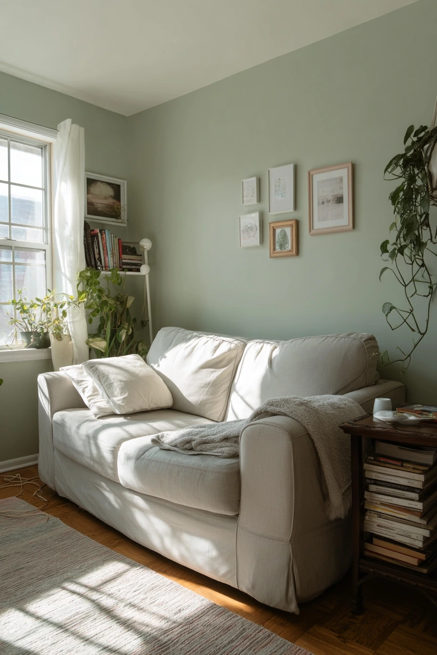
Soft sage is a gentle green that makes a small living room feel calm and fresh. It is a good choice for renters who want color that still reads as neutral. With a compact sofa, thrifted side table, and a simple peel-and-stick gallery wall, sage adds life without making the room feel busy.
Morning window light looks great on this color. You can even see faint plant shadows from a trailing pothos, which gives the wall quiet texture. Soft sage also works with everyday clutter in a realistic way, like stacked paperbacks, a charging cable by the armrest, and a slightly wrinkled throw.
To style it, use warm whites, light woods, and black accents in small amounts. Keep frames simple and match the mat color so the gallery wall feels tidy. If your room is narrow, use one large mirror or one tall plant to pull the eye up.
- Choose warm white curtains to soften the green and brighten the room.
- Add thrifted wood pieces for warmth and a more homey feel.
- Use peel-and-stick frames or lightweight frames for renter-friendly art.
- Bring in one pothos or snake plant to echo the wall color.
- Keep throws and pillows in cream, tan, and soft gray for balance.
Pro Design Tip: If sage looks too cool, add warmer bulbs in your lamps and pick fabrics with beige undertones to keep the room from feeling minty.
Budget Considerations: For renters, use removable wallpaper panels or paint one large foam board in sage and lean it behind the sofa for a color moment without painting walls.

3. Clay Blush Living Room Paint for a Cozy Evening Corner
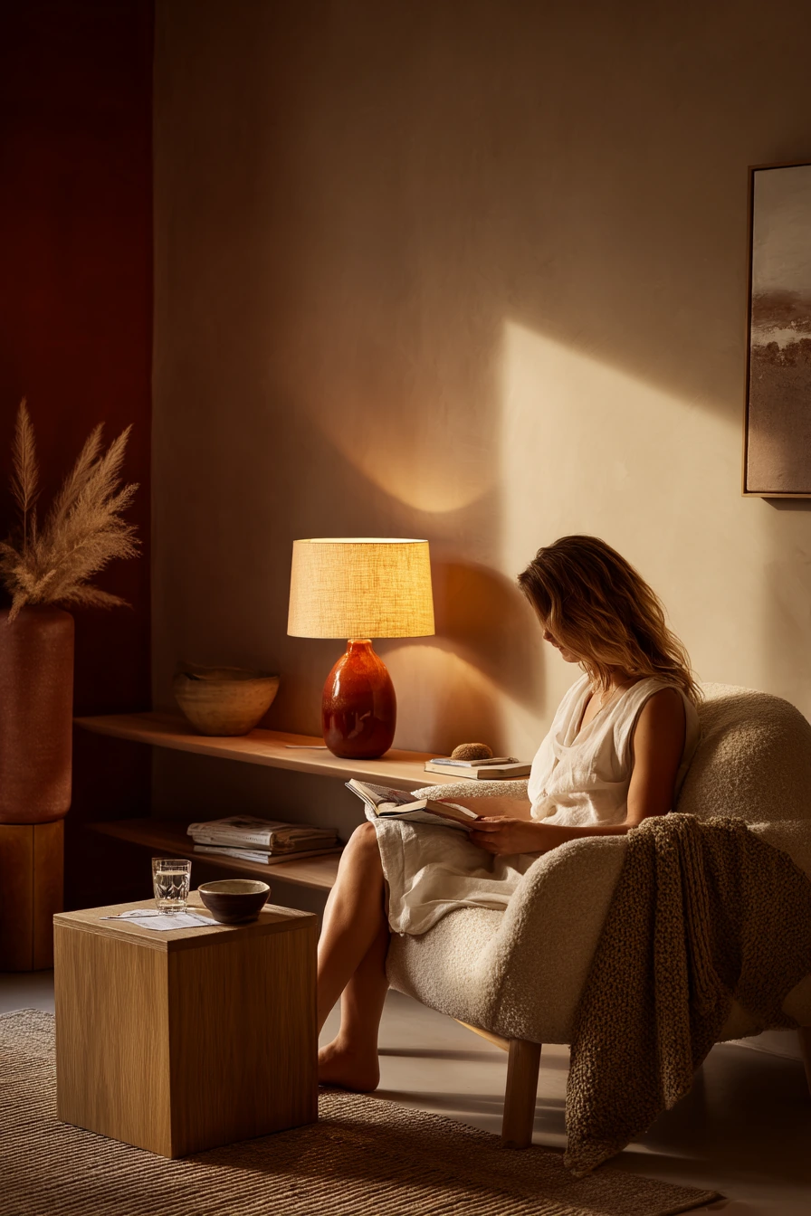
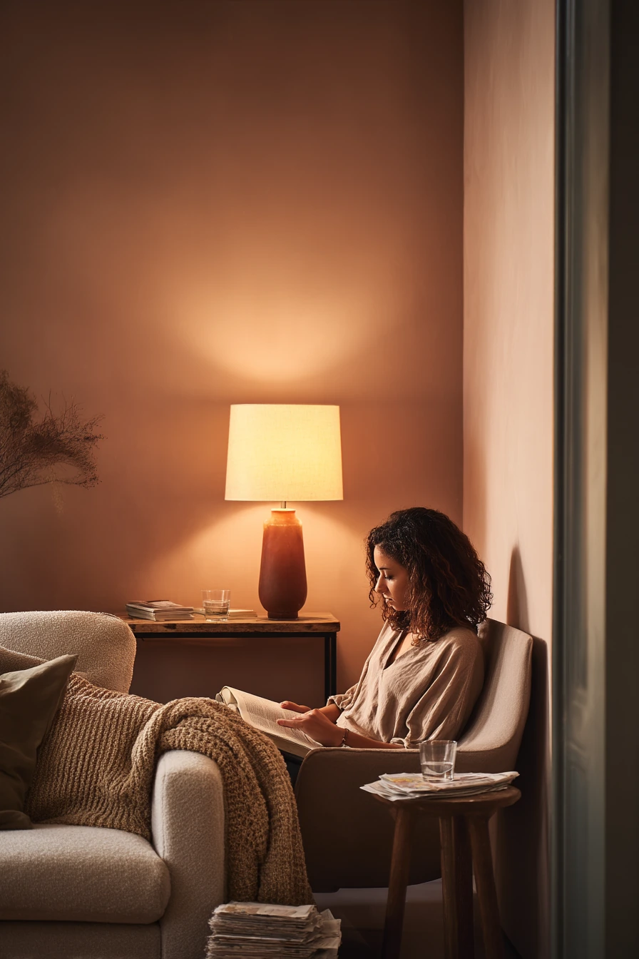
Clay blush is a muted pink with earthy warmth. It can make a small apartment living room feel soft and personal, especially at night. With a boucle chair, a low walnut shelf, and a ceramic vase, this shade creates a warm evening mood that still feels grown up.
This color is great when your lighting is mixed, like an amber table lamp plus fading daylight. The wall looks smooth, but still shows cozy shadows and real texture. It also pairs well with small daily items you cannot hide, like a water glass on a side table and a small stack of mail near the sofa.
To style it, keep your wood tones rich but not too dark. Walnut, medium oak, and warm bamboo work well. Use creams and warm grays for textiles, then add small black details for definition, like a picture frame or a lamp base.
- Use a warm lamp shade to make the blush feel deeper at night.
- Pair with walnut or medium wood shelves for grounded contrast.
- Add a knit blanket in oatmeal or cream to keep it soft.
- Choose simple ceramics in off-white, sand, or terracotta tones.
- Keep art minimal, like one print with warm neutrals and thin frames.
Pro Design Tip: Clay blush looks best when you repeat the color in tiny ways, like a pillow stripe or a book cover, so the wall does not feel random.
Budget Considerations: If you cannot paint, try a clay blush peel-and-stick mural behind the chair, or hang a large blush textile to get the same warm effect.

4. Cool Dove Gray Living Room Paint for a Clean Work-From-Home Feel


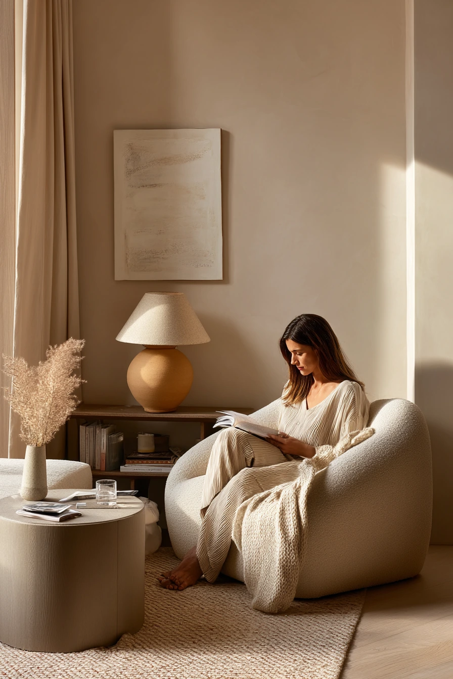
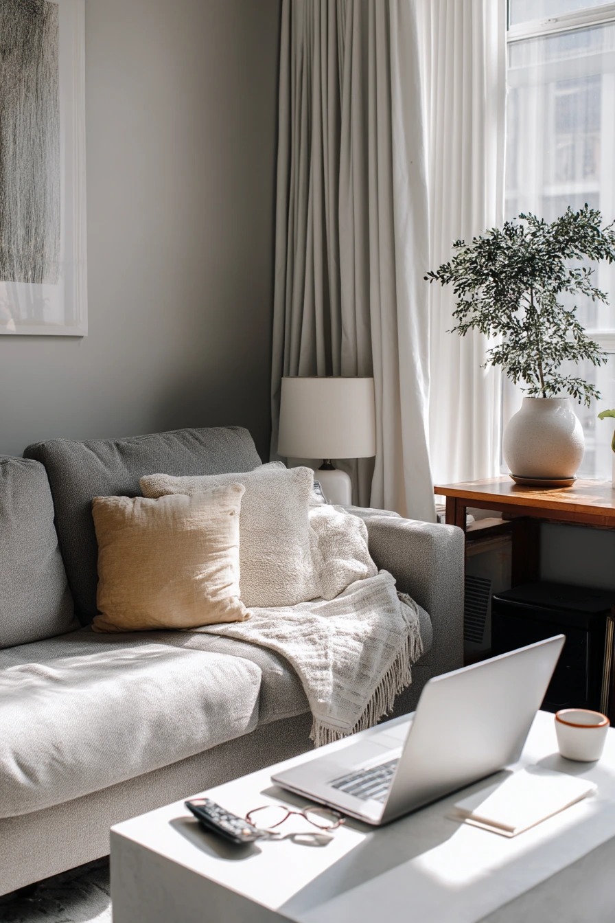
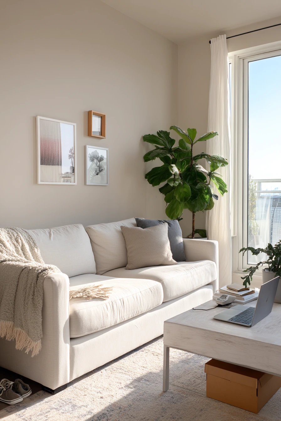
Cool dove gray is a crisp, quiet wall color that suits a neat living room and a work-from-home routine. It looks polished without feeling cold if you use the right textures. With linen curtains, a slim media console, and a sculptural plant, dove gray gives the room calm structure.
Late afternoon window light creates clean gradients on this paint, which makes the space feel orderly. It also supports practical items on display, like an open laptop on the coffee table, a notebook, eyeglasses, and the remote. Even a slightly crooked throw pillow can feel intentional against a steady gray background.
To style it, mix soft whites with light gray and add warm elements like oak, rattan, or beige. Keep patterns simple, like thin stripes or small checks, so the room stays serene. Use closed storage in the media console to reduce visual noise during the workday.
- Choose linen or cotton curtains in warm white for softness.
- Add a light wood coffee table to warm up cool gray walls.
- Use one large plant with a sculptural shape for a clean focal point.
- Keep desk items in a tray so the coffee table stays tidy.
- Layer a textured rug to prevent the room from feeling flat.
Pro Design Tip: With cool dove gray, pick a white trim that is not too bright, because a stark white can make the gray read bluer in daylight.
Budget Considerations: Swap small items first, like curtain panels and pillow covers, before replacing furniture; these changes often fix a too-cool gray room for less money.

5. Muted Olive Living Room Paint for a Library-Style Cozy Room


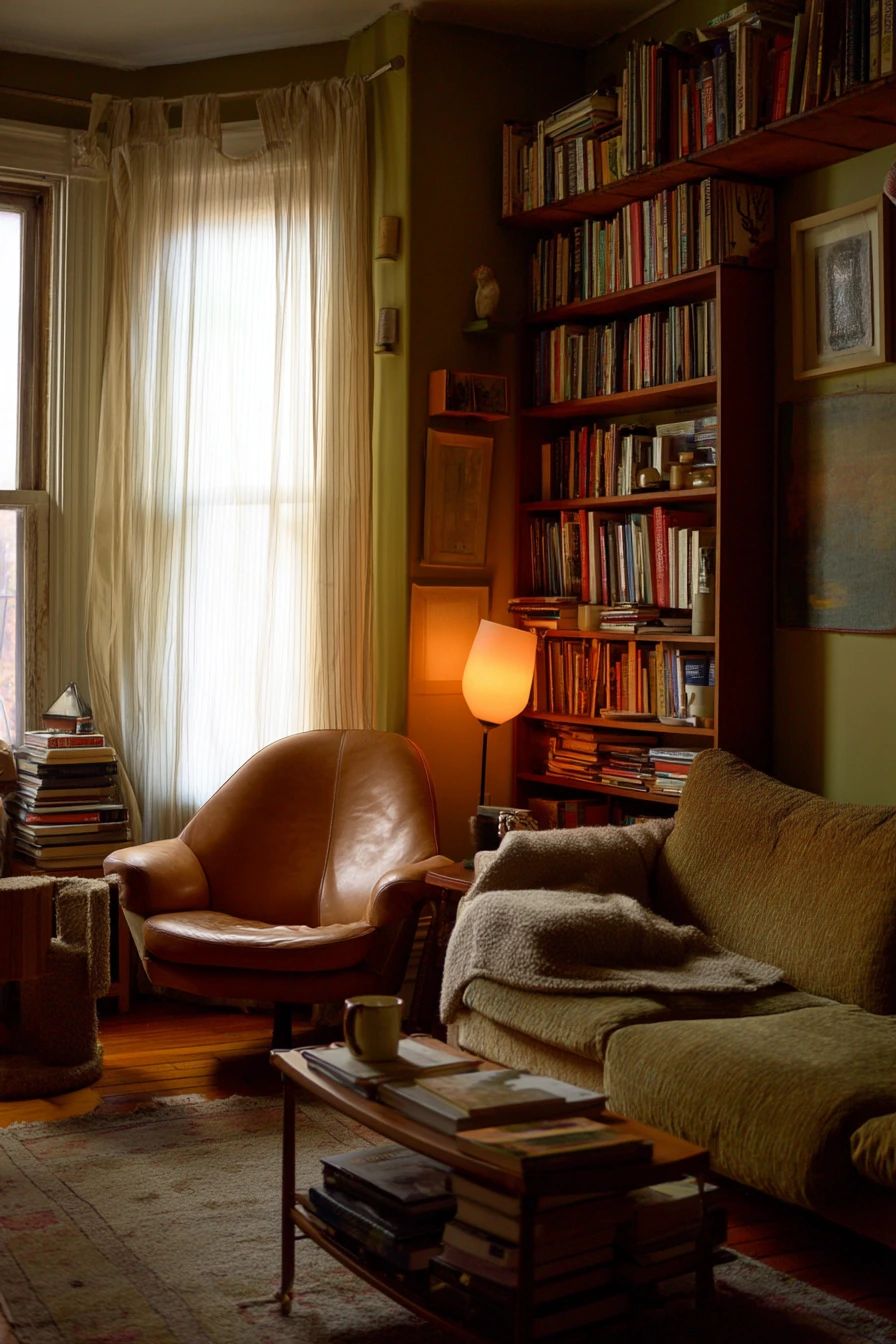
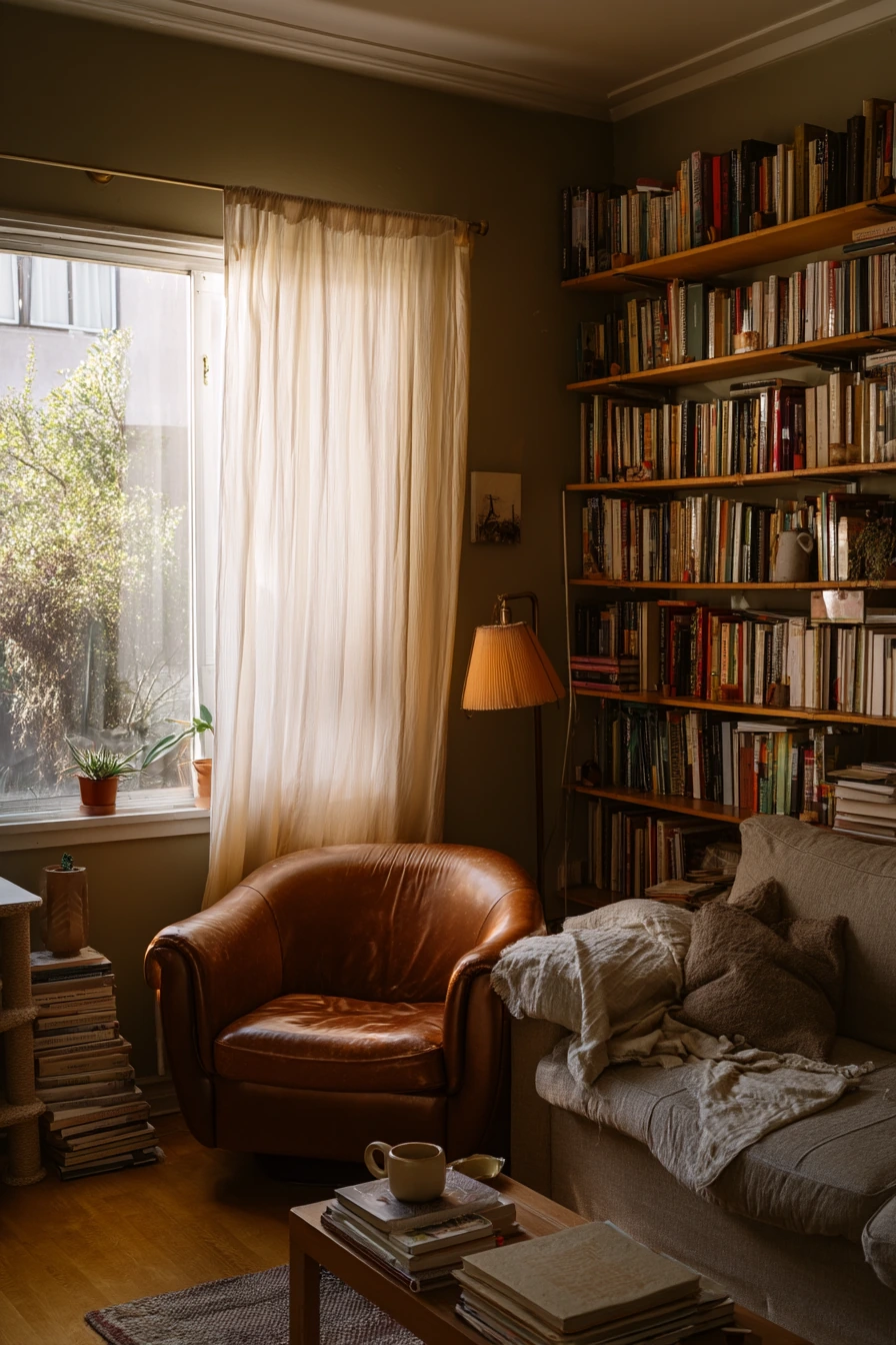
Muted olive is an earthy green that feels deep, steady, and comforting. It is perfect for a living room that is heavy on books and comfort, with wall-to-wall shelves and a worn leather chair. This color makes the room feel like a quiet place to land at the end of the day.
Olive walls work well with soft window light through sheer curtains, plus warm lamp glow near dusk. The paint looks rich without needing shine, and it pairs naturally with lived-in pieces like stacked novels on the floor, a folded blanket, and a cat scratching post in the corner.
To style it, lean into warm materials. Leather, aged wood, brass, and creamy textiles keep it welcoming. Add a rounded sofa or curved shapes to soften the darker wall color. If the room feels too heavy, use lighter rugs and art with plenty of negative space.
- Use warm lighting, like soft white bulbs, to keep olive from feeling muddy.
- Pair with leather and wood for a classic, cozy look.
- Style shelves with a mix of vertical and horizontal book stacks.
- Add a light rug to brighten the floor and balance the walls.
- Bring in one or two ceramic pieces to add matte texture.
Pro Design Tip: Paint the shelves the same muted olive as the walls for a built-in look that hides visual clutter and makes the room feel larger.
Budget Considerations: If built-ins are not in the budget, line one wall with matching bookcases from a big-box store and paint them to blend with the olive walls.
6. Buttercream Living Room Paint for a Bright Kid-Friendly Space

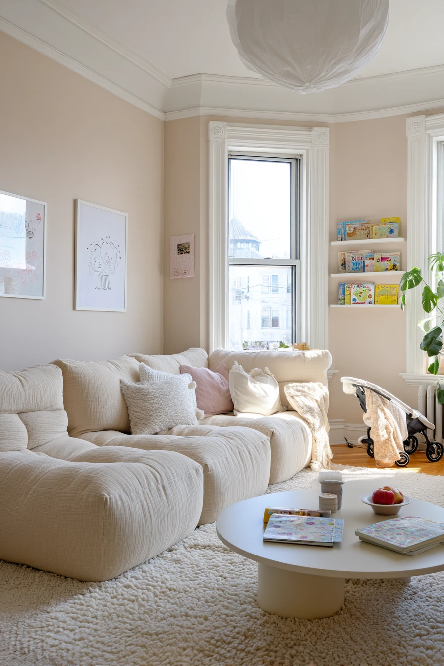
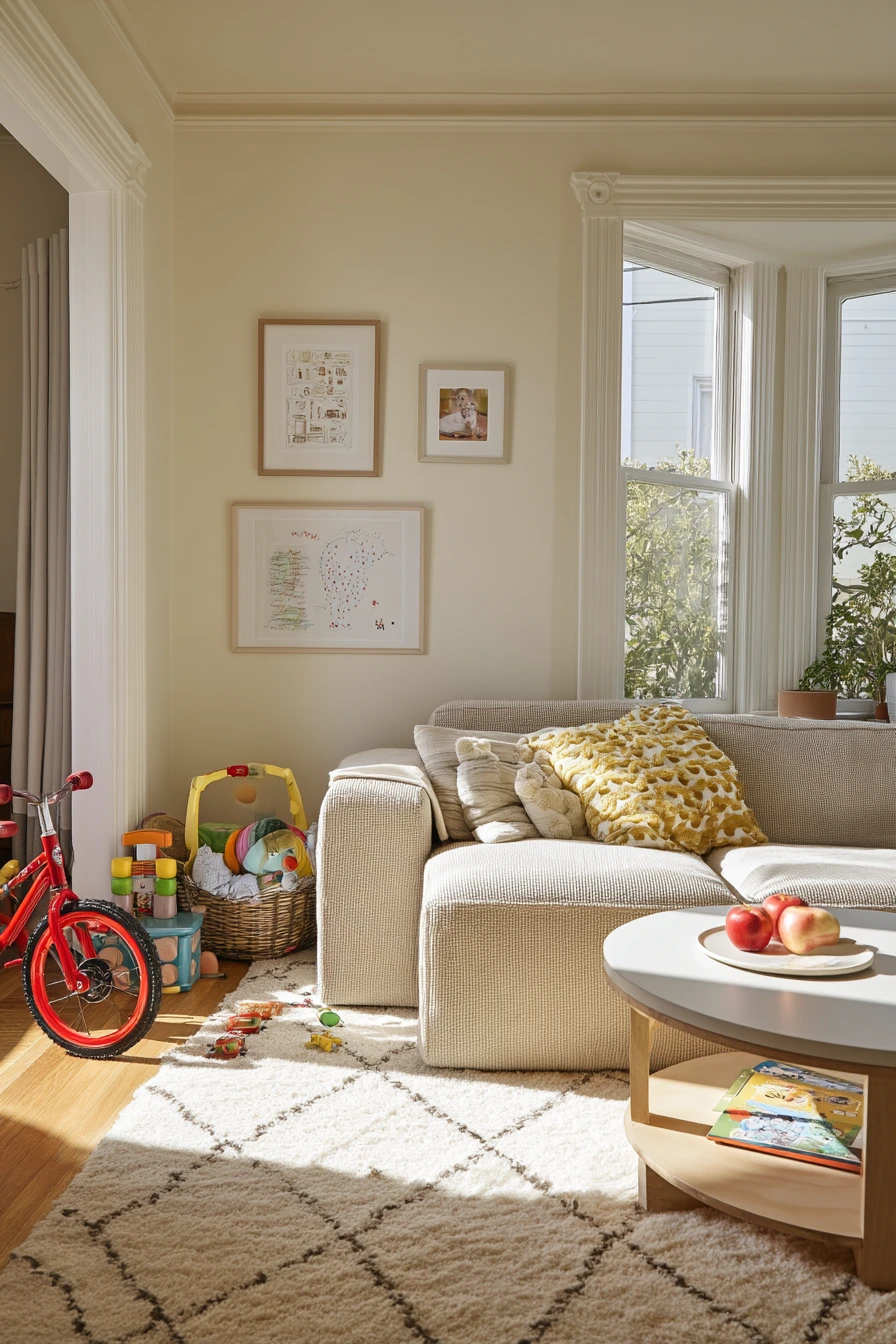
Buttercream is a soft, warm yellow that makes a living room feel sunny without being loud. It is a strong choice for a young family space where the room needs to handle real life. With a modular sofa, rounded coffee table, washable rug, and a toy basket that is half spilled, buttercream keeps the mood cheerful and gentle.
This paint looks best in morning light because it brightens the walls without harsh glare. It also makes small details feel sweet and human, like a kid’s drawing taped to the wall, a stroller by the entry, and a half-eaten apple on a plate. Buttercream helps the room feel welcoming even when it is not perfect.
To style it, use warm whites and light woods, then add a few playful colors in small doses, like dusty blue, sage, or terracotta in pillows and art. Keep large furniture neutral so the room does not turn chaotic. Use storage you can reach fast, like baskets with handles and ottomans with lids.
- Pick a washable rug with a simple pattern to hide stains.
- Use baskets for toys so clean-up is quick.
- Choose a modular sofa that can shift for play space.
- Add rounded tables to reduce sharp corners in a kid zone.
- Hang art low or use tape for kids’ drawings to make it feel personal.
Pro Design Tip: Buttercream can look too strong at night, so use warm, dimmable lamps instead of bright overhead lights to keep the color soft.
Budget Considerations: If repainting often is not possible, choose a durable scrubbable paint finish and keep extra paint for quick touch-ups around baseboards.

7. Dusty Blue Living Room Paint for a Relaxed Coastal Style


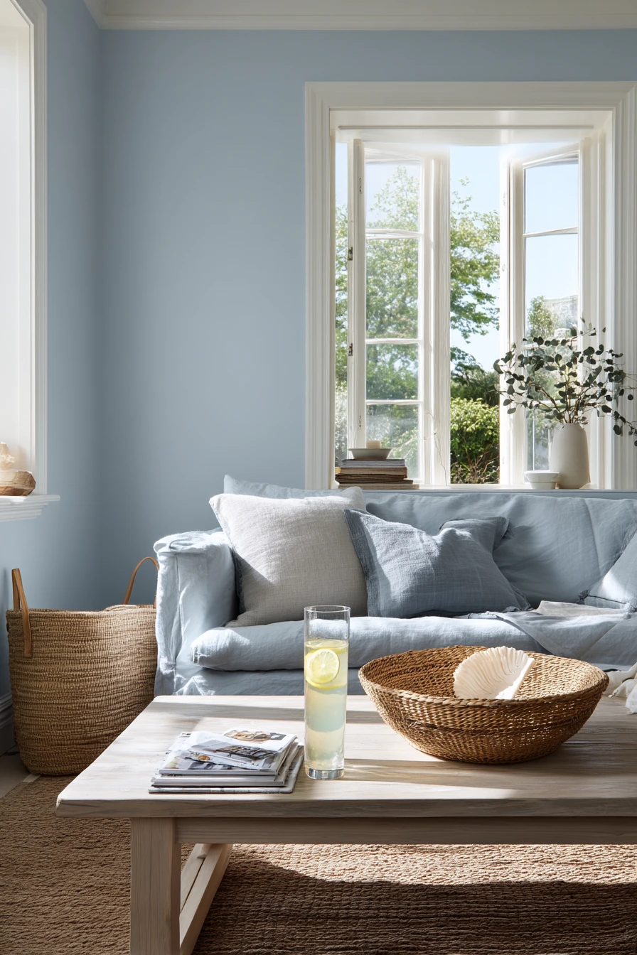
Dusty blue is a sun-faded, matte wall color that fits a relaxed coastal-inspired living room. It feels cool and airy without being icy. With a slipcovered sofa, pale wood coffee table, woven tray, and a seashell bowl, dusty blue sets a slow weekend tone.
Natural window light highlights the paint finish and makes the wall color look soft, not shiny. This shade also works well with casual items that show real life, like stacked magazines, a beach tote by the chair, and a lemonade glass with condensation. It gives the room a clean backdrop while still feeling comfortable.
To style it, mix whites, sandy beiges, and light woods. Add woven textures like jute, cane, and seagrass to keep the look grounded. If the room leans too cool, bring in warm accents like a tan throw or a light oak frame.
- Use slipcovers in warm white for an easy, washable look.
- Add pale wood furniture to keep the room bright.
- Style a woven tray with coasters and one small vase for order.
- Choose art with soft horizons, beach tones, or simple line drawings.
- Layer in jute or flatweave rugs for a coastal feel without theme decor.
Pro Design Tip: Dusty blue looks more expensive when you keep contrast low, so choose trim, curtains, and rugs in soft whites instead of bright white.
Budget Considerations: Skip pricey coastal decor and focus on texture; thrifted baskets and simple linen-look curtains can give the same relaxed style for less.

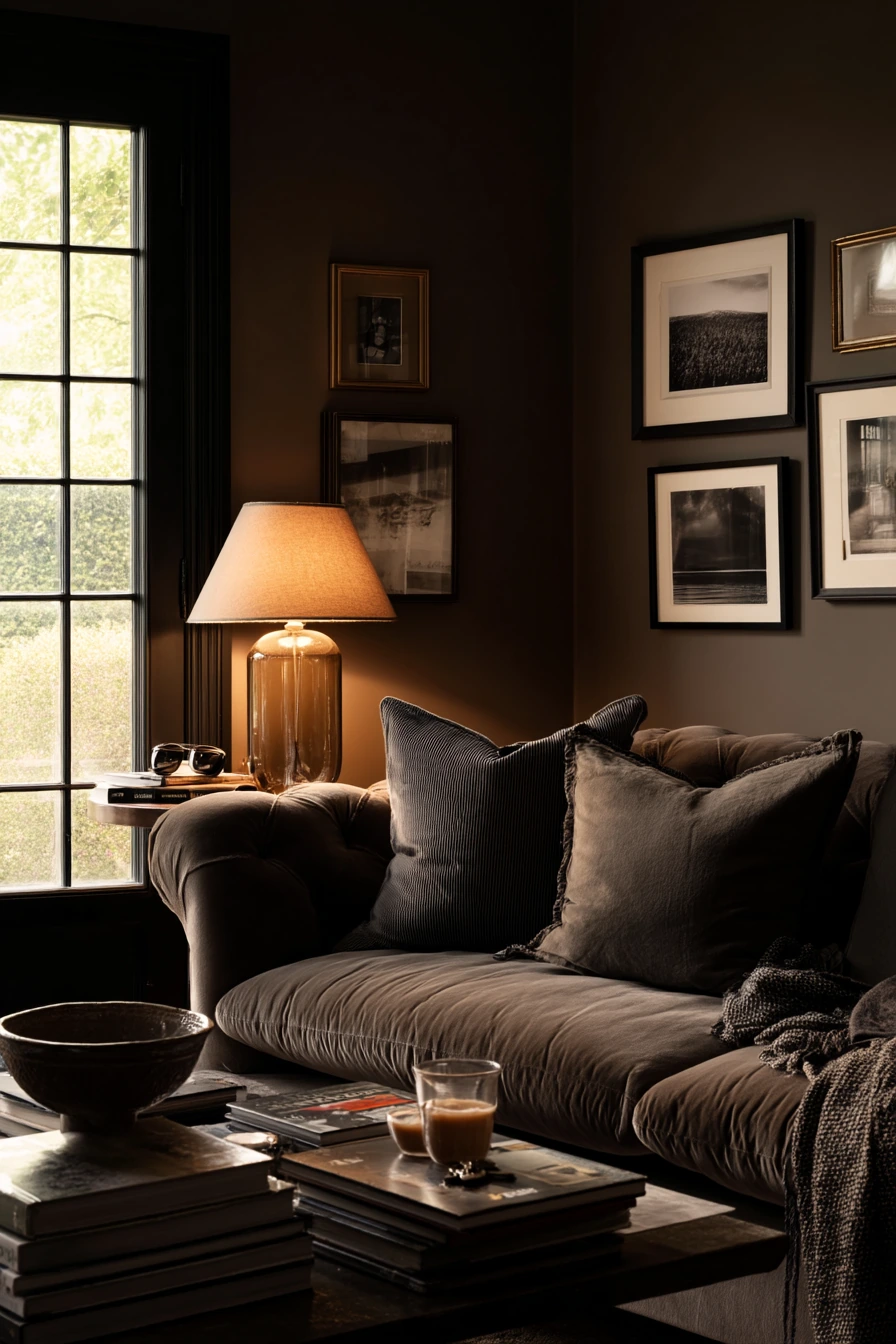
8. Deep Taupe Living Room Paint for a Moody, Intimate Look
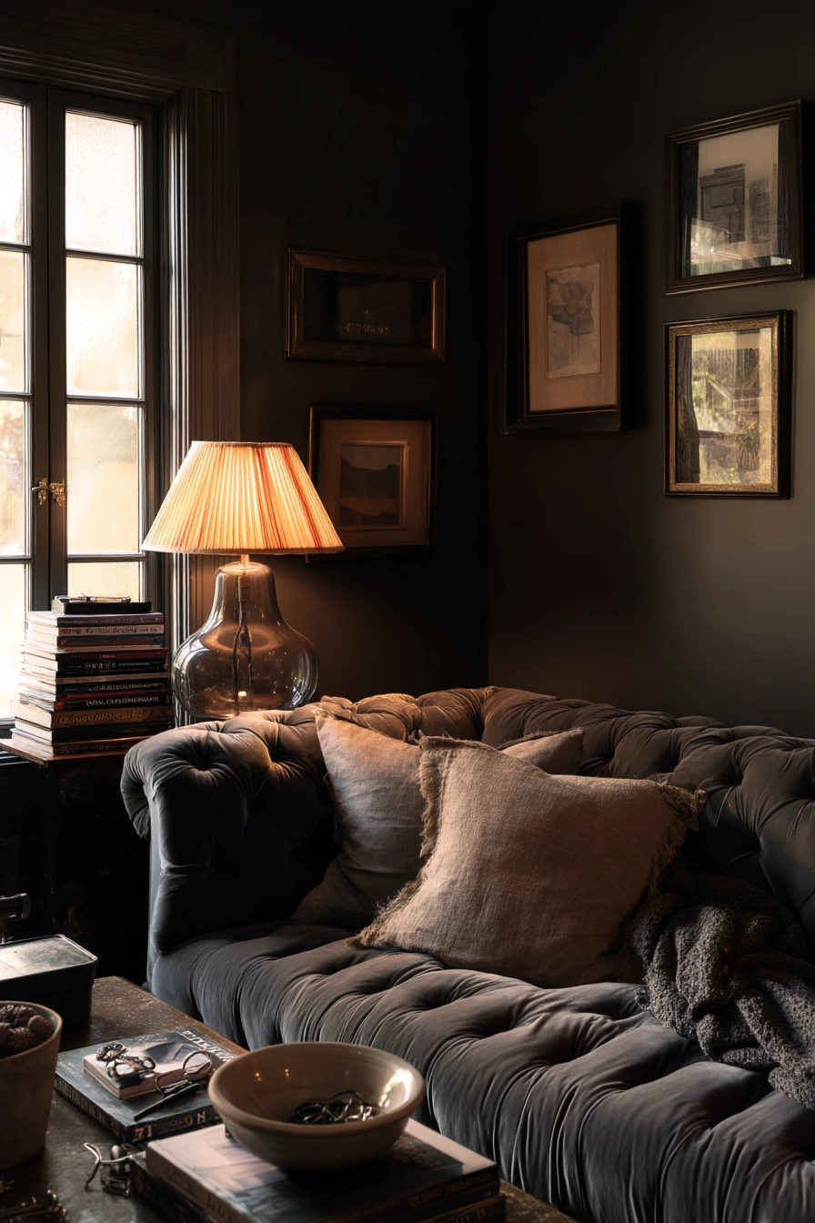
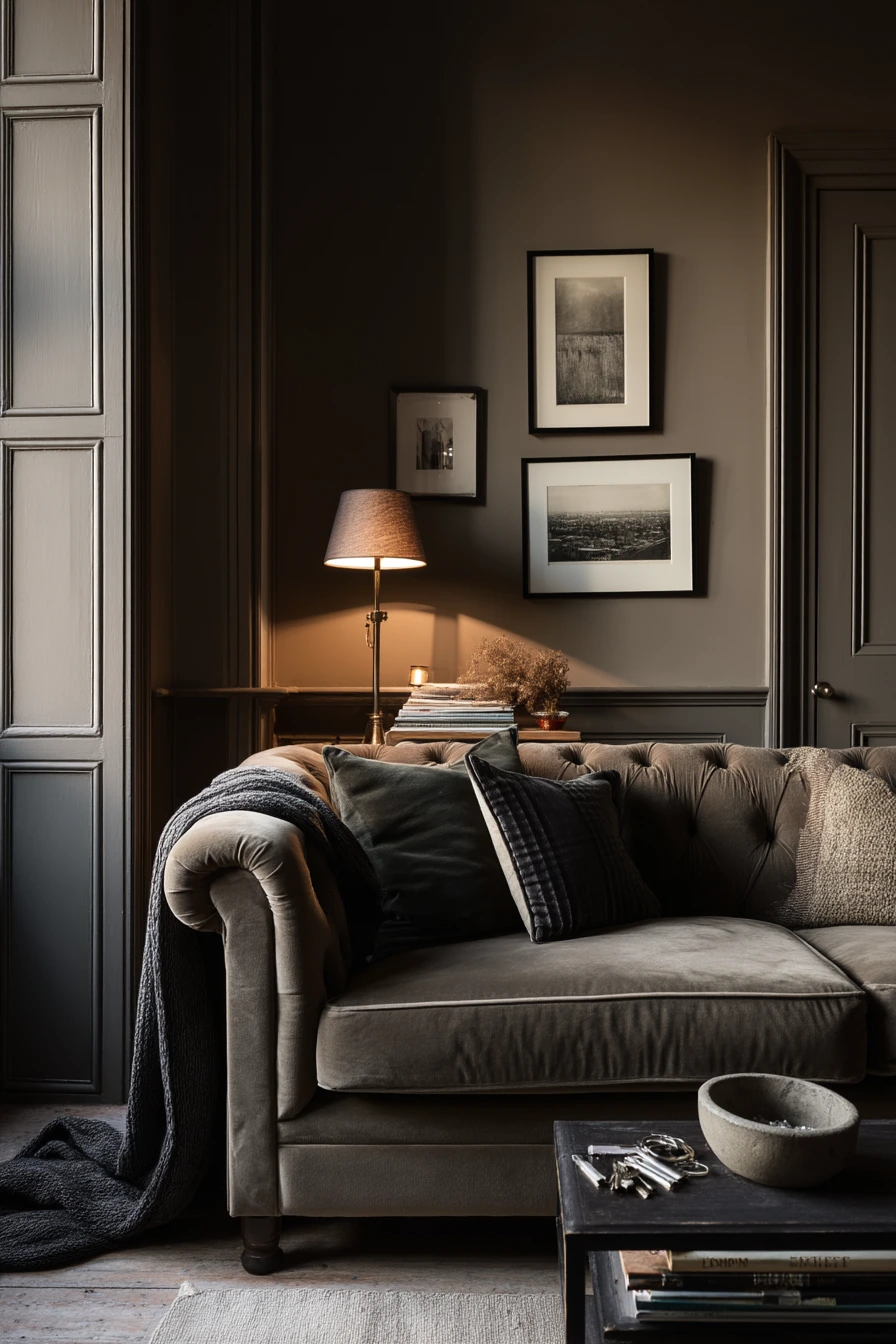
Deep taupe is a rich neutral that makes a living room feel intimate and calm. It works well for slow evenings and quiet conversation. With a velvet sofa, smoked glass lamp, and framed black-and-white photos, deep taupe creates a layered, velvety backdrop that still feels like a real home.
This color shines when you mix warm lamp light with fading window light. The wall color holds shadows well, which adds depth without needing lots of decor. It also hides everyday items in a tidy way, like stacked board games, a half-folded blanket, reading glasses on the side table, and a ceramic bowl for keys.
To style it, add contrast on purpose. Use lighter textiles like cream or camel, and bring in metal accents like brushed brass or black. Keep your art simple and graphic to avoid visual clutter. If you worry the room will feel dark, use mirrors, light rugs, and a few tall lamps.
- Choose warm bulbs to make taupe feel cozy, not flat.
- Pair with velvet or textured upholstery for a soft, moody look.
- Use black-and-white photos to add clean contrast.
- Add a light rug to lift the floor and balance dark walls.
- Keep small clutter in trays or bowls so surfaces feel calm.
Pro Design Tip: Paint the ceiling one shade lighter than the walls to keep the room cocooning but not heavy.
Budget Considerations: If repainting the whole room is costly, create a deep taupe accent wall behind the sofa and use darker curtains to extend the moody effect.

9. Pale Sand Living Room Paint for a Simple First-Home Neutral
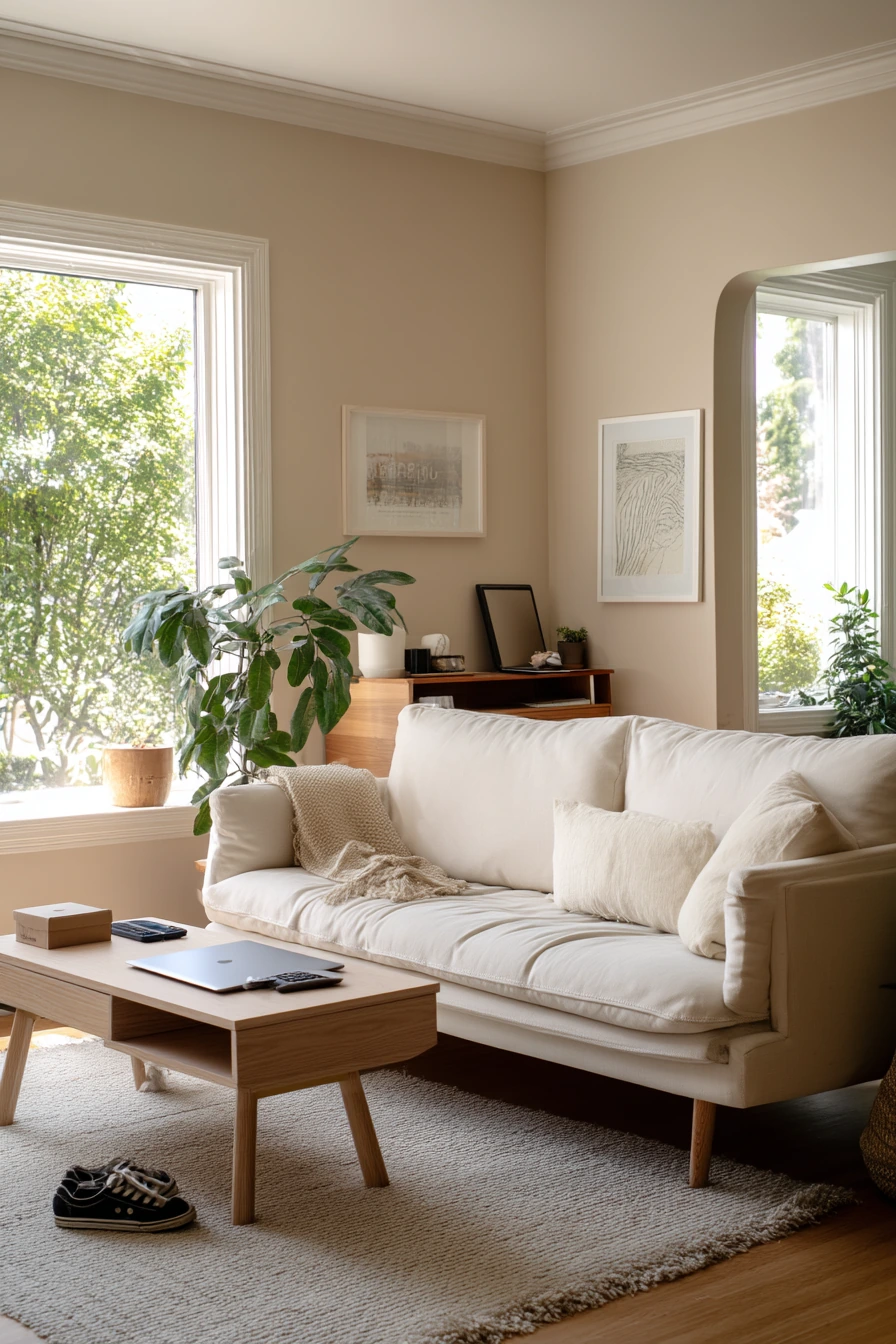
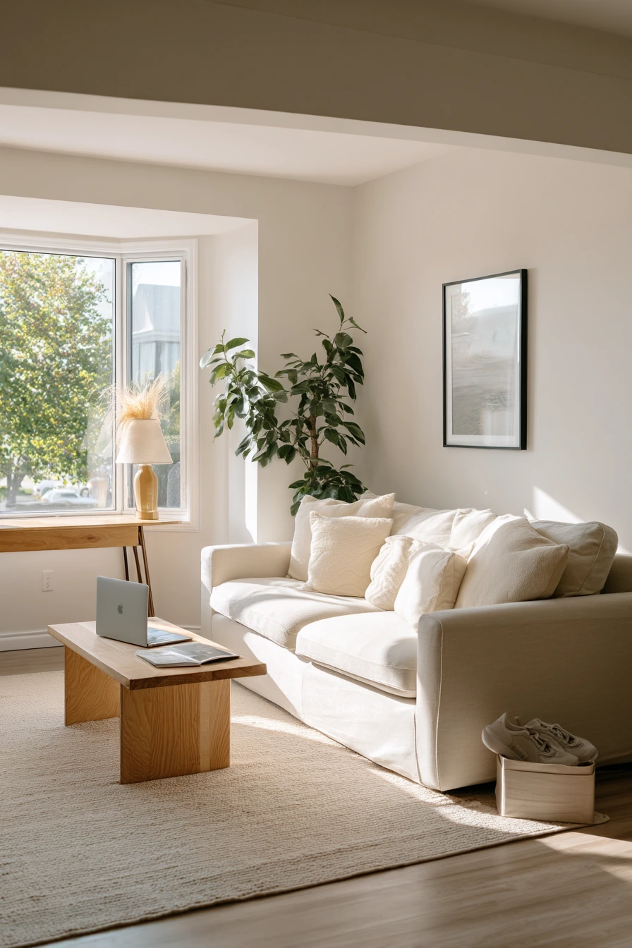
Pale sand is a soft neutral that feels clean, light, and hopeful. It is a smart living room paint color idea for a first home because it works with almost any furniture style. With an affordable sofa, a secondhand coffee table, and one large plant, pale sand keeps the space unfussy and warm.
Late morning light makes this shade glow gently, and a matte finish helps hide small wall imperfections. It also makes room for everyday life, like a laptop charging on the floor, sneakers by the rug, and a delivery box tucked near the console. Pale sand does not demand perfection, which is helpful when you are still building your home.
To style it, focus on a few strong pieces instead of lots of small decor. One large plant, one simple art print, and one good rug can do most of the work. Add black or dark bronze accents for structure, and repeat wood tones to keep it cohesive.
- Choose a rug with warm beige tones to match the walls.
- Add one large plant for color and height.
- Use secondhand wood furniture and keep finishes similar.
- Pick one small art print and give it space on the wall.
- Create a simple drop zone with hooks or a basket near the entry.
Pro Design Tip: With pale sand walls, add contrast at eye level, like darker pillows or a medium wood console, so the room does not feel washed out.
Budget Considerations: Spend on the rug first; a larger rug makes the whole living room look more finished, even with budget furniture.

10. Soft Terracotta Living Room Paint for a Warm Hosting Space
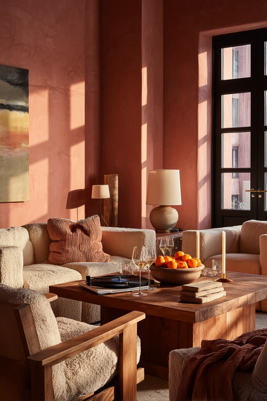

Soft terracotta is a warm, friendly paint color that supports a social living room. It brings a gentle clay tone that feels inviting for Friday night hosting. With mismatched armchairs, a low sofa, and a record player, terracotta adds energy without looking too bright.
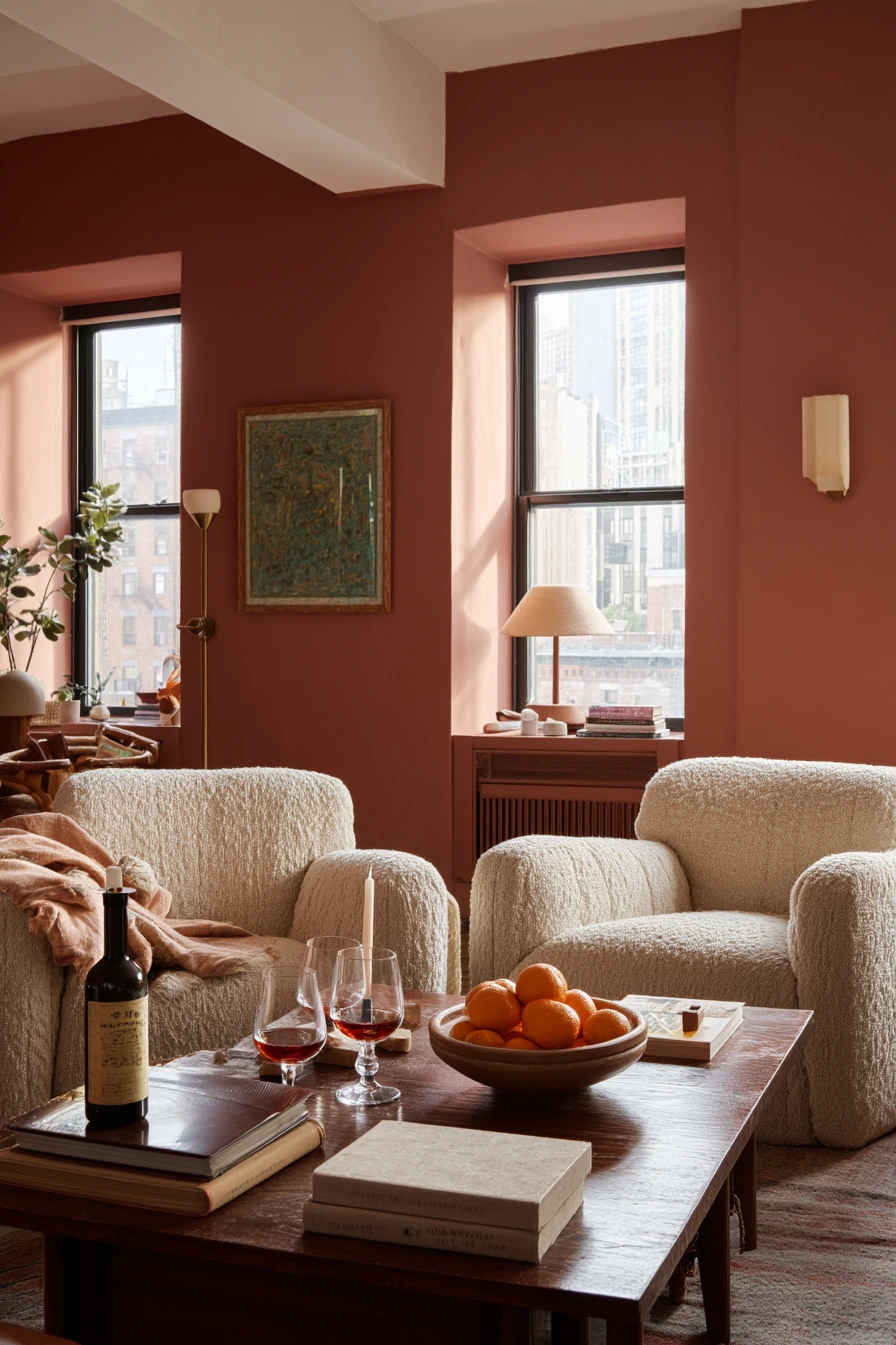
This color looks best at dusk when natural light fades and lamps add amber depth. It also fits the reality of a lived-in party space, like candle stubs, wine glasses, stacked coasters, and a throw draped over the arm. A shallow bowl of oranges ties in naturally with the wall color and adds a fresh styling touch.
To style it, keep your biggest items simple and let the wall color carry the warmth. Use creams, warm whites, and caramel tones in textiles. Add a few black accents to sharpen the look, like frames or a record stand. If the room is small, use fewer, larger decor pieces to avoid clutter.
- Use warm white curtains to soften terracotta walls.
- Mix wood tones, but keep them in the warm family for balance.
- Style the coffee table with coasters, one bowl, and one candle tray.
- Add extra seating with small stools that tuck away.
- Use layered lighting so the room stays cozy at night.
Pro Design Tip: Terracotta pairs well with muted greens; add one olive or sage pillow to balance the warmth and make the palette feel intentional.
Budget Considerations: If you cannot buy new chairs, slipcover mismatched seating in similar warm neutrals and let the terracotta walls unify the look.

These living room paint color ideas are meant to work in real homes, with real routines and real clutter. Start by matching the shade to your light and how you use the room each day.
If you want the easiest choice, warm greige or pale sand are flexible neutrals. If you want more personality, try soft sage, dusty blue, clay blush, muted olive, deep taupe, buttercream, or soft terracotta.
Before you commit, test paint samples on more than one wall and check them in morning, afternoon, and evening light. Small styling changes like better lighting, a larger rug, and simple storage can make the color look finished fast.
FAQ
1) What is the best living room paint color for resale value? Warm greige and pale sand are safe choices because they work with many furniture styles and look good in most light.
2) How do I choose a paint color for a small living room? Pick a softer mid-tone like soft sage or pale sand, then use warm white trim and mirrors to keep the room open.
3) What paint colors make a living room feel cozy? Deep taupe, muted olive, and clay blush can feel cozy, especially with warm lighting and textured fabrics.
4) Should my living room be lighter or darker than the rest of the house? Either can work, but keep the undertones similar so rooms connect. You can go darker in the living room if nearby spaces are light.
5) What undertone problems should I watch for? Greige can turn gray in shadow, dove gray can look blue, and buttercream can look stronger at night. Always test in your own light.
6) What is the most renter-friendly way to add paint color? Try peel-and-stick wallpaper, removable panels, or painting large boards you can lean behind the sofa instead of painting walls.
7) What finish is best for a busy living room? A washable eggshell or satin finish is easier to clean than flat paint, especially with kids and pets.