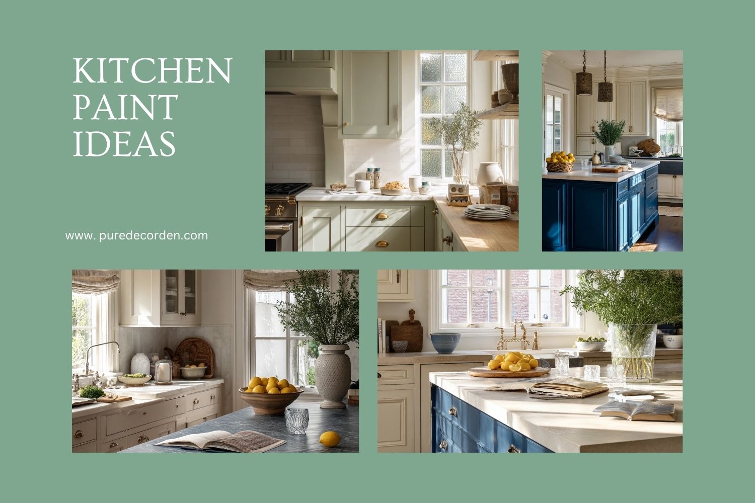

Looking for kitchen paint ideas that feel real, not showroom perfect. The right color can make a kitchen look brighter, larger, and easier to live in, even when there are lunch boxes on the counter and towels on the oven handle.
This guide walks through 10 paint looks inspired by everyday kitchens, from soft sage cabinets and warm white rentals to deep blue islands and timeless cream. Each section includes simple styling ideas you can copy with the items you already use, like open shelves, brass pulls, and a butcher block island.
You will also get practical paint tips for renters and homeowners, plus quick ways to match hardware, counters, and lighting. If you came from Pinterest, you can use these ideas to pick a color fast and plan the rest without overspending.
Use the headings to jump to the vibe you want, then save the tips for your paint day checklist.
1. Soft Sage Kitchen Cabinets for a Calm Family Look

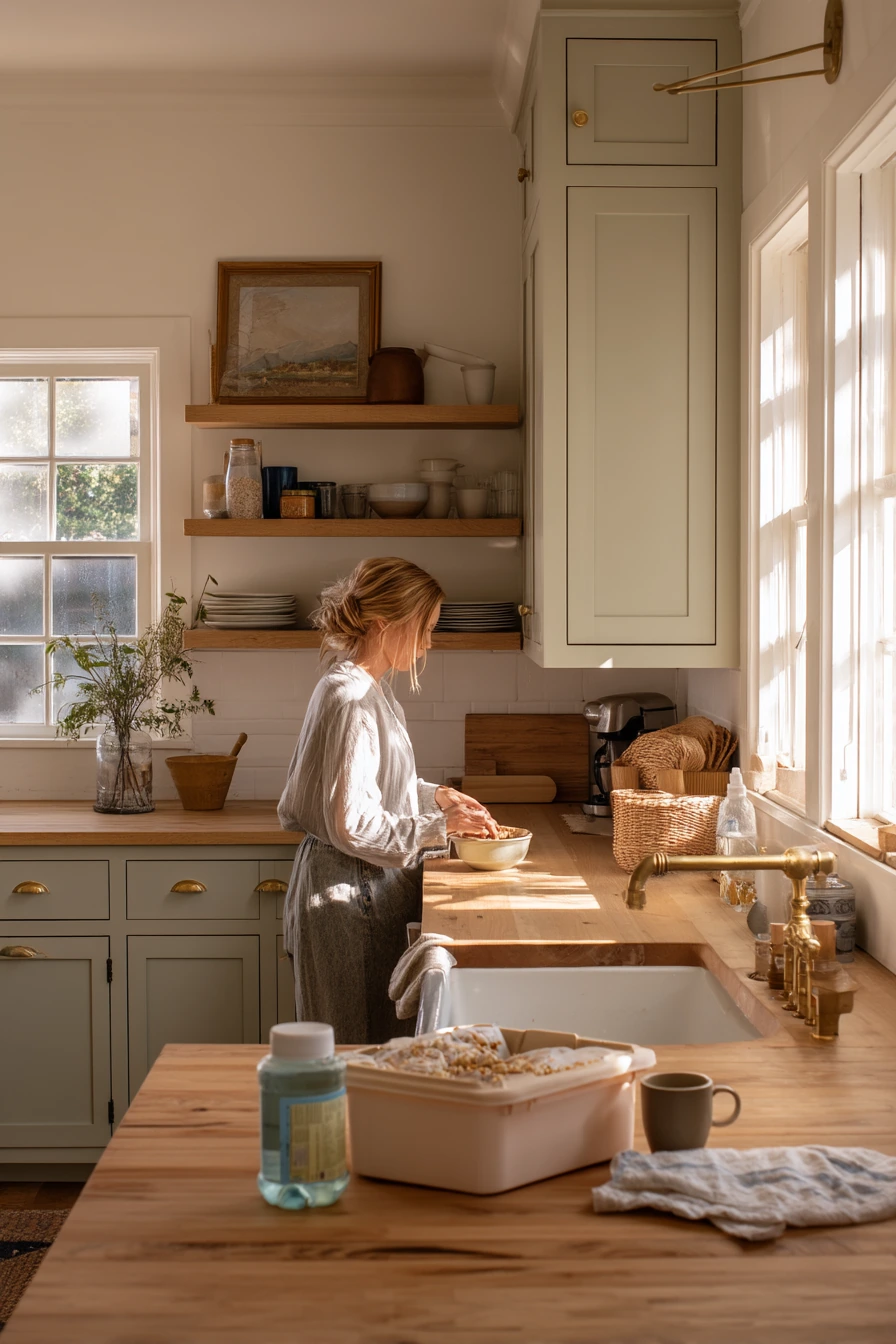
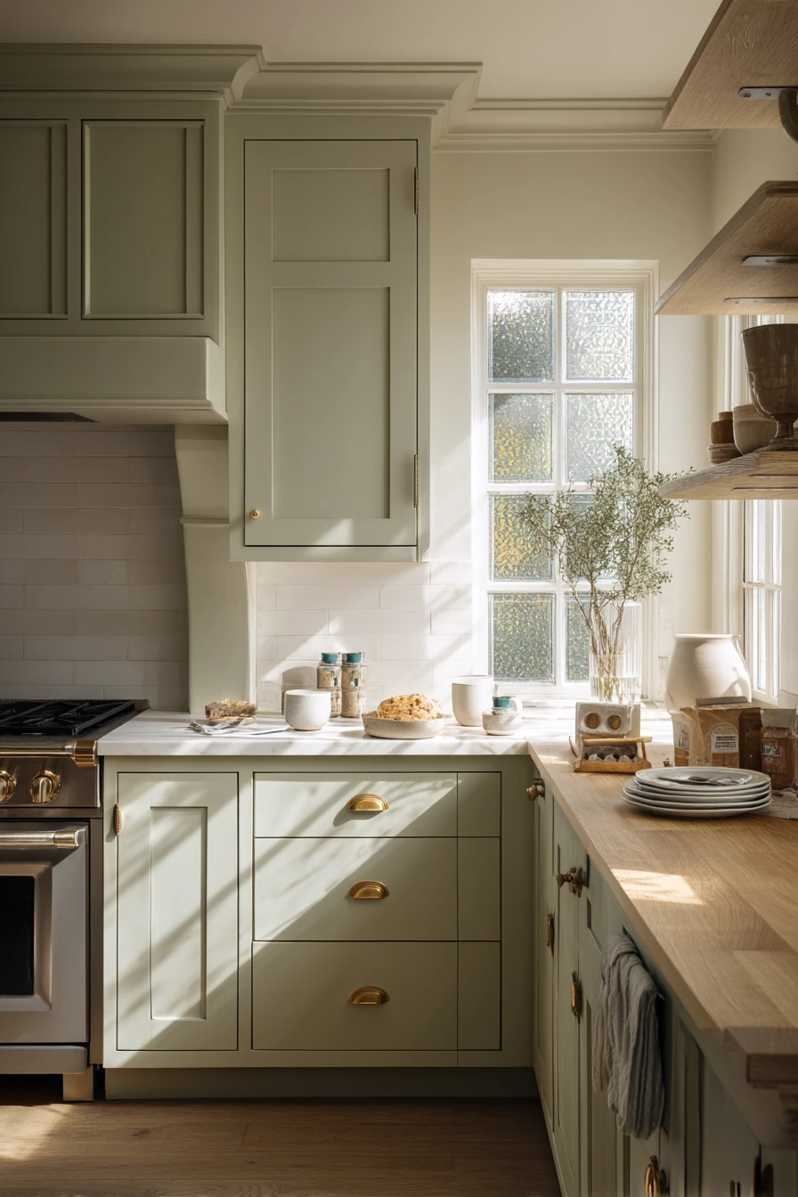
Soft sage painted cabinets are a smart choice when you want color but still need a calm, easy backdrop for busy mornings. In a real family kitchen, sage reads gentle in natural morning window light, especially when plant shadows fall across the wall. It pairs well with aged brass pulls, pale oak shelves, and a butcher block island, so the room feels warm instead of cold.
To make this look work, keep the supporting finishes simple and a little natural. Pale oak shelves bring in light wood tone and help the sage feel fresh. Aged brass hardware adds softness compared to shiny chrome, and it looks better with fingerprints and daily use. If your counters are already a mix of tones, sage is forgiving and helps everything feel tied together.
Style it like a lived-in kitchen, not a staged one. Leave a ceramic mug out, keep a folded dish towel over the oven handle, and store lunch items in one spot so the counter stays useful. Add one plant near the window for gentle shadows, and keep decor minimal so the paint color stays the focus.
- Test sage on two walls to see how it shifts from morning to evening light.
- Choose a warm white for walls so the green does not look gray.
- Use matching wood tones on shelves and stools for a steady, calm feel.
- Keep counters simple with one tray for breakfast basics.
- Pick aged brass pulls to soften the look and hide wear.
Pro Design Tip: Paint the island or base cabinets sage and keep uppers lighter if your kitchen does not get much sun, so the room stays open.
Budget Considerations: If new brass pulls are pricey, swap only the most used doors first and add the rest later, or use brass-look adhesive hardware in the short term.

2. Warm White Rental Kitchen Paint with Easy Upgrades

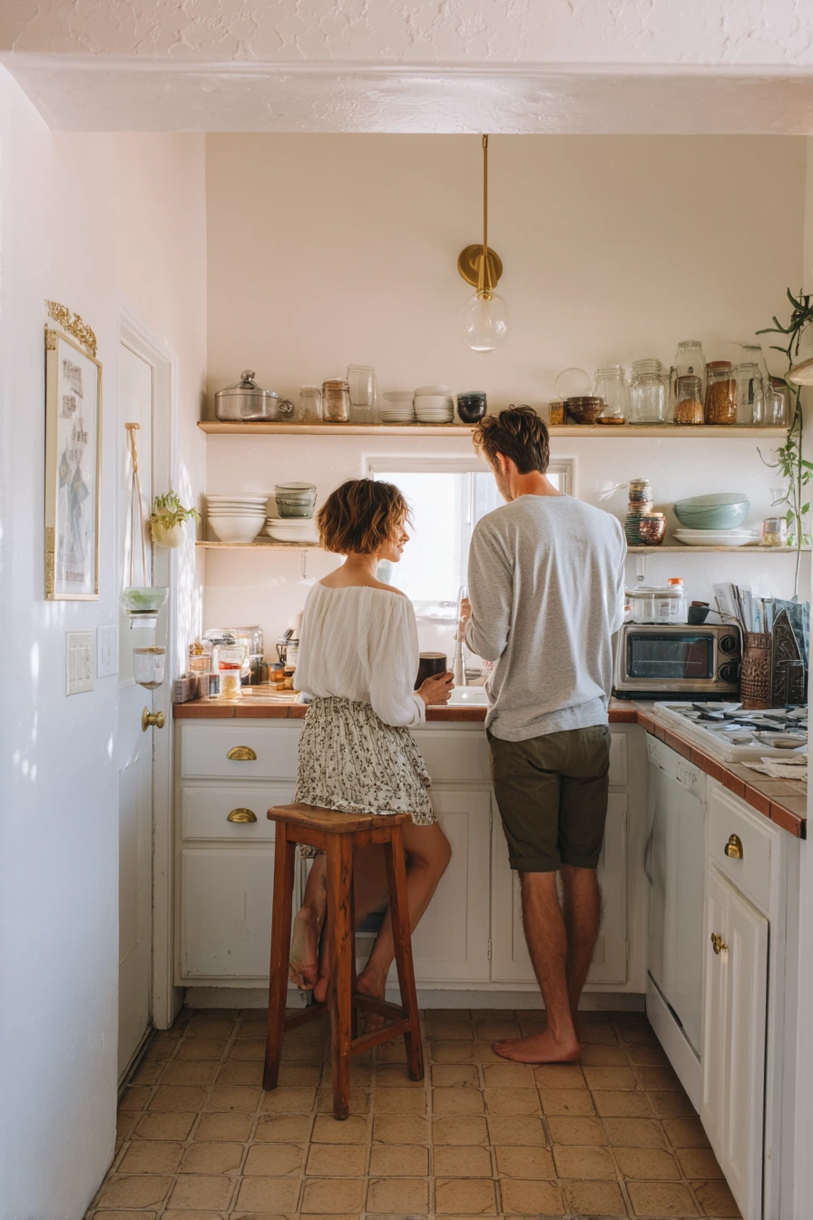
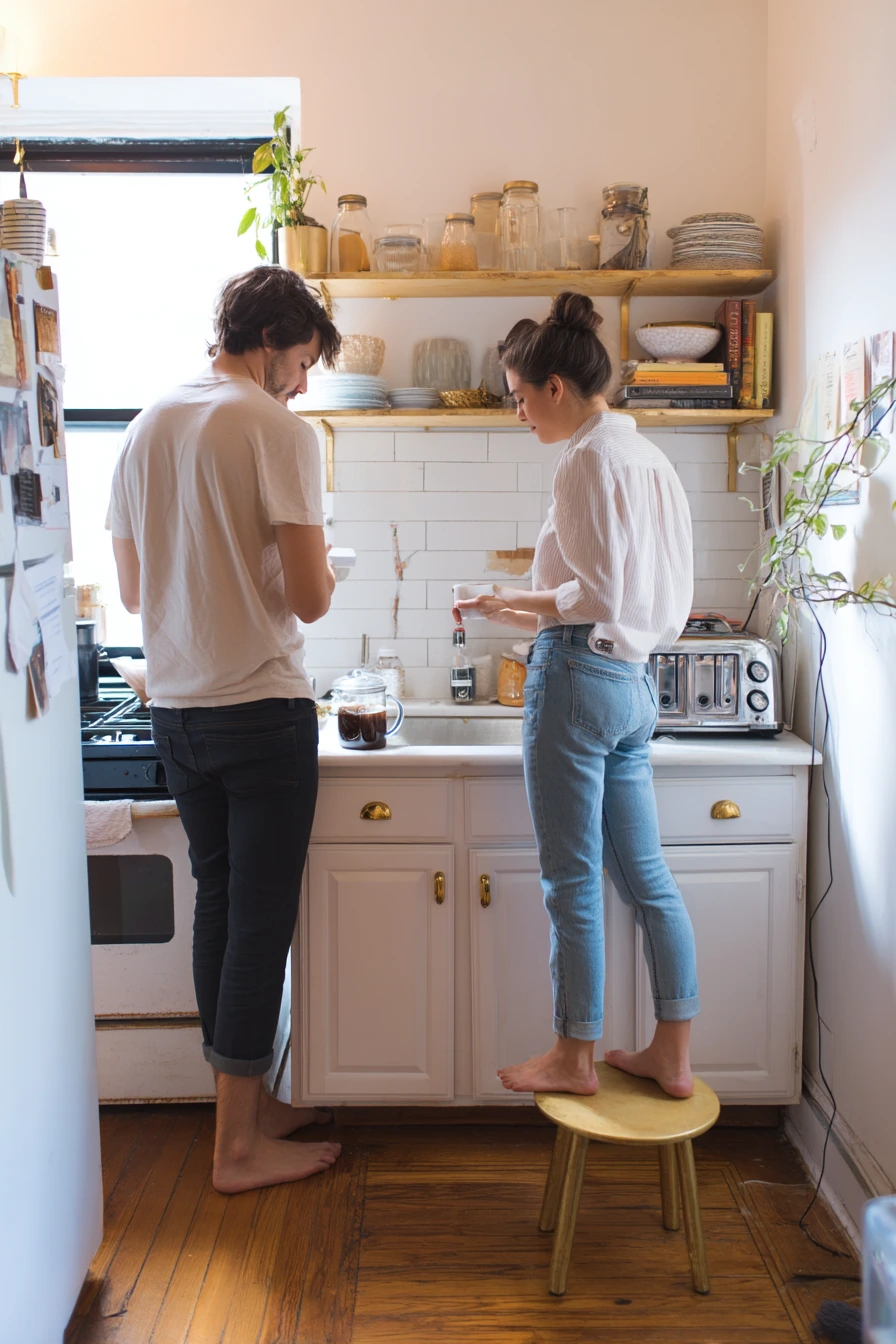
Warm white paint is one of the best kitchen paint ideas for a modest rental because it brightens the room without looking stark. It works with most countertops and floors, and it makes small spaces feel cleaner even when life is happening, like a charging cable by the toaster or a half-read cookbook on the counter. In soft late-morning light, warm white keeps the space airy and practical.
To add personality without major work, bring in peel-and-stick brass hardware and open shelves with mismatched bowls and glass jars. The mix of textures is the charm. A thrifted wood stool adds warmth and gives you a spot for quick tasks, like setting up coffee before work. If your cabinets are dated, warm white can make them look newer without replacing them.
Style this look with small, useful items. Keep one plant leaning toward the window for life and color. Use a simple tray to hold coffee gear so the counter does not feel cluttered. If you are sharing the space, pick one shelf for everyday dishes and another for pantry jars, so the open storage stays tidy.
- Choose a creamy warm white, not a bright blue-white, for rentals with cool light.
- Use removable, peel-and-stick hardware to get a brass look without drilling.
- Keep open shelves to two or three so the wall does not feel busy.
- Mix clear jars with labels to make pantry items look neat.
- Add one warm wood piece, like a stool, to balance the white paint.
Pro Design Tip: Use the same warm white on trim and cabinets for a smooth, built-in look, then add contrast with wood and brass.
Budget Considerations: If painting cabinets is not allowed, focus on washable warm white wall paint, stick-on hardware, and thrifted shelves you can take with you.

3. Deep Blue Kitchen Island with Creamy Uppers


A deep blue island is a strong focal point that still feels classic, especially when paired with creamy painted uppers. This combination works well in a suburban kitchen with soapstone counters and linen Roman shades because the finishes are quiet and grounded. In warm afternoon natural light, deep blue looks velvety and rich instead of harsh.
To keep the room balanced, let the island carry the bold color and keep the rest calm. Creamy uppers soften the contrast and help the kitchen feel bright. Soapstone or dark counters pair naturally with blue and hide daily marks. Add small lived-in touches, like a salt cellar and a water glass with condensation, to keep it welcoming rather than formal.
For styling, lean into simple, useful accents. A vase of herbs near the cutting area brings fresh green that looks great next to blue. Keep a cookbook open on a stand, but choose one spot for it so it does not spread clutter. If you like a collected look, use one or two wood boards to warm up the cool tones.
- Sample the blue on the island in both shade and sun before committing.
- Pick creamy uppers with a warm undertone to avoid a cold, high-contrast look.
- Use black or aged brass hardware to match soapstone and keep it timeless.
- Add linen shades or simple fabric for softness against the strong island color.
- Style with herbs, citrus, and wood boards for a fresh, everyday feel.
Pro Design Tip: Keep the ceiling and most walls light, then repeat the blue in one small item like a runner or bowl to make the color feel intentional.
Budget Considerations: If repainting all cabinets is too much, paint only the island and update hardware; it gives the biggest change for the least paint and time.


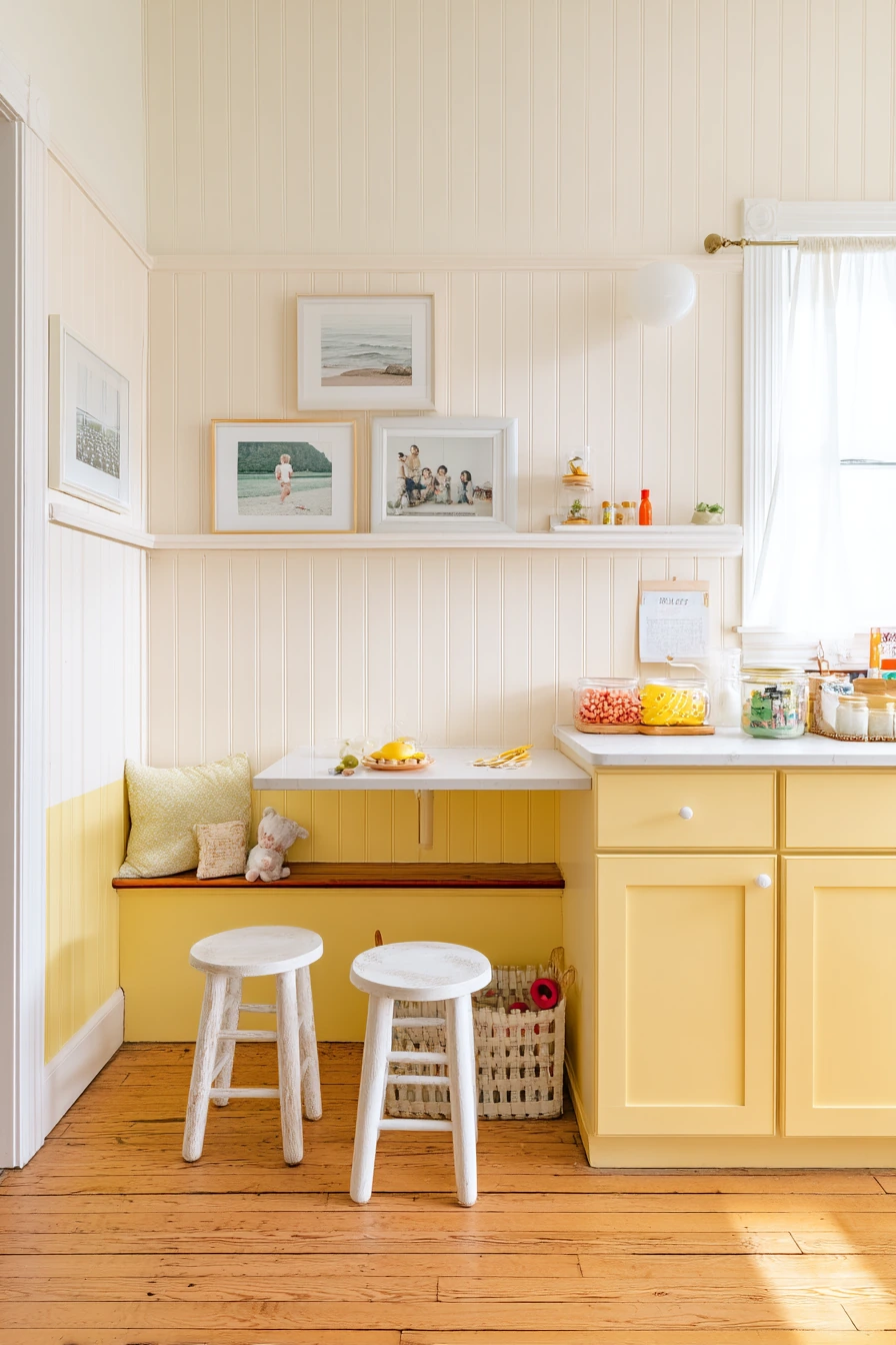
4. Butter Yellow Lower Cabinets for a Cheerful Kitchen Nook


Butter yellow paint on lower cabinets brings a sunny, friendly mood to a kitchen nook. It feels especially cozy with white beadboard and vintage stools, and it looks great in soft sunrise light that turns the room honeyed and gentle. This is a good option when you want color that still feels soft, not loud.
To make butter yellow look grown-up, pair it with clean whites and warm neutrals. White beadboard adds texture without adding another color. Framed family snapshots near the pantry make it personal, and they fit the lived-in feel of snack packing and daily routines. If your kitchen is small, yellow can help it feel more open and happy.
Style it with simple fabrics and baskets. A slightly wrinkled table runner works better than a stiff one, because it matches the casual vibe. Keep a bench area organized with a toddler toy basket under it, and use a small tray for snack items so the counter stays usable. Choose warm metal finishes, like brass or bronze, to keep the yellow from feeling too sharp.
- Use butter yellow on base cabinets only to keep the room light.
- Pair with white beadboard or a simple white backsplash for a clean frame.
- Choose vintage stools or wood seating to add warmth and charm.
- Hang a small set of family photos in matching frames for a tidy look.
- Keep linens neutral, like oatmeal or cream, so the yellow stays soft.
Pro Design Tip: Pick a yellow with a creamy base, not a neon tone, and test it next to your white paint so it does not read green.
Budget Considerations: Beadboard panels and trim can add up; a budget option is beadboard wallpaper or painting the lower wall with a simple stripe detail.

5. Pale Greige Paint for a Narrow Apartment Kitchen


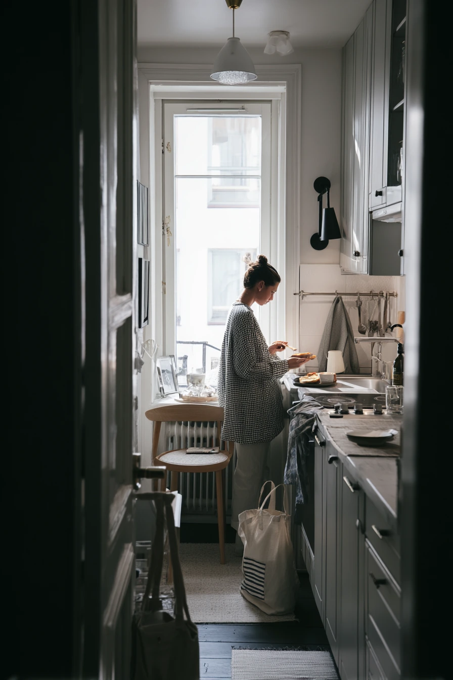
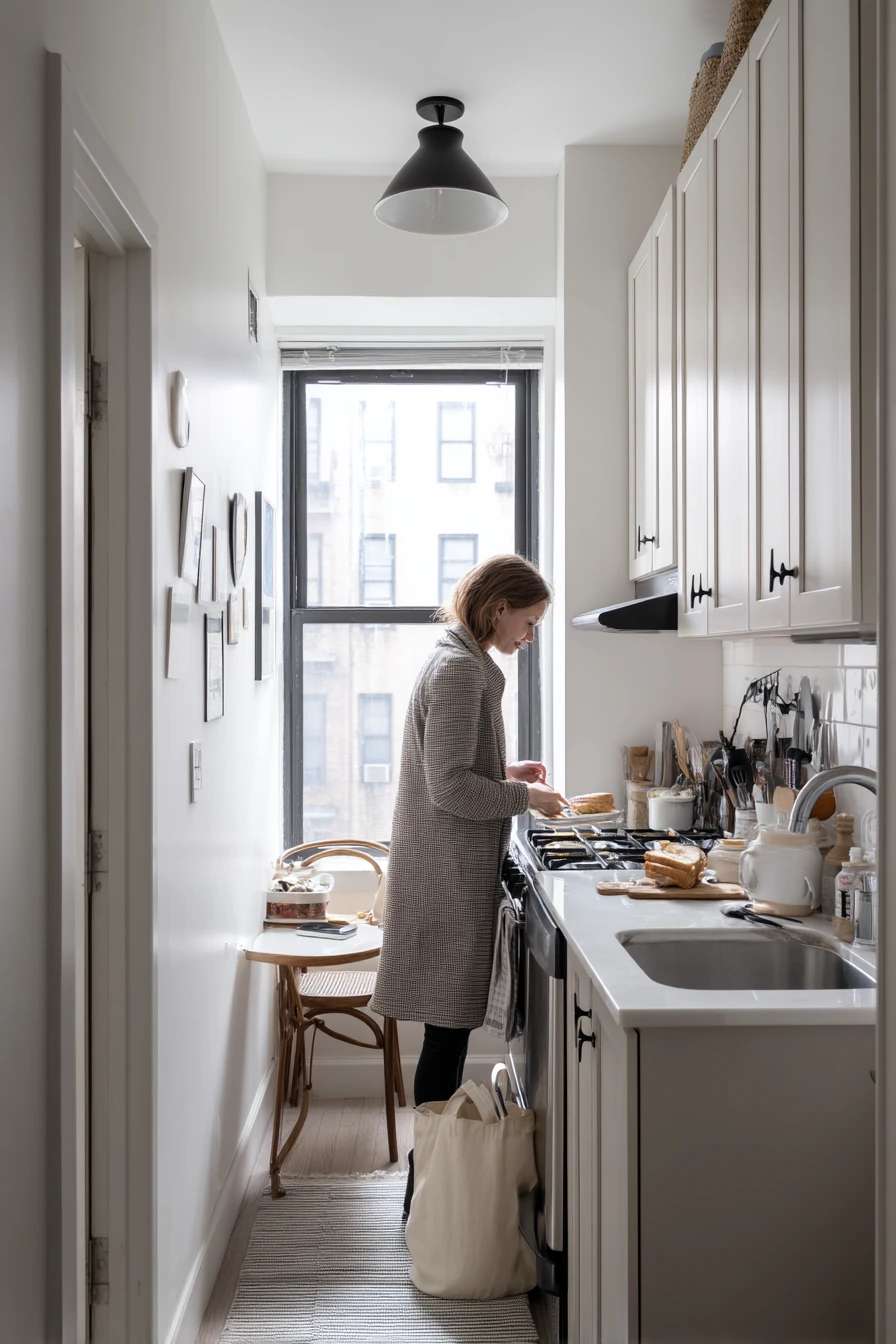
Pale greige is a go-to paint color when a narrow apartment kitchen needs to feel bigger and calmer. It sits between gray and beige, so it warms up cool spaces while still looking clean. With compact cabinets, a slim black sconce, and rail hooks, greige makes the background feel smooth and quiet in soft side light with crisp shadow lines.
This is a great choice for renters because it works with many fixed finishes, like older tile or mixed metal fixtures. Greige also helps small kitchens look less cluttered, even when there is a dish rack, a striped towel, and a phone charging on the counter. If you have a small round table by the window, greige keeps the eating nook from feeling cramped.
Style it with simple black accents and a few natural textures. A black sconce or matte black rail hooks add structure. Use one bowl near the door for keys, and choose a tote bag and coat hook area so the entry side does not spill into the kitchen. Keep decor minimal and focus on function, like a small tray for toast items and a compact cutting board.
- Choose a greige with a warm undertone to avoid a flat, cool gray feel.
- Use matte black lighting or hooks for clean contrast in a small space.
- Keep the table light in color or round in shape to help traffic flow.
- Store daily items in one zone so counters stay clear.
- Add one natural texture, like a wood board or woven placemat, for warmth.
Pro Design Tip: Paint walls and trim the same pale greige in very tight kitchens to reduce visual breaks and make the room feel wider.
Budget Considerations: If you cannot paint cabinets, paint only the walls and add black stick-on sconces or plug-in lights for a high-impact update.
6. Clay-Colored Lower Cabinets for an Earthy, Cozy Kitchen
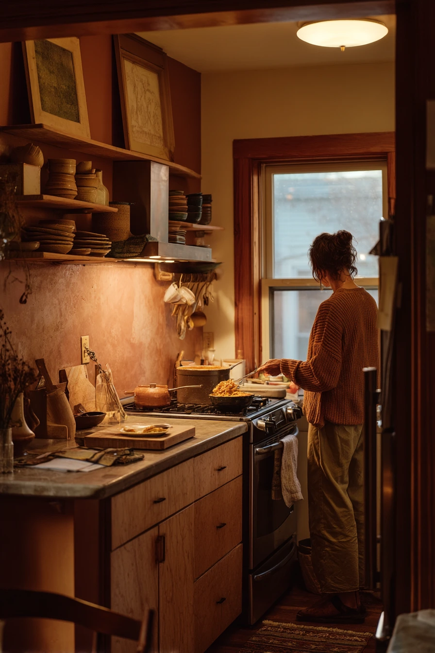

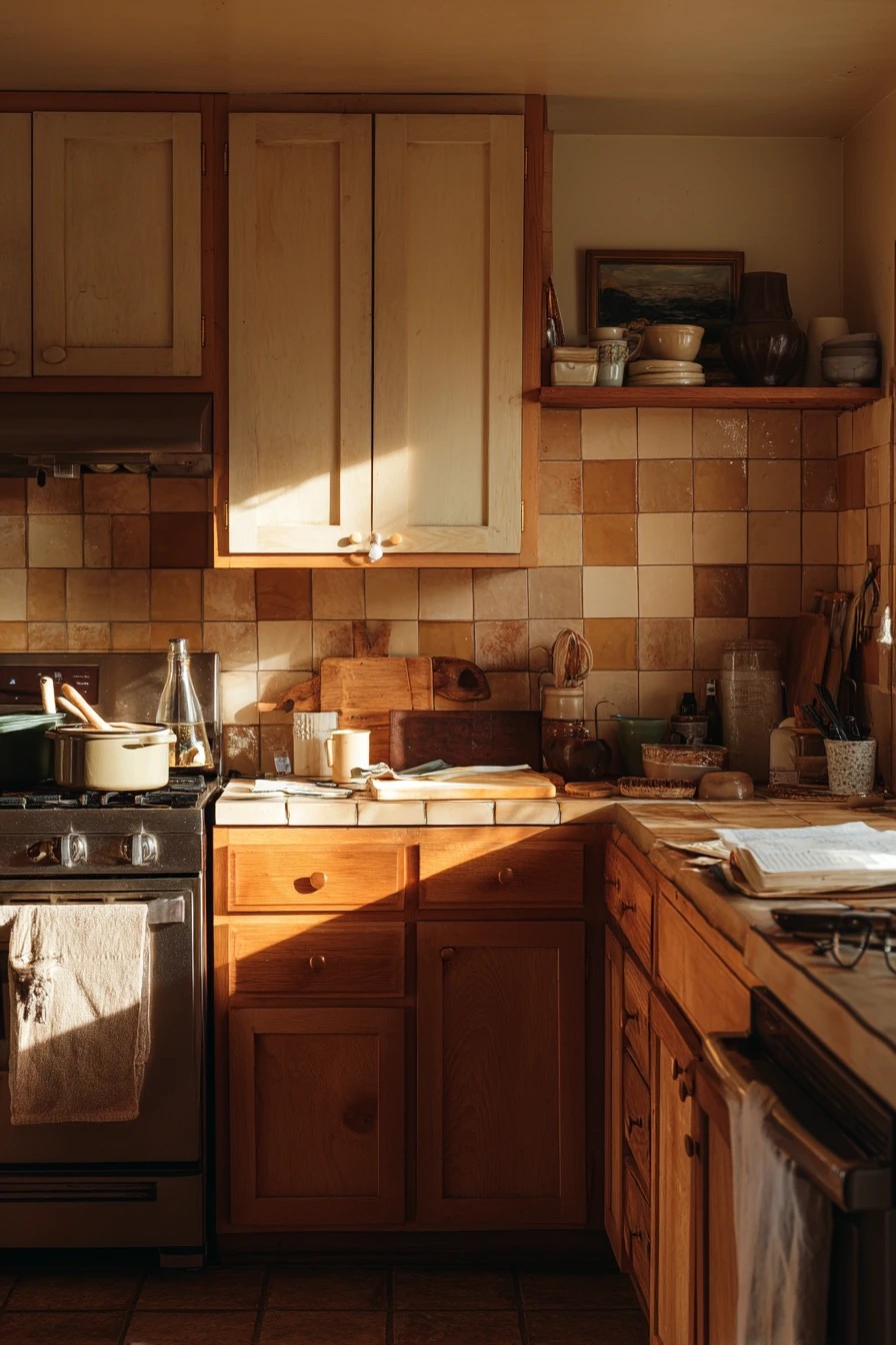
Clay-colored lower cabinets bring an earthy, grounded look that still feels inviting. This color works well with warm oak trim, handmade tile, and a shelf of stoneware because the tones feel natural together. In the evening, practical lamp light mixed with fading window glow makes clay paint look soft and rich, not bright.
Clay is a good middle option if you want more warmth than greige but do not want a strong red or orange. It hides scuffs better than very light paint, which is helpful in a lived-in kitchen where cooking happens daily. Pair it with light walls and a simple counter surface so the room does not feel heavy. Add a few personal cues, like glasses by a cutting board, to keep the space relaxed.
To style it, use texture and simple shapes. Handmade tile can be the star, so keep decor low. Stoneware in cream, sand, and gray looks great on open shelving. Use warm wood tools, a linen towel, and one small basket for everyday items. This palette also works well with plants, but choose one bigger plant instead of many small ones.
- Pick a clay tone that leans warm and muted, not too pink.
- Balance clay bases with lighter uppers or light walls for a bright feel.
- Use warm oak, walnut, or natural wood to support the earthy palette.
- Choose handmade or look-alike tile with simple variation for depth.
- Keep styling minimal with stoneware and linen for a calm countertop.
Pro Design Tip: Repeat the clay color in a small accent, like a rug stripe or utensil crock, so the lower cabinets feel connected to the rest of the room.
Budget Considerations: Handmade tile is costly; use a small tiled area behind the stove only, or choose ceramic subway tile in a warm off-white for a similar feel.

7. Black Lower Cabinets and Cream Uppers for Farmhouse Style


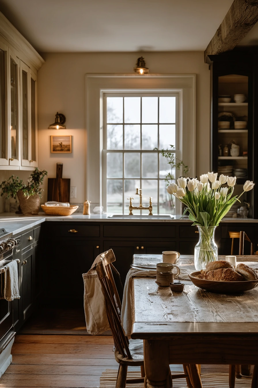
Black lower cabinets with cream uppers are a strong farmhouse color combo that still feels friendly. It works best with simple shaker fronts and warm wood, like an old table with tulips and bread. In soft dusk window light, the black looks deep and calm, while cream uppers keep the room from feeling dark.
This look is practical for real life because dark base cabinets hide scuffs and busy areas near the floor. Cream uppers are easier to keep bright and help reflect light. Add warmth through wood furniture, woven pieces, and soft textiles. Everyday mess, like half-folded napkins or a stray spoon, will not fight with the paint colors because the palette is steady.
Style it with a mix of clean and casual. Use a simple centerpiece on the table, like one vase of tulips. Keep a market bag near the back door in a basket so it looks organized. If you have pets, a dog bowl can sit on a small tray so it feels planned. Choose warm bulbs in lamps so the cream reads soft, not yellow.
- Use a true soft black or charcoal for a calmer look than jet black.
- Pick a creamy white for uppers to add warmth next to black paint.
- Add a wood table or stool to keep the palette from feeling too sharp.
- Use simple black or brass pulls for a farmhouse finish.
- Layer soft lighting for evenings so the black stays cozy.
Pro Design Tip: Keep the backsplash light and simple so the black lowers feel crisp and the room stays bright.
Budget Considerations: If painting all lowers is too much, paint only the sink run or island in black, then add matching pulls to spread the effect.

8. Muted Olive Cabinet Paint for a Budget-Friendly Refresh

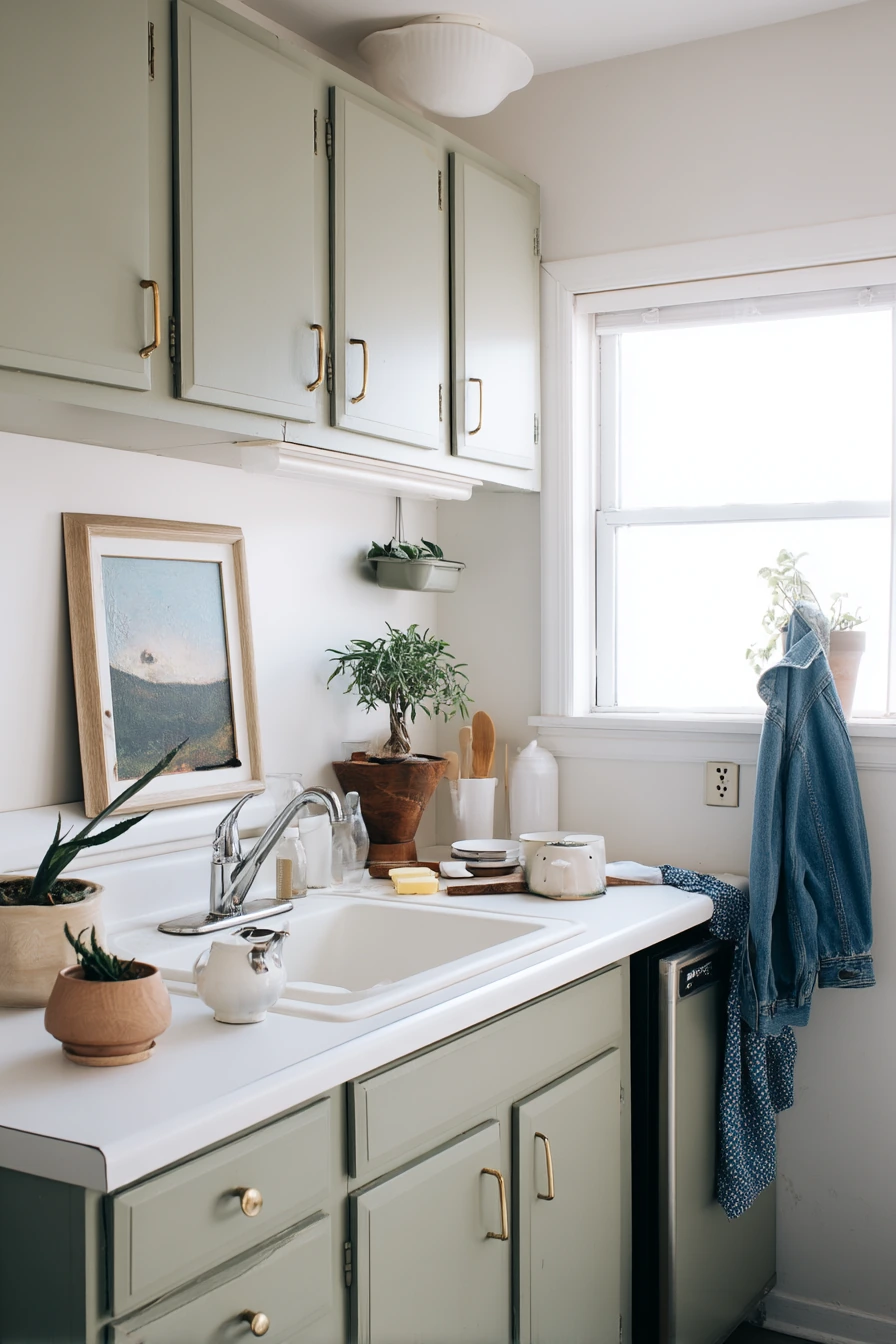
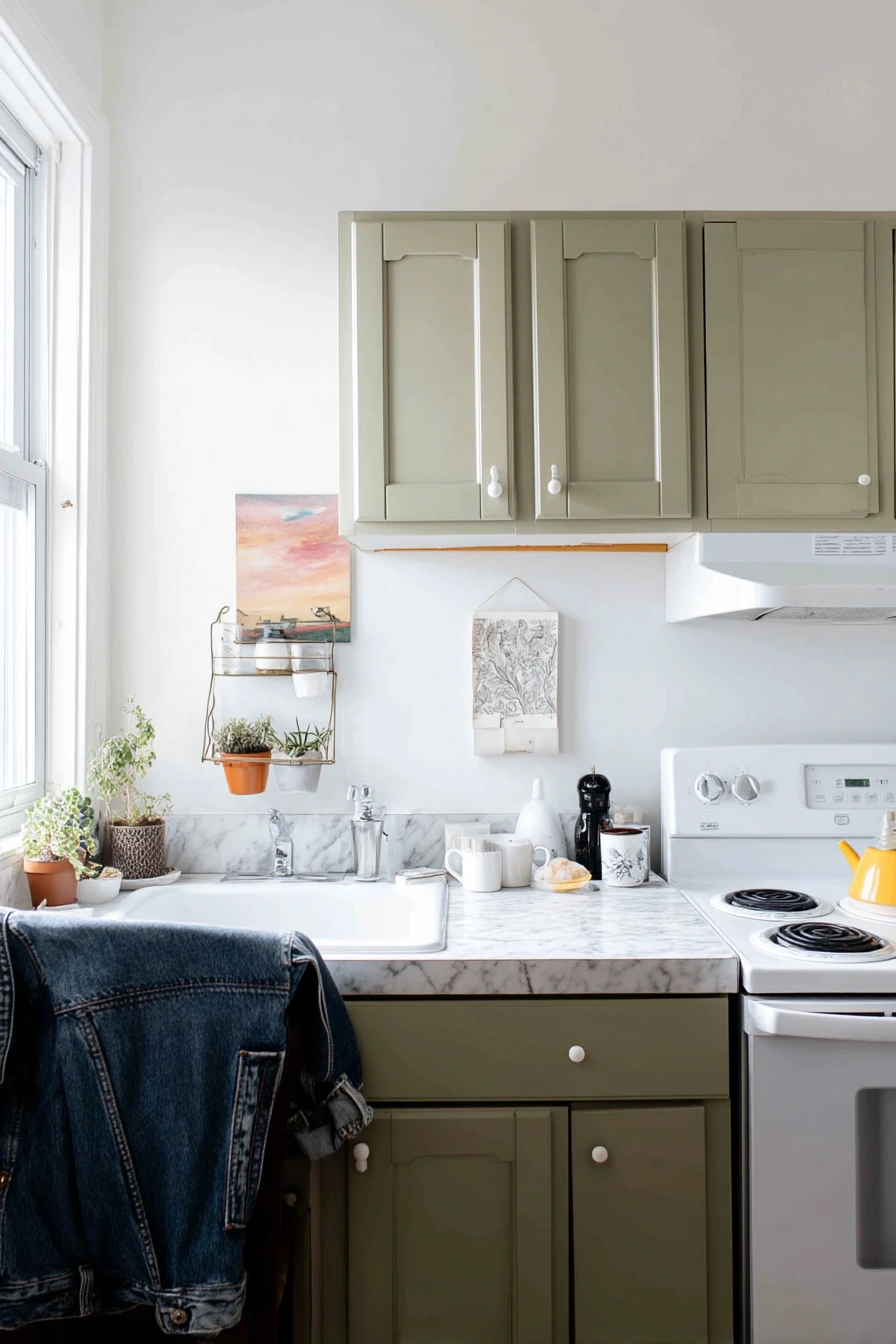
Muted olive cabinet paint is a smart option for a budget-friendly kitchen makeover because it adds color without feeling loud. Olive looks fresh with simple white counters and it blends well with everyday items, like folded mail, a dish sponge, and a chipped bowl. On cloudy days, this color stays even and gentle instead of shifting too much.
Olive works especially well for renters who want personality but still need a practical space. Pair it with thrift-store art and a tiny herb rack by the sink to keep the mood light. Because olive is a nature-based shade, it looks good with many metals, including brass, black, and nickel. If your kitchen has limited sunlight, choose a lighter olive so it does not feel heavy.
Style it with useful, casual layers. Hang one or two pieces of art, not a full wall, so the kitchen still feels clean. Use a denim jacket over a chair as part of the lived-in story, but keep the chair area tidy by storing bags in a basket. Add a small wood cutting board and a white towel to keep the look balanced.
- Choose a muted olive with a little gray for a calmer, modern feel.
- Use white counters and white walls to keep the space bright.
- Add thrifted art in simple frames for character without clutter.
- Keep herbs near the sink in one small rack or tray.
- Use one warm wood accent to soften the green tone.
Pro Design Tip: Pair olive cabinets with a warm white backsplash and warm bulbs, so the green reads cozy instead of dull.
Budget Considerations: If cabinet painting is not possible, paint only the pantry door or a small section and add olive accents like towels and art to echo the color.

9. Muted Blush Pantry Wall with Off-White Cabinets

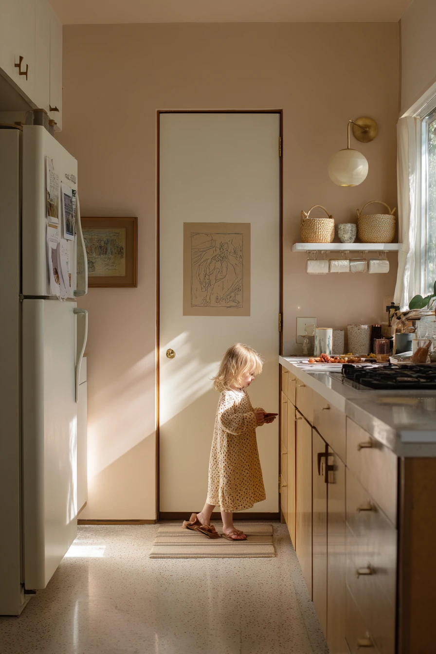
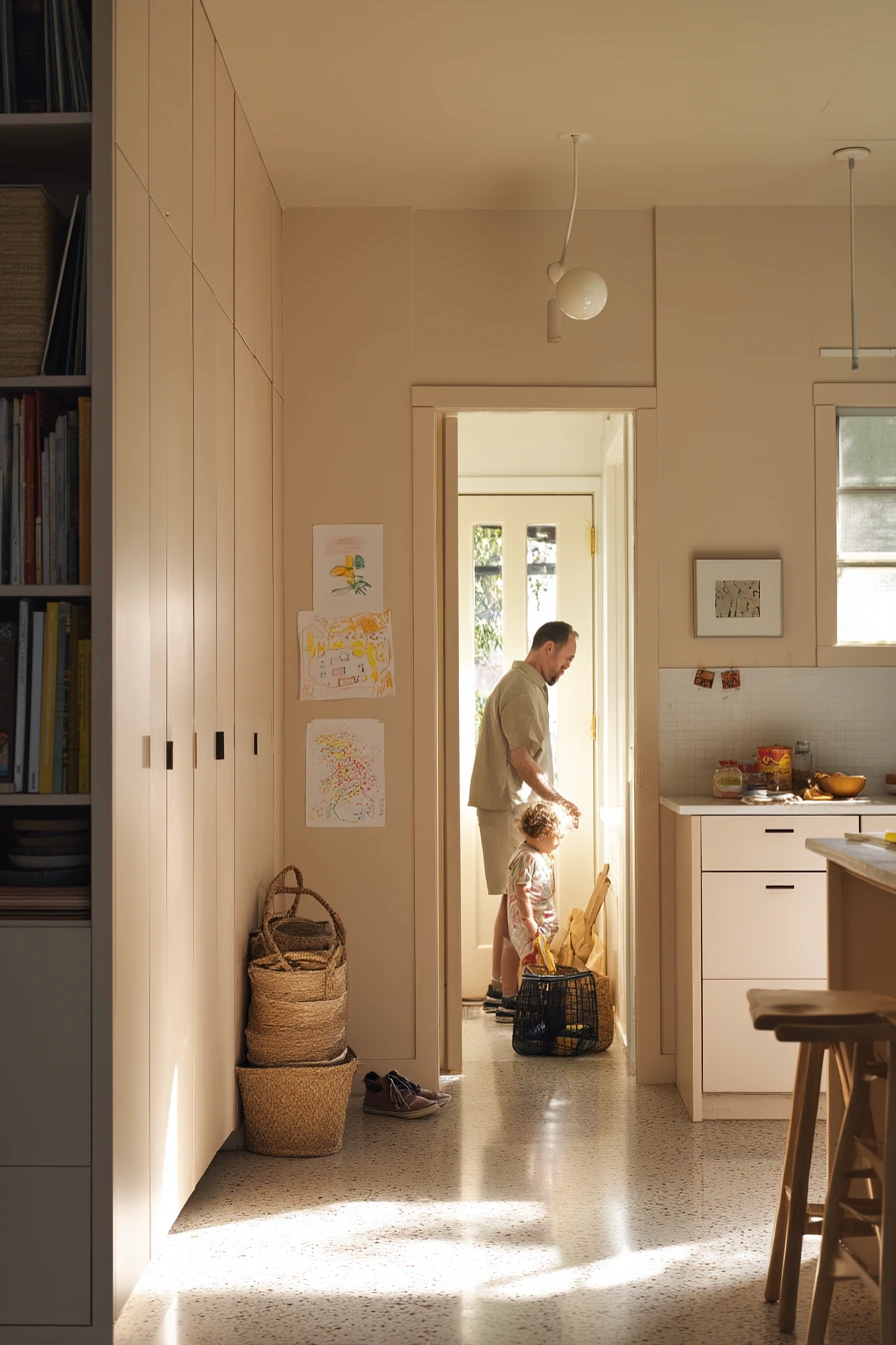
A muted blush pantry wall is an easy way to add color without committing to full kitchen cabinets. Blush looks upbeat but soft, especially with off-white cabinets, pale terrazzo, and woven baskets. In afternoon window light, it can read slightly rosy and warm, which makes the kitchen feel welcoming for weekend routines and snack runs.
This idea works well in family homes because it feels personal and gentle. A child’s drawing taped near the fridge fits right in, and the blush wall helps it look intentional instead of messy. Off-white cabinets keep the room light, while baskets add storage and texture. If your kitchen has a lot of hard surfaces, blush can soften the look.
Style it with natural tones and simple lines. Use woven baskets for snacks and paper goods so counters stay clear. Keep a notebook and receipts in one tray to avoid piles. If the threshold area gets busy with shoes, add a small mat and a slim rack so the entry does not take over the kitchen view.
- Use blush on one wall, like a pantry wall, to keep it subtle.
- Pair blush with off-white cabinets for a clean, warm balance.
- Add woven baskets to bring in texture and easy storage.
- Use terrazzo or light counters to keep the palette bright.
- Frame kids art or use matching clips so it looks neat on the wall.
Pro Design Tip: Choose a blush with a muted, dusty undertone so it feels timeless and pairs well with wood and brass.
Budget Considerations: Painting one accent wall costs much less than painting cabinets, and you can update the look later with new art and baskets instead of repainting.
10. Timeless Cream Kitchen Paint with Brass and Marble
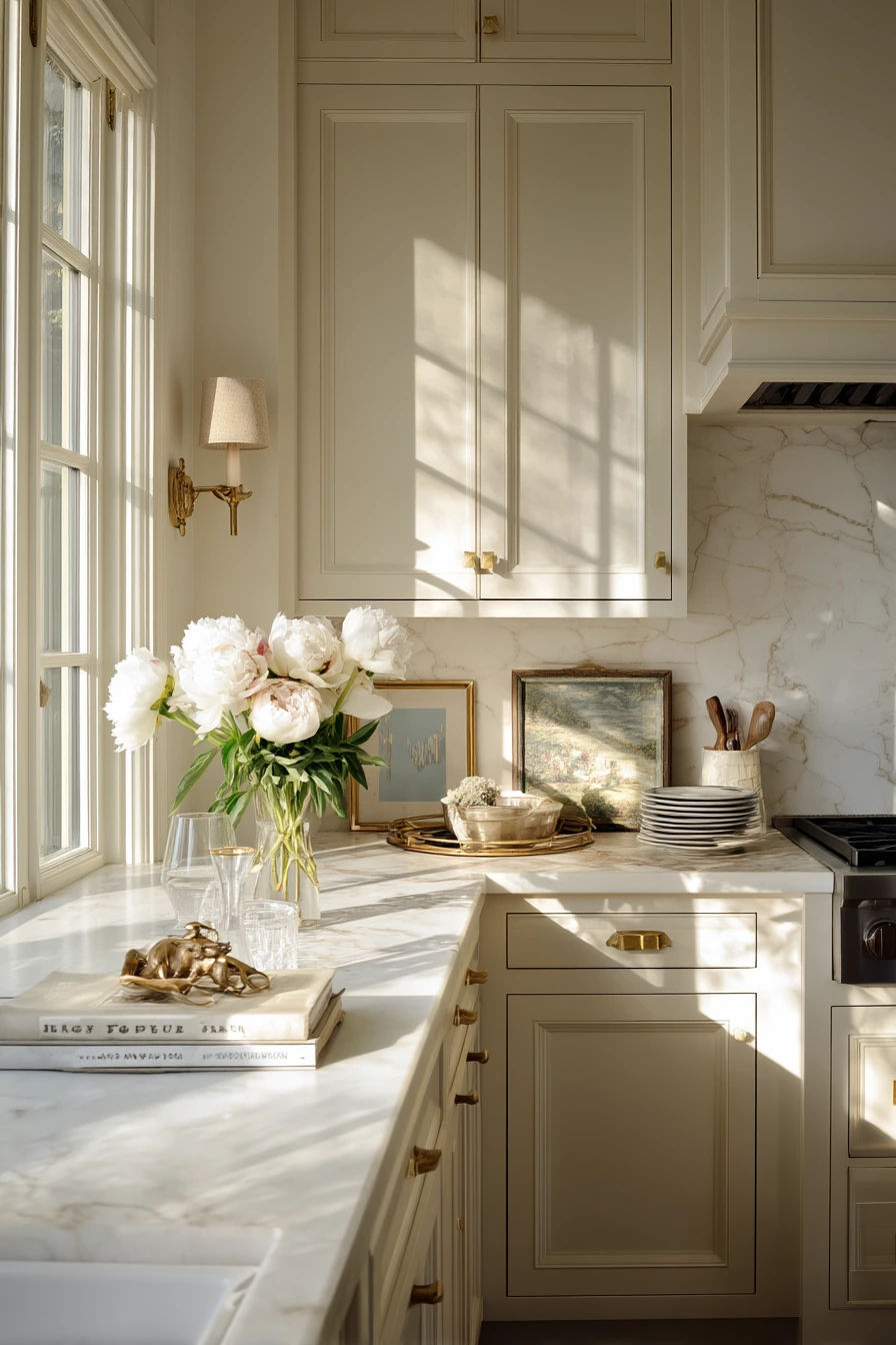
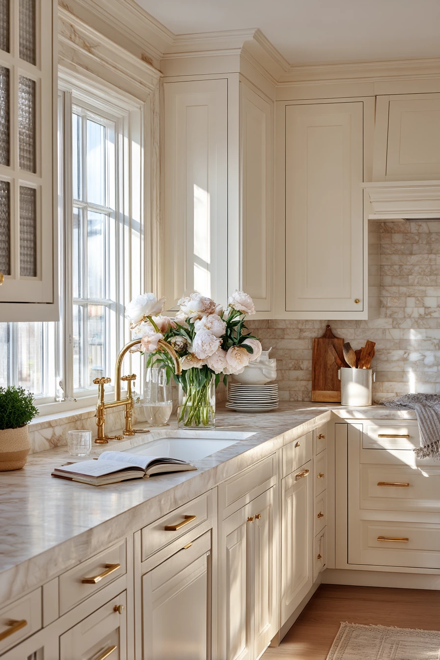
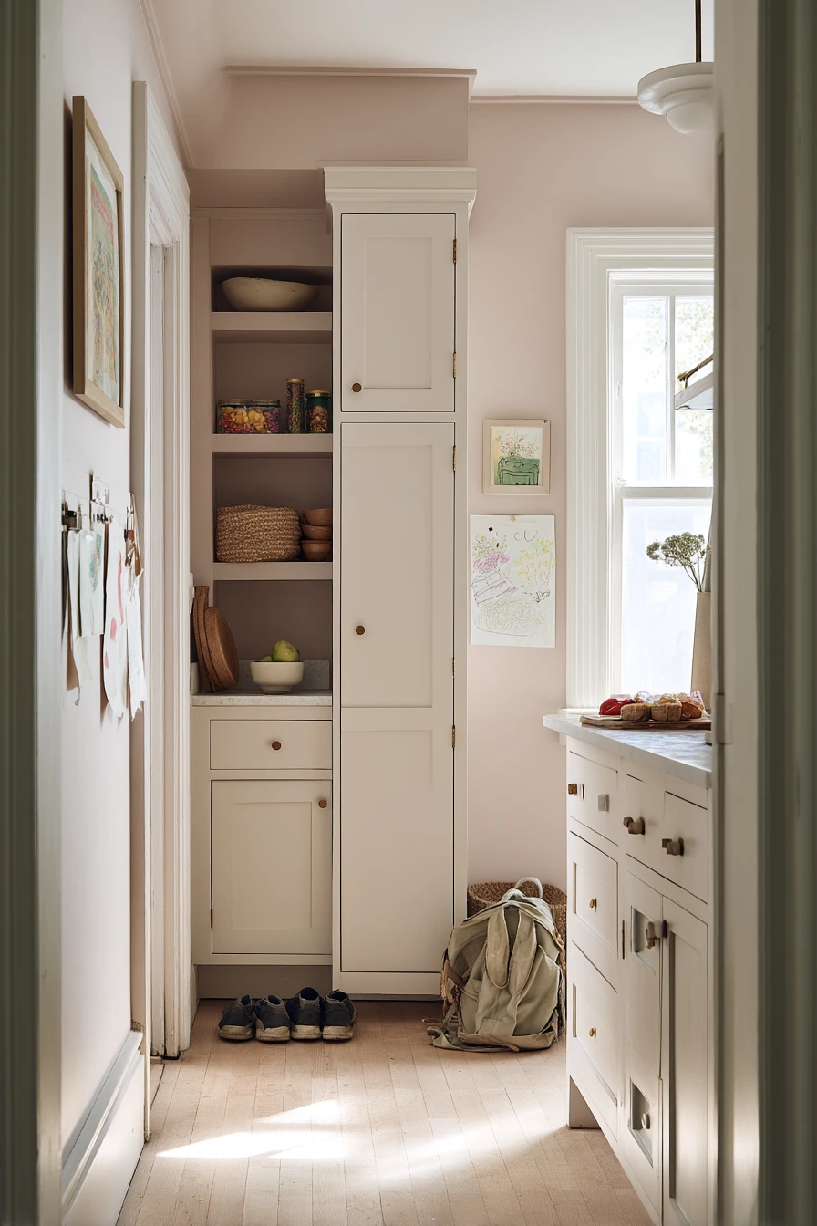
Timeless cream kitchen paint is a classic choice when you want a polished look that still feels lived-in. Cream cabinets pair naturally with brass fixtures and a marble backsplash, creating a soft, elegant palette. In soft late-afternoon window light, cream looks luminous and calm, and it stays forgiving when real life shows up, like stacked plates, a creased tea towel, or a cookbook propped near the stove.
To keep cream from looking flat, layer in texture and warm metals. Brass adds gentle shine and helps the space feel warm. Marble brings pattern and movement, so the cabinets can stay simple. A narrow gallery ledge is a good styling spot because it lets you display a few items without crowding the counter. If you entertain, cream also photographs well, which is helpful for listing photos or sharing on social media.
Style this kitchen with fresh flowers and controlled clutter. A vase of peonies is a simple focal point. Keep a wine glass or serving tray on one side and move daily tools into drawers. Use matching canisters or a small crock for utensils so the counter stays tidy. Add warm lamps or under-cabinet lighting so the cream color stays cozy at night.
- Choose a cream with a warm base so it does not read yellow against marble.
- Use brass fixtures and pulls to add warmth and classic style.
- Keep the backsplash simple but textured, like marble or a marble-look tile.
- Style a gallery ledge with a few framed pieces and small ceramics.
- Add warm lighting so the cream stays soft in the evening.
Pro Design Tip: Use two sheens of the same cream, like satin on cabinets and eggshell on walls, to add depth without changing the color.
Budget Considerations: Real marble can be expensive; a marble-look porcelain tile or laminate can give a similar effect with easier upkeep.


Good kitchen paint ideas start with how you live, not just what looks nice in a photo. A soft sage or muted olive can hide daily wear, while warm white and pale greige can make small spaces feel open.
Pick a color that works with your light, then build the look with simple pieces like hardware, shelves, and textiles. Small updates, like painting an island or a pantry wall, can give you a big change without a full remodel.
FAQ
1. What is the best paint finish for kitchen cabinets? A satin or semi-gloss cabinet paint is easiest to wipe clean and holds up better to moisture and fingerprints.
2. How do I choose a kitchen paint color with little natural light? Use warmer shades like creamy white, warm greige, or a light sage. Test samples in the darkest corner and at night under your bulbs.
3. Can renters paint kitchen cabinets? Some leases allow it with written approval. If not, paint walls, add peel-and-stick hardware, and use removable shelf liners for impact.
4. Do dark cabinet colors make a kitchen feel smaller? They can, but using dark paint on lower cabinets only and keeping uppers light helps keep the space open.
5. What colors look good with brass pulls? Sage, cream, warm white, muted blush, deep blue, and many olives all pair well with brass because it is a warm metal.
6. How can I update my kitchen without repainting everything? Paint one focal area, like the island or pantry wall, then refresh lighting, hardware, and a few textiles to match.
7. How long should I wait before using freshly painted cabinets? Most paints feel dry quickly, but curing can take a few weeks. Be gentle with doors and avoid heavy scrubbing until fully cured.
Use these color schemes as a starting point, then adjust the shade to your light and your daily routine. The best result is a kitchen that looks good while you are actually living in it.